How to write some of the best ads of the last decade
Writing scripts, eh? There must be quite an art to it. I’d imagine that all the great ads have a beautifully worked script behind them that reads like the love child of William Goldman and James Joyce, calling down the twin angels of screenwriting and literature to bring wonderment and genius to the masses.
Well, maybe.
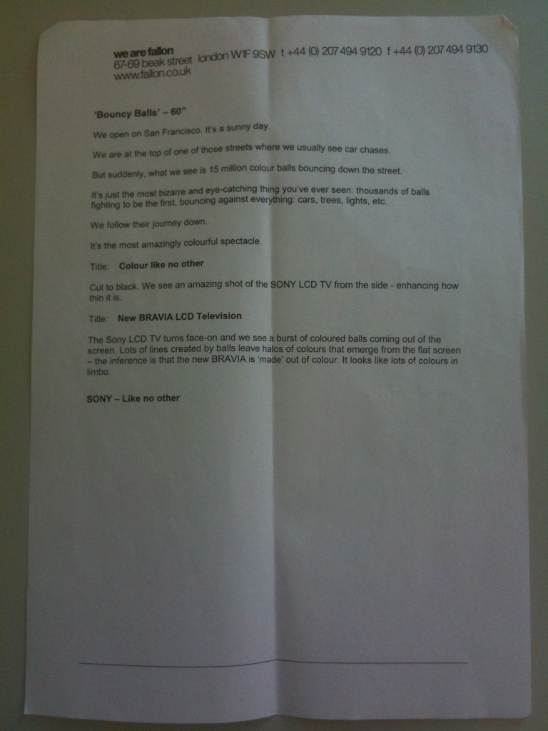
Here’s the first version of Balls:
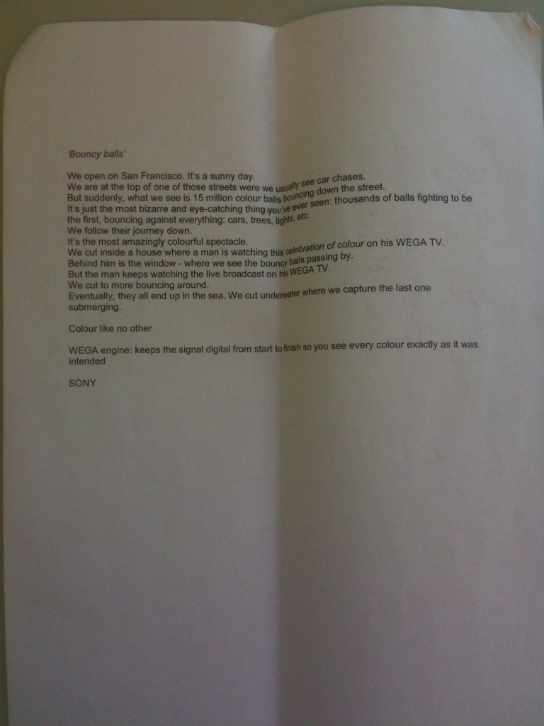
…Which then became this:

Check how short the ad bit is compared to the overwritten 'client' bit at the end. Overwriting the client bit is a tried and tested technique for making them think you give as much of a shit about the packshot as you do about the Kubrick pastiche that precedes it.
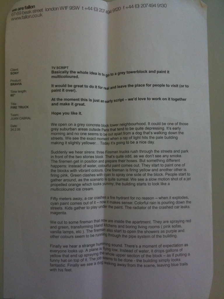
And was ‘Paint’ just like that from the start? Nope, it was about firemen and doggies. Was the existence of people thought to be a no-no?
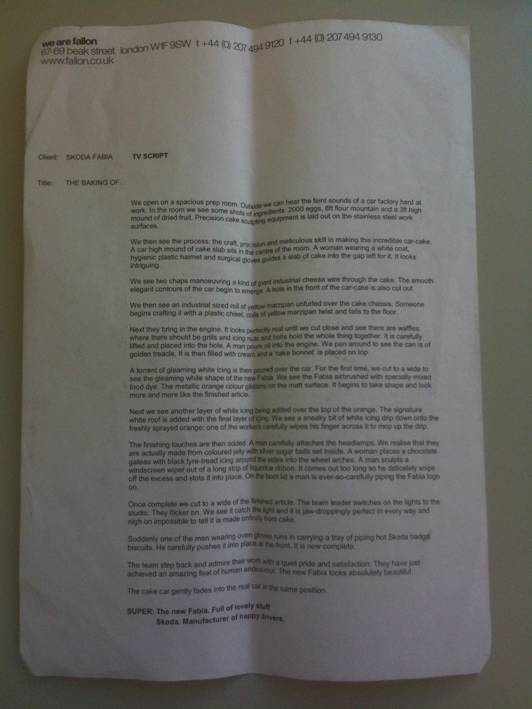
And lastly, Cake. Now this one has been written with tender loving care and the feeling that a GOOD AD is what you are reading:
And that’s how it’s done.
I think the lesson here is that, as you might expect, much of the ad happens in the execution.
And thanks to anon for sending me these scripts.


It’s funny looking at these now, because so many ads today ape them. But when they were written (well, when balls was written) it was an entirely new style.
Who would have thought one humble script would unleash so many technicoloured folksy soundtracked bits of crap in the years to follow?
This would make an interesting series, wouldn’t it? Would also be interesting to see the scamps for famous print ads. We’ve got the original scamp for Saint Wayne somewhere. It doesn’t look like much. (Yes, commenters, no surprise there as the finished ad was shit too.) We used to have the original script for Cog lying around somewhere. Interestingly, that had the name of another Honda model throughout. Each time it appeared that model name had been crossed out in biro and replaced with the hand-written word ‘Accord’. I think Simon Thompson, the Honda client at the time, now has the script kept safe in his scrap-book.
Wouldn’t be easier to just show the Letterman clip?
Neil, I’d love to show more of the genesis of famous ads. I think it’s somewhat heartening to see that they are often no ‘better’ written than those produced by the rest of us on a daily basis.
Actually, I think D&AD did this for a few campaigns, along with explanations from the team responsible.
So if Juan, Chris or John are reading this, they are very welcome to explain that this version is the result of many late nights. Or, alternatively, five minutes in the pub.
And if anyone wants to send others in, I’ll gladly put them up (classics only, please).
Can someone tell me what’s so good about that Skoda cake ad? I mean seriously it’s a car made out of cake. That’s it.
I actually ate a cake made to look like a caterpillar the other day and I didn’t get that excited about it. Seriously, what’s the big deal? Is it that it’s a big cake?
Heartening to see it isn’t just my scripts that get bogged down in mandatories, sign-offs, multiple positioning lines, needless product details, small print and miscellaneous client hysteria.
Also love the “Hope you like it”. Not sarcastic. Just genuine enthusiasm.
I hope clients read this. Should be as useful/interesting to them as it is to us.
I never got St Wayne. I mean seriously. It’s a wanker with an England red cross on it. I don’t get it.
I’d like to see some of the one line scripts that get sent to directors. I heard that Levis Odyssey was ‘two people try to get out of a box’ although that might be bollocks.
I found the original script for Cog
http://www.youtube.com/watch?v=GXrRC3pfLnE
Whoa there. Is that a begging note I see at the top of “Paint”?
Rule Number One.
Never, ever send directors scripts with notes saying things like ‘we’d love to work with you on it’ and ‘hope you like it’.
Translation: ‘We know this is a lame idea. Hope you can make it into something a bit better. Please help us’.
If the script is good enough there’ll be a queue of A-listers round the block.
Can’t read the “Cake” script Ben. My eyes are old (my knees are knackered).
I believe the script for this said ‘people rub themselves in Levi’s jeans’:
http://www.youtube.com/watch?v=Ln2l476cj5U
Ed Morris once told me that when he presented the Playstation ‘Double Life’ script to the creative director he printed it out A1.
Not sure he really needed to but it showed his belief in the script.
Sorry, Mr. G. Not sure how to make it bigger.
surprised A1 was big enough for Ed’s ego
Sorry to argue with Mr G. but the begging letters work a charm at the top of the right script. It is a Mother staple and reminds us all what beautifully brought up young ladies and gents they are.
Although prize for best packaging of a script goes to VW Night Drive. A thing of such beauty, I still have it
How extraordinary that Ed Morris had such an enormous amount of faith in his own script.
The critical thing here is obviously ‘the right script’.
On balls it would work, but
‘Dear Frank,
I love your work. Please could you shoot this fucking awful Yeo Valley ad with rapping farmers?
Cheers’
might fall on deaf ears.
Saint Wayne scamp here:
http://bit.ly/cDIsvG
Ben – Any thoughts on the Ikea follow up ad to cats?
The one when two nobheads dance like pricks round the kitchen.
John “cake face” Allison and Chris “cream filled” Bovill here,
The script you see is the BACC friendly “take the client on a journey” version, I think the original was about 3 pages long and finished with a giant cherry landing on top of the car. Which would have been SHITE.
This is the script we sent to all the directors. It turned out to be quite close to what we actually filmed even though we know fuck all about baking. We had one mandatory requirement; “Can you make it in camera?” Only Chris Palmer said he would try and do it.
Thats when we all threw away the script and it became the job or expert bakers, icers and cooks.
“Lets make a car out of cake” is a simple idea yet no script on earth is going to ensure that its properly executed. There’s only so far a thesaurus will get you. Will Self could probably write the best scripts ever, but without a good director a brave client and a decent budget it will just be some words on a page.
J&C
Some from the dark ages.
How John Webster writes a Sony CD Player ad with John Cleese.
http://i52.tinypic.com/2wo9gmx.jpg
Mel, Griff and Tim Delaney do Philips radio ads.
http://i52.tinypic.com/1yvonp.jpg
Thanks, C&J, and TCLI.
Anon: I think the new Ikea ad is basically shit. No idea, full of annoying cunts and the worst endline in living memory.
In a book produced to accompany the 20 best radio ads of whenever, Griff claimed he wrote ‘Firips’ by himself.
I remember Walt Campbell telling me about selling in the Guiness Surfer advert and the account guy coming back with client feedback. The account guy asked Walt, and I quote, “Do you need the horses?”.
Personally I believe Balls would have been improved tenfold if it were written in chalkboard, or perhaps comic sans MS.
@ Mrs Kay
The trouble is that the ‘please have a look at this’ is a line that all too often accompanies the lamest of the lame. Seeing that sort of comment on the front of the script prepares the reader for the worst – simply because of what has gone before….
Polite almost certainly, but apologetic all the same.
(Fight! Fight!)
i did a blog about that video i ripped off years ago http://theescapepod.wordpress.com/2009/10/09/it%E2%80%99s-coming-up-on-the-tenth-anniversary-of-this-campaign-mother-of-god-how-times-flies/
I have it on good authority that this is the original script for cog – scroll to 1.30
http://www.youtube.com/watch?v=thJOfavJLeA
Probably missed the boat on this post. But, if anyone’s still there, did any of these excellent scripts have to suffer research groups? And, if so, how did they escape (relatively) unscathed?
no testing involved in bud ad phil.
That must be why it turned out so good eh! Cheers Vinny.
Elavil….
Elavil side effects. Elavil….
Vicodin no prescriptionon….
Vicodin no prescriptionon….