McDonald’s Delivery: Pros And Cons.
There’s a French McDonald’s Delivery campaign that’s spent the last week or two doing the rounds on my LinkedIn and Twitter feeds:
The coverage and mentions have been uniformly positive, so let’s have a look at the pros, and if I can dredge any up, the cons:
Pros:
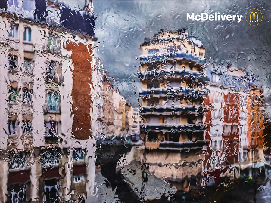
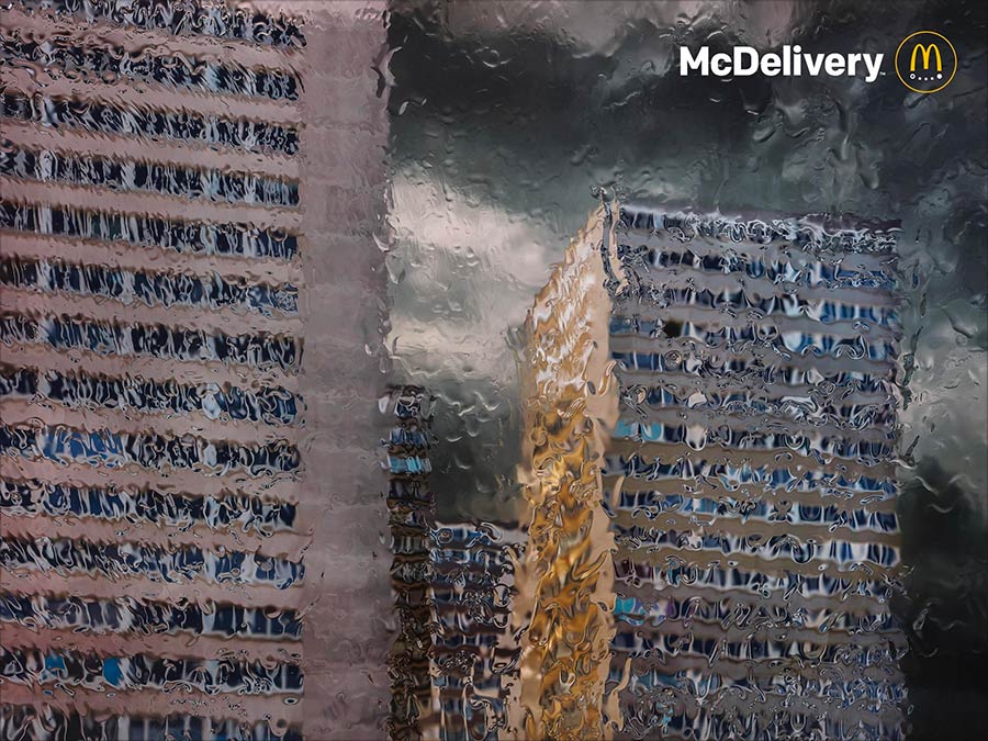
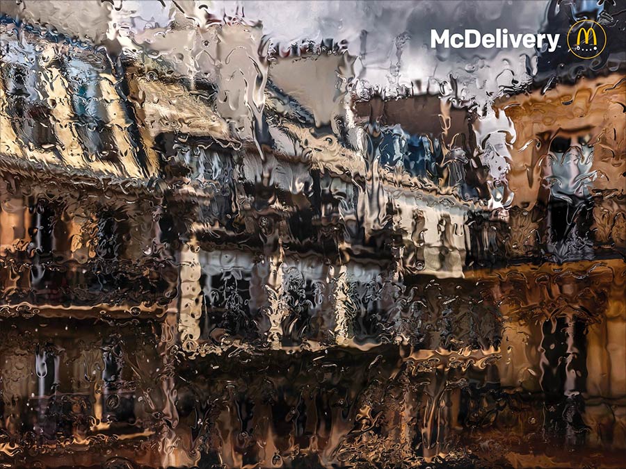
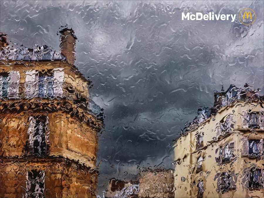
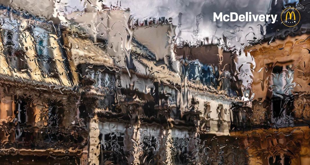
The photos are remarkable. The way they portray a rainy day through a window works brilliantly because we’ve all seen that view a million times, but I’ve never seen it conveyed so accurately in a still image. And it doesn’t just work visually; it also works emotionally, giving you every iota of that drab and disappointed feeling of a wet day from indoors.
The branding must also be very good because, for reasons I can’t quite put my finger on, I always remember it’s for McDonald’s Delivery. Perhaps it’s the very clear logo, and the fact that it’s for a big company that I’m already familiar with. Maybe it’s consistent with the tone of other McDonald’s communications I’ve seen in the past. Whatever it is, it passes that essential test.
It’s clear and simple: ‘Crappy day when you don’t want to go outside? Let us bring your McDonald’s to you’. Got it. If I wasn’t aware of McDonald’s Delivery before, I am now, and if I was aware, I’ve been reminded in a charming way.
Cons:
Why are there five of these things? When I was at college, and in some of the agencies I’ve worked at since, ‘The same ad three times’ was a withering insult. If each new execution isn’t bringing something new to the party, why bother making it? Which is your favourite of these? ‘Tower Block In The Rain’? ‘Block Of Flats In The Rain’? ‘Building In The Rain’? Or is it ‘Other Buildings In The Rain?’ Come to think of it, why are they all buildings? It wouldn’t make the ads much different, but as they’re just views from someone inside a building, why not add a bridge, or a bunch of shops? Why stop at five? Why not do 37 of these?
It’s 100% generic. Is McDonald’s the market leader in delivered food in Paris? I have my doubts. So these ads are really just for ‘delivered food’. Maybe you see them and think you’ll call Domino’s, or your favourite baguette jamon delivery service. There’s nothing that tells me why I should order from McDonald’s Delivery (not another delivery service) on a rainy day. (May I also add that surely delivered McDonald’s is pretty unpleasant. I have nothing against the food when it comes fresh from the restaurant, but waiting 20 minutes for it to come through the rain? Give me a pizza or a curry any day of the week.)
Somewhat related is this post from Dave Trott. It talks about the great Bob Levenson’s test for a good ad:
“Here’s the test,” said Bob Levenson: “If you look at an ad and fall in love with the brilliance of it, try taking the product out of it.
If you still love the ad, it’s no good.
Don’t make your ad interesting; make your product interesting.”
Try that test with this campaign: cover up the logo and see if you still love it. If you did before, I’m pretty sure you still do. What most people seem to like about this campaign is the photography. There’s really nothing here that tells you why MD is good enough to spend your money on. I suppose it presumes that we all know if we like McDonald’s already, so it can just let us know that this thing we like or don’t like is now available for delivery. Maybe that’s enough, but maybe a better ad would give me a good reason to give it a go.
I think that’s enough about the pros and cons. Overall I think it’s one decent ad (with amazing photography/post), not five amazing ones. Additionally, I apologize for the cynicism, but this industry has driven me to it: these ads have a big whiff of Cannes fodder about them. I’d love to believe the client decided to run these five virtually identical ads, but I can’t help thinking at least some of this campaign was created purely for the purpose of entering it for some awards.
If it was intended and created with only its effectiveness in mind, I apologise!
BK
Dunno. Is this a ‘campaign’?…..
http://i.haymarketindia.net/News/Levis—Fall-Apart1.jpg
Or the same idea dressed up as series of different looking ads?
Avedon wouldn’t let the Creatives (Will & Martin) into his studio when he took those shots.
Them were the days.
I can only seem to see one of those Levi’s ads, but I remember a few of them in D&AD (1992?).
As far as i recall, they had different lines and different people, making different points about why they’re such good workwear or whatever.
If the McD’s ads had a different line or markedly different visual on each, adding something to the overall communication, I’d call it a campaign.
Yes. Will & Martin’s ads were definitely a campaign.
But these ads…?
I like them so much I’m going to call them a campaign.
So there.
Hey, you do you (as the kids say)!
I love this campaign. It does the first thing any ad needs to do ( and 99% don’t ) and that is to stand out. It does that in spades. Great photography and simple art direction- it tells me McDonalds are now doing home deliveries, which is something I didn’t know before. They may not be the leader in fast food deliveries, but they possibly are the leader in fast food, so it can be generic. Even if they are not, they are one of the most famous brands in the world. It’s talking directly to McDonalds lovers. Nothing else is needed. I agree about them looking similar, though. The areas look a bit samey to me (a non Parisian) and why didn’t they do one at night? That could have also looked stunning. I’d still vote for it though.
A good point about doing one at night.
I bet that would have looked stunning.
They should’ve had a McDonald’s in shot in some, if not all of them.
Thus eliminating the need for a logo (McDelivery will suffice) and removing the issue of it potentially being an ad for Deliveroo, Foodora, Uber Eats et al.