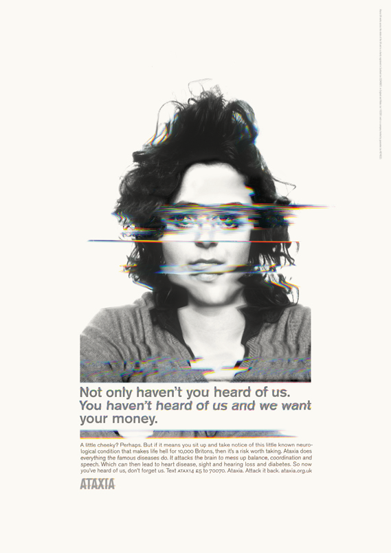
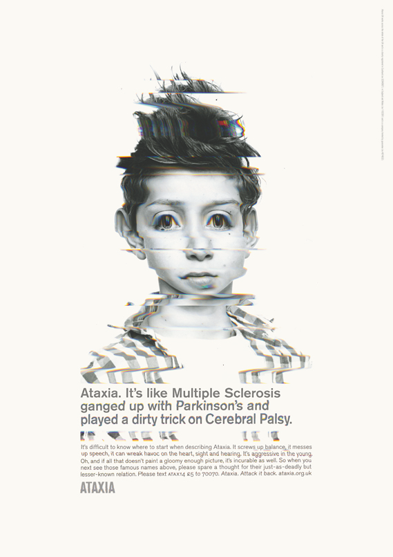
Ah, this is how a public service print campaign should be done
Posted in Uncategorized
Fine art direction, excellent writing and a clear message:
(Interest declared: I’m friends with most of the people involved in this. Nice one, Paul, Antonia, Peter and Jeremy – and the other people involved that I have yet to meet.)


Excellent work, without a doubt. Hard-hitting and memorable. They’ll remember these.
Lovely. Especially that last one.
Aren’t these really plonky and dated?
The headlines are really tired and overwritten.
The Art Direction is total Belford by numbers.
Be honest with yourselves and pretend you haven’t seen the credits…
Strong work.
I agree with John S – the last one is particularly good.
My respect for it will be doubled if it isn’t entered for any awards.
Dated? Compared to what?
Dated, because it’s Print advertising. A medium which is in strong decline as newspaper readership falls.
Dated, because in this digital, disposable world, this kind of thing will almost certainly not raise significant funds or increase awareness for the cause.
Dated, because it’s terribly familiar in the context of much of Belford’s previous (brilliant) work – it reminds me of the stuff he did for booze awareness recently and has a stylistic similarity to the Big Issue print from many moons ago, when he and Nigel were at TBWA. I can’t be arced to wade through his site, but I’m sure there are many other examples.
Dated, because that kind of Sean Doyle-esque copy (who is brilliant, by the way) smacks of ten years ago (when Sean and Nigel were doing it in a very fresh and interesting way).
Dated, because ten years ago every team in London would have been envious of it and wanted it in their book, seeing it as a potentially award-winning route to a better job. Whereas now, even though it’ll probably nick some gongs, ECDs are almost completely disinterested in “print” teams. And it will therefore get you nothing.
I think that if ‘I wish my son had cancer’ is good then so is this.
@ Oh, Do Come On
Do you need a cuddle?
yeah. but don’t you think the last headline is the same, but not as good as “i wish my son had cancer”?
Do something this considered and beautiful for butter.
and i agree will sell sell. as always.
That’s why it’s dated. What’s it dated compared to?
‘Dated’ as in ‘its really good like stuff used to be’.
Wow. Such diverse reactions to our work but reactions nonetheless. Can only be a good thing for Ataxia.
As the dated writer of this campaign I’d like to say that right now I’m thanking my lucky stars that I have a lot more on my site besides print ads. Otherwise I’d be well screwed, wouldn’t I?
P.S Hello Ben.
This is the best print campaign I’ve seen in years. Speaking as someone who has worked on nearly a million charity accounts and who has supported Ataxia charities since ‘ChildLife’ was around, I just love it.
I know the images are amazing. But the copy is first class. It’s just fucking BRILLIANT work all over.
Hi Antonia!
Fine job.
There were also some very positive Tweets linking back to here.
Brilliantly written and art directed by Antonia and Paul.
Stunning photography by Rankin.
3 great creative people at the top of their game.
All to raise awareness for a very worthwhile cause. (I for one had never heard of this terrible disease.)
What’s not to like about these ads?
And I think they look anything but dated.
Quite the opposite actually.
Work doesn’t have to be digital to be cool.
Although oddly enough I can imagine these would look great in a moving digital format with moving distorted imagery.
Also they aren’t ‘print’ ads. Even if they want to be, they aren’t.
I’ve not seen them in print and I probably never will.
I saw them online. And their stillness makes them far more interesting than any shitty little interactive tech bollocks could ever make them.
The funny thing is, if you do something much, much worse than this, stick it on SM and call it ‘content’ then it’s suddenly contemporary. Well fuck contemporary. Fuck fashion. Good is good is good. And this is good.
Good is good.
Agreed. New is not good. Old is not good. Interactive is not good. Content is not good. Print is not good. Film is not good. Good is good.
The idea that these are somehow diminished because printed publications are less popular is the same moronic logic as suggesting that Usain Bolt’s achievements are unremarkable because track and field events are less popular than professional football.
@Oh, Do Come On. It’s in print, because print readers have the most disposable
income to donate -and they do. The only quibble would be to make the call to action much bigger and bolder. Varifocals and weakened short-term memory are a greater enemy to the effectiveness of the campaign than some twat who once took a piss next to John Hegarty at Century.
PS. My book “The Hundred Most Memorable Homepage Takeovers” is still waiting for one to include. Any candidates?
Can’t believe anyone doesn’t think these are brilliant . . . why is it dated?