Interessant press ad
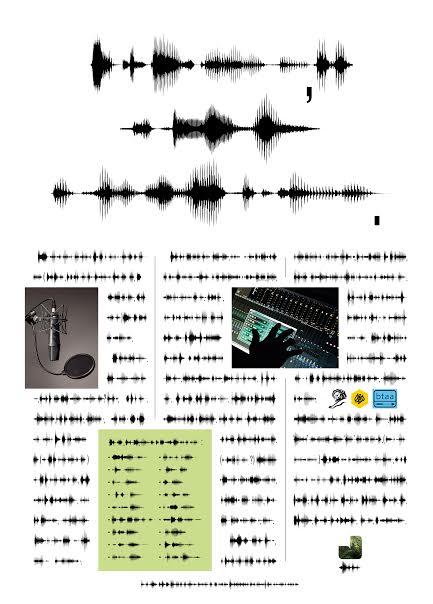
Here’s an intriguingly different press ad, along with an explanation from Simon Morris, the AD (interest declared, also a friend):
How’s things? Sorry for the intrusion, but we thought you might like to take a look at the attached ad we created for Jungle Sound Studios in London. As you can see, although the ad very much takes the form of a ‘traditional’ long copy ad, there are no words on it at all. The sound waves are actually a translation of 613 words of written English espousing the expertise and love for sound that the people at Jungle have.
We (‘We’ being my copywriter, Dean Webb, and myself) basically wrote a ‘normal’ press ad, recorded the words at Jungle using a professional voiceover artist, and then took the resulting sound wave images and used those to create the ad in place of the original words. It’s the first time any of us had ever ‘recorded’ a press ad and we don’t think we’ve seen anything done like this before. And although there are no words as such, we really feel that the ad conveys Jungle’s dedication to their craft and their sheer love of sound much more than it would had we simply left it in English.
The ad has just come out in the trade press (i.e Campaign) and we really can’t predict how people in the industry will react to an ad with no phone number, no web address, no name and no call to action. We’re hoping that those people familiar with Jungle – most of the advertising creative community in London, the studio has been around for 20 years – will recognise the logo and appreciate the audacity of the approach, and that maybe others will realise that there’s something interesting going on with a sound studio here and be intrigued enough to find out who’s responsible.
I’ve also attached the full translation as it makes quite an interesting read in itself. Of course, not very many people will ever get to read that.
There’s not a lot of money behind the ad so we’re trying to get it as much exposure as possible, if you could help in that respect we would be most grateful, even if it means we’re about to be pilloried for making a long-copy ad that no-one can read.
Will they be pilloried? Only you, dear reader and potential commenter, can decide.
But this takes me back to a campaign I did with Daryl, where we wrote three recruitment ads for a typographer in Wingdings and Dingbats. We didn’t have much cash either, so we did some predatory thinking® and made the kind of ads that would be covered by the advertising trade press. Zero money spent, lots of the right eyeballs on the ad.
Creating work for Jungle work being interesting enough to feature on this blog is another instance of that.
Job done.


Clever. I like the fact that the original ad looks like it’s out of the 1988 D&AD annual. (That’s not sarcasm by the way, I really do like that about it.)
The awards logos are distracting. Get rid of ’em and It’d be a decent ad.
Simon Morris, a man of talent and integrity.
It’s great. Lovely Idea wonderfully crafted.
Can anyone actually read sound waves?
I like it a lot.
Agree with Wigan. Get rid of the award logos. Lovely otherwise.