More creative bravery
Posted in Uncategorized
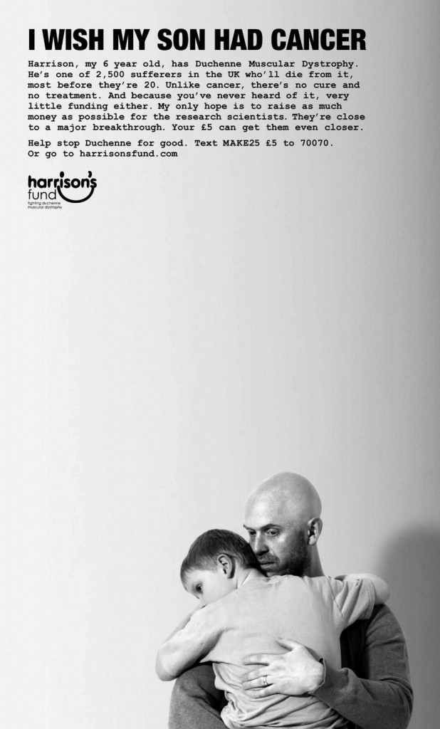
I don’t think I’ve ever mentioned how fantastic I think this ad is:
It’s a brilliant reworking of the tired old tropes of charity advertising. It stops you in your tracks an demands you read, and, if you have a heart, give a shit.
And it’s a proper charity ad with lots at stake (not a freebie paid for by an agency so they can win awards). Here’s the story behind it.
Anyway, the question is, what do you do next?
Well, the creative responsible sent me an email yesterday to explain:
Hi Ben, read your blog for the last couple of years. Just read your last post about bravery and thought maybe this ad we’re running this week as a follow up to the ad ‘I wish my son had cancer’ we ran a year or so ago, might be a relevant example. Alex who started the charity when his son was diagnosed, has given up his job as a Director of a food business to do whatever it takes to try and fund research into treatment that might buy him some time with his son. We work with him pro bono to try and raise awareness.
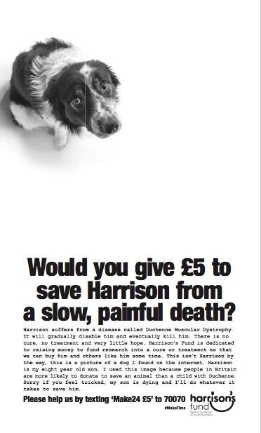
This latest ad is based on a hunch I had that it would be easier for him to raise money if his son was an animal. So we ran two digital ads (for free, we’re owned by Havas Media) identical in every way bar the image – one had a shot of Harrison, the other a dog we got off shutterstock. The dog pulled twice as hard as the kid so we’re running the attached ad in the Evening Standard this week. The first ad aimed to create conversation around how much Cancer has come to dominate the charity sector and this we’re hoping will create a conversation around the choices people make when they’re donating.
Quite the hunch.
Here’s the ad:
Brave advertising, particularly when there’s so much at risk and one chance to get it right.
How many of us work under that pressure?


Brave indeed. Good luck to everyone concerned with Harrison’s Fund. Can’t argue with that last line of copy.
Yup, just stick a dog in it. The power of reframing things can’t be overstated.
I think they’re both very good, and clearly the cause is an important one. But why does the first one imply that there’s a cure for cancer? Seems like a weird thing to let slip.
Very strong work. Good luck to them.
I’m surprised this work hasn’t had more reaction and positive comments on here. It worries me a bit, this is proper, genuinely good advertising and no one seems that bothered.
I’m hoping/assuming everyone’s been stunned into silence.
Sell! Sell! is absolutely right. Best ad I’ve seen in a long while. It is clever, relevant, well written and executed.
As for 3/A’s comment, it is gratuitous and not true.
wonderful
“I wish my son had cancer” was my favourite ad of 2013.
It comes to front of mind when I think of good print ads.