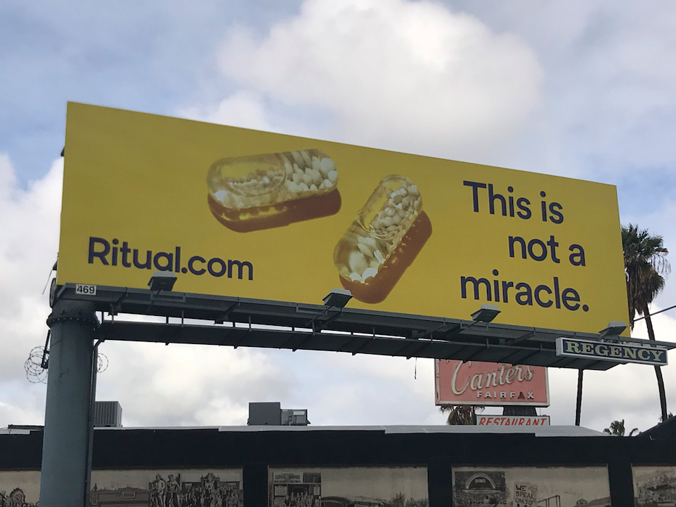
This is a very good poster that will never win an award.

I live in LA.
It’s a very poster-heavy city, mainly because it’s the epicentre of the entertainment industry, so we have dozens of movies and TV shows that require endless promotion. But beyond that there are plenty of lawyers, cannabis dispensaries and quasi-prostitution apps that need a bit of public exposure. And we all drive, so we’re all out and about, passing dozens of billboards even if we’re just popping out for a pint of milk (organic, gluten-free almond, naturally).
So it takes a lot for a poster to stand out. But the one above managed to do exactly that. Yes, I get that it’s not a Cannes/D&AD-friendly, conceptually tight masterwork, but we’re all grown-ups here; we realise that awards are just a bit of silly guff that’s of no interest to the real world.
So why is this good?
- I noticed it. That is the sine qua non of advertising. No notice, no ad. Why did I notice it? I think that’s entirely down to the art direction. It’s very simple, very clear and very yellow. We don’t get many yellow posters around these parts (usually because a picture of Tom Cruise’s face doesn’t sit well on that colour), so it was different. So it stood out. So I noticed it. It’s also very simple, so I could take it in while driving: five short words and a website. Easy.
- That line: ‘This is not a miracle‘. It’s thought-provoking. ‘What is not a miracle? Those pills? Why aren’t they a miracle? If they’re not a miracle, why are you making such a big deal out of it? Isn’t it more usual to tell me your product is a miracle? Why do you think I’d be interested in a non-miracle?‘ Like the colour yellow, the line, a canny mixture of confidence and self-deprecation, is odd. Elegantly, it sunk its claws into my curiosity with a light bit of confusion. Lines don’t have to bring closure. They don’t have to make you happy or satisfied. They have to stand out. They have to be noticed.
- The typography. I’m not a typographer, but I know this is unusual. The website is bottom left, the line is on the right, the typeface is plan yet bold. It’s not an easy read. If you do the usual thing and go left to right it makes no sense. So you have to go left, right, maybe left again to see the picture, then down to the website. It’s not a company I’ve ever heard of, so I’m really none the wiser, but as with the line, I’m pleasantly confused.
- The image. What the hell are those pills? Why don’t they look like normal pills? I know they’re not a miracle because you’ve just told me so, but they’re something special. Maybe they are a miracle. This is like a policeman at a crime scene telling you ‘there’s nothing to see here’ when there clearly is, so your intrigue doubles. It also looks pretty tricky to shoot semi-translucent golden spheres inside a translucent three dimensional curved oblong so the whole thing stands out on a yellow background. Well done, art director!
- The cues. This company is big enough to afford a billboard in LA, so it must be the real deal. You don’t get to buy one of those unless you’re somewhat successful, so why haven’t I heard of you? And ‘ritual.com’? If you can afford a web address like that, you must be doing something right. There’s no way you just snapped it up in 1993, so you had to pay a fair whack for it. How did you do that? By being successful. So this ‘miracle pill’ stuff can’t be bullshit. You must already have sold a lot of them, and you can only do that if the product has satisfied a lot of people. And it would surely only do that if it were good…
So I’m in.
I was in the car with my wife, so she looked them up on her phone and sure enough, they’re selling a women’s multivitamin with yellow branding, premium packaging, and continued intelligent self-deprecation (‘For skeptics, by skeptics’).
Surprisingly enough, I’m not in the market for a women’s multivitamin, but that’s what happens with billboards: they’re seen by people who aren’t relevant to the message. However, I’m now a minor brand advocate. I’ve just spent twenty minutes writing this post. I’m going to promote it with a tweet and a LinkedIn post, and if the subject comes up, I’ll almost certainly mention it to any interested parties.
All that has come from a single, well made poster that won’t win any awards, but will do something even more important: it’ll sell multivitamins.
Love this, thank you for recognizing this ad… I didn’t design it, my department didn’t design it, but it does 100% of what we preach every day… simplicity, don’t talk down to clients, respect them, and they’ll respect you. Love this! Thanks for sharing!
Thanks for noticing. Curious, did you’re wife pull the trigger? ✌?
Nah. Not bothered about multivitamins, really.
Good to know you’re over there!
I respect that. For what it’s worth, this isn’t your grandma’s multi. Not even close. It’s 9 high-quality essential nutrients that the body knows exactly what to do with. Benefits are real and backed by science.