My favourite ads of the decade, number 8: Twitter Hashtag Billboards.
As we approach the 2020s it must surely be time to take an arbitrary look at my favourite ads of the last decade.
Just to clarify: these are not the ‘best’ ads, or the work that ‘moved the industry forward’. They are simply my faves: subjective, personal, based on nothing more than admiration and affection. Did they work? I think so, but I’m not digging around for the stats. Life’s just a touch too short.
I’ll be counting down from 8 to 1 because they are in order of ITIABTWC Merit. Number 8 is my 8th favourite; number 1 is my number 1. I could have said that they’re in no particular order, but fuck that noise. If I’m going to stick my neck out and say that these are the winners, then I’m going to jump right in and give the real countdown.
Why only eight? Well, I just went through the crackers of the decade and could only find eight that still leave me in awe. Of course, there were many other excellent ideas and some of them might have been worth some kind of inclusion, but here’s the problem: advertising awards have become so corrupted over the last couple of decades that I no longer trust case studies. A ‘50% increase in sales’ can mean going from 4 sales to 6. ’20 million media impressions’ is unverifiable and usually some wanked-off addition of the number of followers of the Tweeters and Instagrammers who said anything about the ad. But as we all know, a lot of followers are bots or bought, so I’m just not going to play that game. Was the campaign big simply because it showed up in lots of social media spaces? No idea. You can now buy that kind of exposure (in fact, you have to), so how do I know how many people actually cared about renaming hurricanes after climate change-denying senators? And beyond that, people might have talked about it an awful lot, but does that mean behaviour changed? Again, we can only take the words of the case study makers for that, and – psssst – they’re kind of biased.
So I went for the biggies. Sorry if you did a really good radio ad in New Zealand. I have no idea if your ‘thing’ was a thing, so I’m not going to include it on this list. My chosen ones are big work for big brands, and unless I’m very much mistaken, they all ran properly at large scale. None was the ‘award’ version (again, I’m open to corrections there).
I’ve also left out an entire genre that regular readers will know I hate: the ‘for good’ stunt. You won’t see any Fearless Girls or Like A Girls here. I’ve spent far too long writing about why I think they’re bad for the industry and bad for the public. Really, they can just fuck off. I plan to do a ‘Worst Ads of the Decade’ post at some point. It’ll be full of dreadful crap of that ilk.
Another category that won’t be appearing on this list is ‘work done for questionable companies’. Yes, I understand that the general definition of ‘questionable’ can be expanded to most corporations, so I’ll be using my own somewhat subjective thumbs up/down on that front. The most glaring absentee will be Nike. I appreciate Nothing Beats A Londoner, Write The Future and Colin Kaepernick, but I hate what Nike does, so I don’t want to champion anything that promotes it. Great ads for shitty things are not great ads.
So (contentious company alert!), let’s have a look at my eighth favourite:


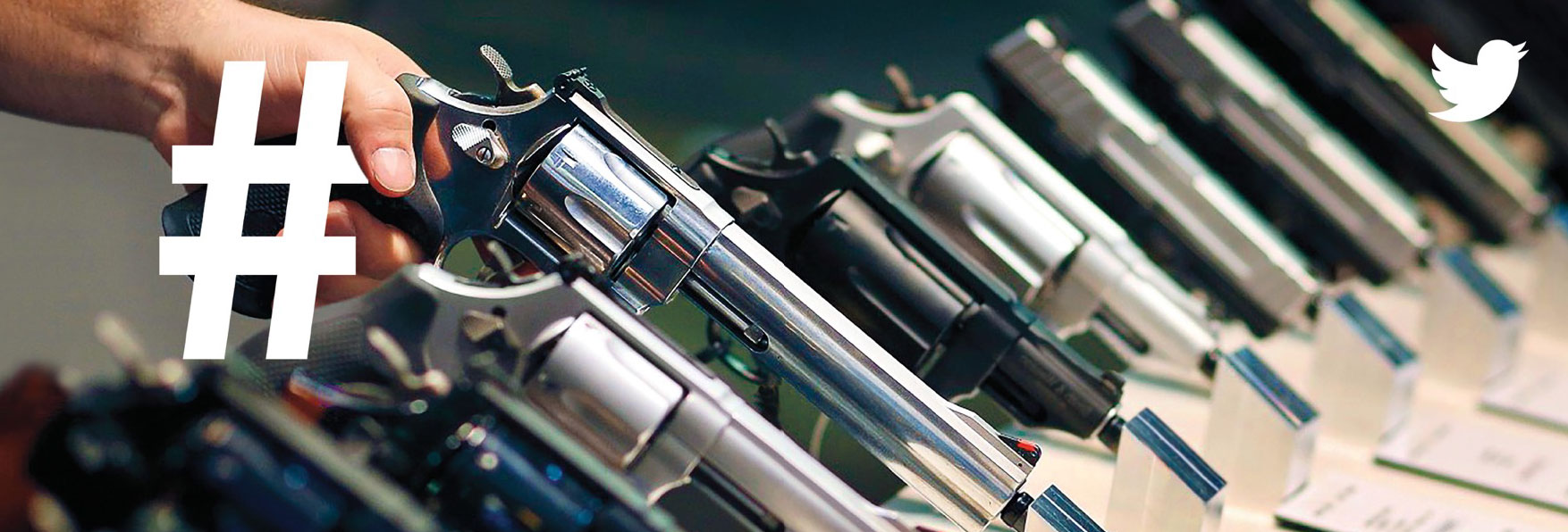
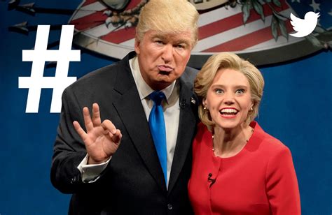
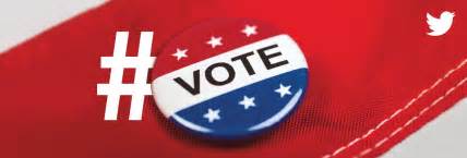
These ran just before the 2016 US Presidential Election, positioning Twitter, quite rightly, as the place where the important issues were being discussed.
But look what the client bought: a simple hashtag, art directed skillfully into excellent images that captured in one powerful swoop the way in which Twitter and current affairs intersect. No line. Just a little logo to sign off the work
It has the kind of confidence that can only exist as a product of authenticity. This is no stretch: the brand and the platform always connect perfectly to push each other to greater heights of significance.
You might not agree with the way in which Twitter stokes division or bends its rules to allow certain people to incite hatred, and that’s OK. I find its thumb lies far more lightly on the scale than certain other media.
So here we have a campaign of strength, simplicity, originality, authenticity and thought-provoking depth.
A worthy number 8.
What could possibly have beaten it?