Great Copy, Part 2
I wasn’t expecting this to happen so soon, but thanks to a excellent contribution from multifaceted writer extraordinaire Mr. Paul Burke, I already have my first guest post in this series.
And it’s kind of ‘guest posts‘ because Paul has offered up two examples of the finest in advertising copywriting:
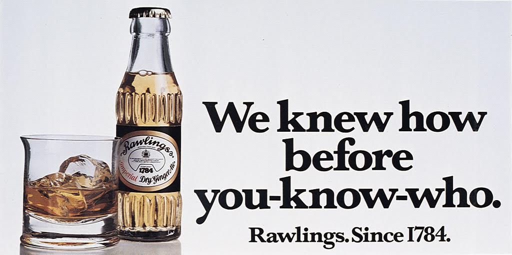
I have two submissions, both from CDP around 1980. Rawlings is one of the best posters ever. The only trouble now is that, if you’re under 40, it’s impossible to appreciate just what a popular and enduring catchphrase Schweppes had in “Sssh. You know who”. Everybody in the country knew it.

In one short, perfectly balanced line, it explains why Rawlings is a better tonic than the brand leader whilst not actually mentioning Schweppes by name but still using their own famous catchphrase to denigrate them. There is nothing I can fault in this ad. And the copywriter was also an art director: Ron Collins.
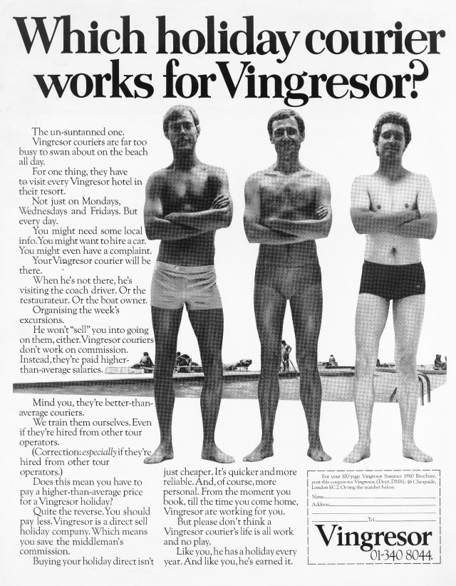
Then some body copy which – examine every word – is faultless. A long forgotten ad for a long gone travel company.

First, it’s a good visual idea that works perfectly with the headline which, in turn, makes you want to read the copy. So much product information crammed in but you don’t mind because it’s written so perfectly in such a friendly but intelligent tone of voice. I love the use of “Mind you” and “Correction:” and all rounded off with a wonderful endline.
My only criticism (and it isn’t the creative team’s fault) – this should have been a nice big colour DPS. But then you could point to the fact that this team put so much thought, care and intelligence into a small B&W single page. Just wonderful. And the team: John Horton and (of course) Richard Foster.
Thanks Paul. A pair of crackers.
That first one is annoyingly clever. It’s one of those ones where the copywriter’s skill has made it seem as if the elements fell serendipitously into place, but anyone who has slogged over a line knows how rarely that happens.
Sorry to get a bit wanky here, but the start and finish match as neatly as the lines of a haiku, and the turning-its-own-weapon-against-it use of the competition’s endline? Chef’s kiss perfection, as the kids (probably don’t) say.
The second was given an added degree of poignancy as the writer passed away on the day Paul sent it over. So let’s take a moment to appreciate Richard Foster, one of the best copywriters of all time.
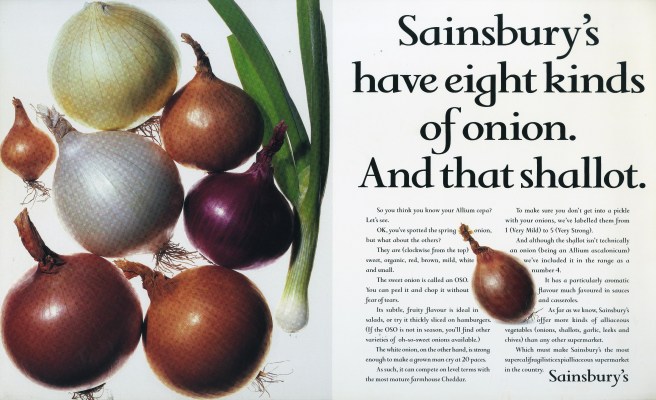
Richard and I worked in the same creative department for several years. I can’t say I knew him particularly well (if you want to get a proper insight into the person and his work, this post and podcast from Dave Dye should be your first port of call), but of course I knew how brilliant he was. Just read his page in The Copy Book; it’s everyone’s favourite: a succint explanation of how he went about writing the copy for a Sainsbury’s ad. No philosophical musings or ancient anecdotes. Just the job and how it is actually done by the best in the business.
I’ll leave you with my favourite of his ads, one that took pride of place on the back of my bathroom door for a few years. Sometimes great headlines just make you like the company behind them, while imparting some fairly prosaic information. The brief was dull, but the result was as memorable as you could hope for. Thanks, Richard, for this one and for so many others.

While the line is certainly clever, in my view the Rawlings poster is at least as much an ad for Schweppes as for Rawlings. In fact, given one is famous and the other not, I think most readers would remember Schweppes after seeing it.
I appreciate Richard Foster’s work but his page in The Copy Book is by no means my favourite. I’d go for Neil French. His work is so good Andrew Rutherford includes one of French’s ad on his page too. It’s from this campaign, for the Ball Partnership. Sublime.
http://www.neilfrench.com/ball/slide/index.html
Sad to hear about Richard. A lovely man and one of the greats, who helped me get my first job in advertising. Have happy memories of him forensically analysing every line of my copy, while simultaneously spinning a pencil on the fingers of his right hand.
Also note the lack of chiselled abs and pecs on the Vingresor models. Just ordinary slim guys.
In the 1970s most people didn’t go to the gym.