Month: March 2021

Great Copy, Part 9.

This week’s exemplary collection of words is from the great Tony Brignull.

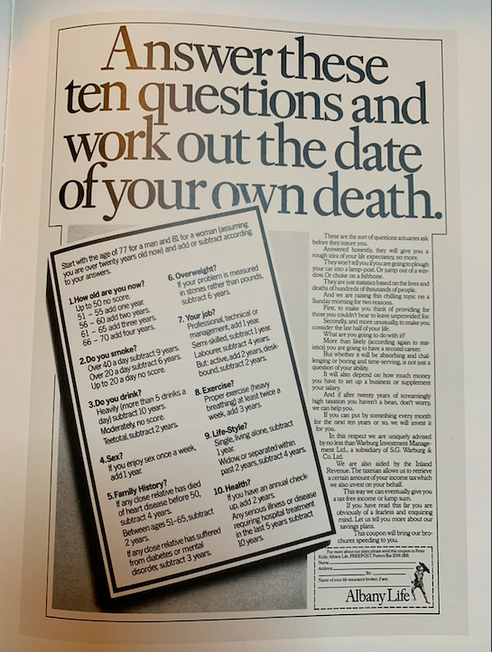
He said that he wanted to create an ad for an insurance company that would insist you read it, and I think he’s done exactly that.

It ran in 1980, so there were fewer distractions (only three TV channels, imagine…), but I would suggest that this ad would still be hard to ignore today.

Unlike much of the guff that runs today, it is not about ‘building a better tomorrow’ or a ‘brighter future for all of us’. It simply says it’s going to tell you roughly when you’ll die.

So that’s the first task completed: you’ve noticed it, and there is now approximately zero chance that you’ll stop reading at the headline. You’re going to do the quiz, think about the answers, read the copy, chat about it with your spouse and probably alter your entire lifestyle. It might even end up saving or extending your life.

Not bad for a single page black and white press ad.

And make sure you read every word of the copy, because it is an object lesson in how to make a persuasive argument flow like melted butter.

It starts with a little reality check (‘a rough idea…no more’) then heads into a paragraph about the situations that don’t apply, including death by fishbone, lamp-post and suicide. It then offers two excellent reasons for this rude interruption to your Sunday morning, followed by a persuasive argument for needing the money that Albany Life could provide. Finally there’s a slightly edgy reference to how quickly they can send the brochures your way (y’know, in case you do really badly on the quiz), and the all-important coupon.

No puns, no flash, no tricks; just the cold logic that you would never apply to your own death, delivered in a tone that is shockingly matter-of-fact.

40 years after it ran, I’m delighted to know that I’ll make it to at least 80, assuming I don’t choke on a fish bone.


All around different faces I see, some are happy, some in misery. They express joy and pain. No two faces are the weekend.

Free photos that are good.

Online drum machine with everyday sounds.

A constellation of living heritage.

The eternal jukebox.

The coin:

https://vimeo.com/channels/bestofthemonth/483662315

Highest ever horse jump:


Great Copy, Part 8.

Charity advertising might look easier than chocolate bars and soap powder, but of course the very best of any category takes immense skill. Yes, we’re more positively disposed towards the kind of things most charities are trying to achieve, but there’s a lot of them, so rising above the competition is a tough task.

This example is faultless: describing, but not describing; leading you somewhere you don’t want to go; teaching you things in a way that makes you both revolted and somehow grateful. Sure, your day would be easier if you didn’t know that bad things happen to little kids, but they do, so to be given the power to reduce them somewhat is ultimately a good thing.

According to his entry in The Copy Book, the writer Mike Boles says:

The “Rape” ad was all in the preparation. I knew that writing about a man’s childhood experience of rape by his own father had to be authentic. It would be unforgivable if it didn’t come across that way.

Understandably the NSPCC wouldn’t let me have access to a victim of rape. The next best thing was an NSPCC psychologist, someone who knew the emotional journey of the victim.

Once I’d lived with and breathed in theis experience for a few days I was ready to put pen to paper.

I waited until everyone at Saatchi’s had gone home for the night. I wanted it to be dark in the corridors outside my office, and to feel lonely (just like the victim).

And then I wrote it in one go. It took less than an hour, and I made very few changes to that original outpouring.

I saw the ad on crosstracks, heard two women talking about it, one asking the other if she’d read it yet. She hadn’t. I stood behind them and watched as they both quietly read it. It was a real sense of achievement.

London Underground tried to get the ad taken down, as their station platforms were being dangerously clogged up by passengers reading it. That’s the power words can have.

That’s one hell of a headline. From a writing point of view, it’s the perfect friction of style and content. The words are like a hand grenade, but they are written in the style of a direct response ad for printer ink. I always stick to the principle of ‘bendy visual/straight image’ (or vice versa), but this one goes ‘bendy content, straight style’, messing very effectively with your expectations.

I think that sets this whole ad up to help you deal with something you weren’t expecting: that’s not a 3 year old. How does a 3 year old explain anything, let alone something so serious? I think for some of us (especially when this ad ran, when there was far less coverage of this kind of thing), the very idea of that happening to someone so young is also a revelation.

(By the way, we should also credit the art director Jerry Hollens with pairing that headline with that image, and setting it all with the kind of typographical skill that’s beyond my powers of explanation.)

It’s written as a first-person account of child abuse, which, as Mike said, had to be authentic, and he did an amazing job. The words are suffused with a palpable sense of frustrated anger that truly feels as if it is coming from a person who has spent decades trying to process the impossible. ‘He was bloody hurting me,’ says far more than just those five words.

Then he has to tread that fine line of letting us know enough to be disgusted, horrified and sympathetic, but without crossing into anything explicit. The words, ‘but he didn’t stop at kissing’ leave just enough to the imagination, as does ‘My body was his toy for more than 9 years’.

The story continues, with each subsequent paragraph leading you deeper and deeper into this man’s suffering. Your blood runs cold, but Mike’s writing makes you want to read on, hoping to find some kind of resolution to the story, something that tells you what you can do to stop such terrible things happening to anyone else.

And the turn works perfectly. The man found the NSPCC, and some kind of relief from his demons. If you’re suffering as he was you now know where to find help. If you’re fortunate enough that nothing like this happened to you, you now know how to give help.

This won the D&AD Silver Pencil for Copy in 1992. Much as we all wish it were an outdated thing of the past, it is unfortunately still far too relevant, and the writing is just as harrowing today as it was thirty years ago.


So who’s that girl there? I wonder what went wrong so that she had to roam the streets. She don’t do major credit cards I doubt she does receipts. It’s all not quite the weekend.

Foster and Hopkins on the legacy of Silence of the Lambs.

Animated knots.

Read Korean in two hours.

A defence of The Bot Who Cried Wolf:


What are you advertising when you are advertising?

This week I finally got round to watching the Spike Lee movie Bamboozled.

It’s an odd one, to say the least: a black TV executive develops a modern minstrel show featuring black actors in blackface with the intention of being satirical. However, the whole thing backfires when the show is a massive hit.

It starts off a little patchy, but the minstrel parts are remarkably uncomfortable and, consequently, powerful. The movie ends with a compilation of moments from Hollywood films and TV shows that portray white people in blackface and black people in demeaning and negative stereotypes:

As I sat though that, wincing and grimacing, I kept thinking of something else:

For those of you slightly younger than me, or from a country other than the UK, that ad ran before every single film through the 1980s (Kia Ora was a sickly-sweet orange drink on sale in all cinemas). I must have seen it 1000 times, and not once did it ever occur to me that it was racist.

Perhaps I was naive, but I never thought of these crows as the kind of tropes seen in Spike’s film. However, that’s exactly what they are, and if you think I’m just imagining something that isn’t really there, the ad tops this list of the most racist commercials of all time.

That said, there’s a debate among the Youtube comments along the lines of, ‘Jesus Christ! How did they get away with this incredible racism?’ and ‘Come on mate, they’re just crows, not black people. How can that be racist?’. I think the gap might come from the fact that these are particularly American stereotypes, so British people might not have seen them for what they were.

Advertising legend John Webster, who explains the entire genesis of his commercial here, was famous for borrowing from movies for his ads (the most famous example of which is the Cresta Bear, which John has admitted was basically a cartoon version of Jack Nicholson’s performance in Easy Rider). So perhaps he was inspired by the crows from Dumbo:

But they were so racist that one of them was actually named Jim Crow, just like the series of laws intended to oppress the black population of America.

Like I said, most British people didn’t see this ad as racist, so I imagine John Webster was the same. Yes, it’s odd that Kia Ora characters are a parade of racial stereotypes, including ones that weren’t even amongst the Dumbo crows. Yes, one might wonder how, out of all the possible choices, John selected racially stereotypical black crows (why not Russian political heroes in the guise of turtles? Or Brazilian musicians in the form of chinchillas?). But it was forty years ago, and the past is another country.

The ad won plenty of awards, the public (myself included) loved it, and there was no kind of furore at the time. Yes, at that time, casual and not-so-casual racism was rife in British society, including in its TV shows, and that might also have contributed to this ad’s racism being able to hide in plain sight.

Talking of which, later that same decade, this press ad was lauded as one of the true greats:

Maybe it was funny in 1988. Maybe, if you’re a complete arsehole, it still is. But holy shitballs… I know the Native American holocaust doesn’t get as much attention as other genocides, but is it really a reasonable basis for a ‘joke’ by which to sell boots? Imagine if the headline read, ‘We sold their gold, their ivory and their people. Then we went back for their music’, above a picture of a Liberian slave. Still worth a D&AD Silver?

But let’s go back to the point Spike Lee was making: culture has power; perhaps more than we might think. In an interview that accompanies Bamboozled, he reminds us that the KKK was pretty much dead in the early part of the 20th Century, but then The Birth Of A Nation came out in 1915 and, as this article puts it, ‘…depicted the Ku Klux Klan as valiant saviors of a post-war South ravaged by Northern carpetbaggers and freed Black people.’

In that interview, Spike said, “Indirectly, because of (the way they were portrayed in Birth Of A Nation), black people got lynched, castrated, beat, killed, murdered.”

What I’m taking a very long time to say, is that we who put things on air are responsible for all kinds of effects that we might not be aware of. The Birth Of A Nation example is at the extreme end, but it illustrates the importance of the choices we make in the public messages that we create.

Here’s a more positive example: until the early 70s, UK ads didn’t feature ‘normal’ people, by which I mean those that reflected the vast majority of the country. Instead, like most of what was on TV, the ads of that time were full of ‘posh’ people, speaking in BBC English.

Then Alan Parker came along and changed all that with ads like this:

It probably seems quaint when viewed through the lens of 2021, but these casting choices were revolutionary, finally giving a huge slice of the British public advertising that featured people that looked and sounded like them. This helped to legitimise them, and, as some people might say today, made them feel ‘seen’.

That commercial advertised beefburgers, but it also advertised many other things that had a real cultural effect on the country. The casting and set design choices that Alan made, as well as the decision to have the boy speak in a very particular Northern vernacular, made invisible differences that could never appear on the sales charts of Birds Eye.

Advertising then went on to sell all sorts of domestic products in all sorts of homes and kitchens, via all sorts of kids speaking in all sorts of accents. The first layer of messaging was simple enough, but what about the next level down?

Almost all kitchens in ads suggest that they are some version of ‘normal’, so if one features a central island for preparation, what do people think? I have no statistics to hand, but I know very well that most homes in the UK are far too small to have a kitchen with an island (despite eventually making decent money in advertising, before moving to America I certainly never lived in a home with a kitchen big enough for an island; the last one I had was not much bigger than my wardrobe). So people would surely look at these supposedly regular old kitchens and subconsciously ask a few questions: what is that? Why don’t I have one of those? What do I have to do to get one? Is that normal? The family in the kitchen don’t seem massively rich. How did they get that thing? Have I messed up? How can I improve my life to the extent that I can get one of those things ‘normal’ people have?

And you thought you were just selling Flash/Marmite/Chicken Tonight.

You might remember going round to your friend’s house when you were a kid and seeing something they had that you didn’t: a dishwasher, perhaps, or a wine rack. You might have asked what it was and your friend’s mum might have been sensitive enough not to say, ‘It’s a bloody dishwasher, you little pleb’. Hopefully she kindly explained that it was a machine for washing dishes.

So you learned that some people had, and some people had not, and that realisation, understandable though it might be in a non-Communist society, can be quite a lot to deal with.

Advertising tends to portray aspirational lifestyles, so the things in ads tend to be ‘better’ than normal, while simultaneously portraying them as some version of normal. On one hand we might be giving people something to aim for, but on the other we might be making people feel inadequate:

Skinny Models In Ads Cause Immediate Anger, Depression In Women.

Modern Ads And Impact On Mental Health.

I don’t know about you, but when I make an ad I tend to concentrate on conveying the concept clearly, whether through the script or other cues. Of course casting and set design are important, but they don’t receive the kind of attention the ‘ad’ part of the ad does. So we can let a lot of secondary messaging through without detailed consideration, and people will feel a certain way because of those less considered choices.

Thinking a bit harder about these things has led to a greater diversity in the casting of commercials, which must have a positive effect on (non-racist) people, but we should always think about the whole thing, and all the effects those other signals might have.

For instance, there’s no need to make people feel bad, like this highly-awarded ad deliberately did:

As the explanatory copy on the YouTube page says (bold parts mine): When it comes to hosting, we all have those little voices in the back of our heads that say our home isn’t up to the job. And whether it’s the chipped mug, the crack in the wall, the weirdly shaped bathroom, or the living room that has as much personality as a cardboard box, the voices seem to zoom in on our biggest fears and magnify them until we declare our home a no-go zone. But at IKEA, we believe every home is worthy of a get together and that with a little imagination and some clever IKEA products and ideas, there’s no reason not to host. In this campaign we want to inspire the nation to get their homes party ready. And Silence The Critics, once and for all.

Well, at least they’re being honest.

So if we know about the effects we can have on people feeling good or bad, proud or ashamed, adequate or inadequate, maybe we need to be more responsible about what we put in front of the public.

Maybe ‘aspirational’ is not something we should aspire to. Maybe it’s one of the reasons why people hate advertising. Maybe more down-to-earth choices would make for better ads. Maybe we should have departments that can advise us on our secondary choices and how they land. If casting needed to become more diverse, maybe the rest of the ad needs to do the same.

Of course, what I’m saying doesn’t apply to all ads. Thanks to Alan Parker, plenty of commercials have been conveyed in more ‘ordinary’ settings (for balance, John Webster’s Arkwright campaign for John Smiths would be an excellent example).

But let’s not sleepwalk through our choices. As mass media communicators we have great power, and as a certain arachnid superhero’s uncle once pointed out, with great power comes great responsibility.


Great Copy, Part 7.

Sometimes you see a commercial that presents words in a way you’ve never quite experienced before. For example, The Man Your Man Could Smell Like for Old Spice, or the great Errol Morris Miller High Life campaign. Both stand refreshingly alone in terms of syntax, structure and language.

I think we can add the great Monster.com work to that list:

Creating a unique voice is one hell of an achievement. It means you didn’t just come up with a new thing to say; you also came up with a whole new way to say it. How often does that happen? Not very.

But the Monster.com copywriter Gavin Kellett (we should also mention the excellent art director, Nik Studzinski, who did so much to bring these words to life) managed an even greater feat: the spoken words can translate to the page, so when you read the press ad, you can still hear the crazy voice coming through loud and clear.

Let’s look at the details:

A headline that reads ‘I AM NOT YOUR BITCH’, but still makes complete sense with the ad.

A headline that’s actually the last line of the copy.

An opening that’s ridiculously intriguing: ‘He doesn’t even want these photocopies‘? Who? What photocopies? Why are you being so obtuse?

A story that doesn’t reveal its point or meaning until the very end, an end that you’ve already read, but found so strange that you decided to go back to the start and discover what the hell it’s on about. Most ads set up some kind of question right at the start, then answer it in the first sentence of the copy, using further words to beef up the sell. This one treats you like a cat, dangling the string just out of reach until it’s good and ready to reveal its intention. Ballsy stuff.

Talking of the story, that’s a pretty juicy narrative to fit into 80 words. You go from a photocopying errand to unhinged insanity in less than 30 seconds, before hopping over to that nice little punchline for Monster.com. A fine and rewarding journey.

Instead of paring things down to as few words as possible it repeats ‘Tell him’ five times. The tone of voice demands it, but another writer might have ended the piece at ‘Tell him you’re not his bitch’. Doing so would still make sense; it just wouldn’t be great.

So conventions have been broken all over the place in an edgy, funny, irreverent corporate communication that works far better than it has any right to.

And now you know: you may not be your boss’s bitch, but Gavin Kellett’s writing made you sit up and beg,


Going too far

Burger King got in hot water this week for this International Women’s Day ad.

If you can’t be arsed to read the copy it explains that most professional kitchens are led by men, so BK wants to address that imbalance with a female-centric recruiting initiative.

Under many other circumstances they might have been lauded for this provocative headline that enticed people to read about their effort to combat a sexist situation, but this was International Women’s Day 2021, a time to tread very carefully, so no matter how well intentioned or ultimately ‘helpful’ this headline might have been, it was also tone deaf, cloth-eared and click-baity.

And a reverse-Twitter pile-on followed, with the women who pointed out the cloth-eared-ness receiving sexist vitriol from some stupid men. So, inevitably, BK eventually admitted their mistake and removed the Tweet, while continuing to defend the initiative itself:

I find this interesting because I fully believe Burger King, from its Mouldy Whopper to its nice soft rebrand, is looking to become the nice guy of the fast food market. And they’ve done a good job of that thus far, with provocative ads that are underpinned by a consistently positive brand intention.

But they got this one wrong. And when you’re trying to be provocative, that can happen. Unfortunately, you don’t know how far you can go until you’ve gone too far, and that is what BK did. They went a touch too far on the provocation they thought would be required to get this ad and its initiative noticed. But working out the position of that line, even when it is constantly in motion, is an essential part of the job.

Back when I started at AMV I was given a range of Sainsbury’s ads to write. One brief explained that they did not sell bruised bananas, so I came up with a very provocative headline: ‘Sainsbury’s believes that it is right to discriminate on the basis of skin colour’. But you’ve never seen it because the only people (until now) who knew about it were me and my then-art director. We didn’t tell anyone else because we knew it was a wrong ‘un, whose correct destination was the bin. Even in 1998 it would have caused quite the shitstorm, and rightly so, but it would never have run because even if we”d shown it to our boss and he’d been insane enough to approve it, too many other people would have killed it before it reached the public.

I’m sure we’ve all thought of ideas, visuals and headlines that have walked that fine line between ‘provocative enough to be noticed’ and ‘too far – here come the pitchforks’. I recall an ad in the 1990s where a hostage was returned at a checkpoint. He was bundled into the back of his rescue car, whereupon he got all relieved that he could feel its lovely upholstery. (I just found the Campaign article about it, headlined: The expensive ad that was a lesson in bad taste – Both APL and Rover refused to see that hostages do not sell cars.) But I doubt the people involved were attempting to make a big ad for a boring car that would be incendiary enough to get banned. They just got the line wrong.

So it happens, and it’s clearly not a new thing. On one side the BK headline was obviously a bit too much for a lot of people, but on the other, many would say that the work our industry produces is too bland. And in the current world of social media, brands are even warier about putting anything out there that might scare the horses (unless they’re Brewdog, or anyone else who makes gratuitous provocation an essential element of their communications). The consequences are now too great, and the odds of crossing the number of Twitter accounts required to start a backlash are growing by the day. People understand social media gives them the kind of agency they did not have even ten years ago. Wielding that new power can offer quite a buzz.

So I guess Burger King needs to read the Twitter room a little more accurately next time, but I hope this incident doesn’t put them off future attempts at provocation.

We need to make stuff that gets noticed; it’s one of the fundamental parts of the job, and it’s becoming rarer because ‘too far’ is now in the eye of an increasingly unpredictable, noisy and powerful beholder.


I hauled myself up out of the ditch and built me an ark out of gopher wood and pitch. Sat down by the roadside and waited on the rain. I am the hunter of the weekend.

Best movie posters of the decade.

Separate the elements of your favourite song.

Have fun with maps and colours.

The origin of Nokia’s Snake (thanks, J).

Inside a Polar Bear den:


Great Copy, Part 6.

Yes, I’m shooting fish in a barrel again. But this is a series about great copywriting, so that’s what you get. I’ll find some more obscure stuff later, but in the meantime, let’s see what happens when a fly lands on your food.

Before Charles Saatchi was the county’s preeminent art collector (while I’m mentioning his good deeds, for balance I’ll remind you that he is also a famous wife choker), he was a damn good copywriter. Have a look at a few D&AD annuals from the late 60s and early 70s and you’ll find many examples of his brilliance.

But the finest is this one, and it’s an object lesson in how to write persuasive, impactful, memorable copy.

First off, it’s factual: ‘This is what happens when a fly lands on your food‘. He could have said,’This will turn your stomach‘, or something equally attention-grabbing, but it would have reduced the strength of the information. The facts are bad enough, so just get out of their way and present them, clearly and starkly, to the reader. Every additional attempt to be sensational would dilute those facts, so lesson one is, if you already have a rocket launcher there’s no need to stick a pea-shooter to the side of it.

Lesson two: use simple words. Aside from the very basic ‘probably’ and ‘usually’, the only one with three syllables is ‘excrement’, and it’s the right one because (see above), he’s being factual. Technically, ‘faeces’ is also correct, and shorter, but fewer people would understand it. This is an ad for everybody, so don’t shut anyone out with self-indulgent ten-dollar words that make you seem clever but make the ad seem more remote.

Of the 72 words, 57 are monosyllabic. That makes them easy to understand, but also helps the punchy, direct rhythm. Rat-tat-tat… it, stamp, suck… jab, jab, jab. There’s nowhere to hide from the relentlessness…

…Or the evocative descriptions: Good and runny, like a soft boiled egg, only, y’know, revolting; Stamp the vomit, a phrase you hoped you’d never have to read because now you can never forget it; Suck it all back again… Yes, like a vomit-and-fish-finger milkshake.

And let’s give a big hand to the repetition of vomit. Usually the aim is to avoid repeating outstanding words because doing that looks unimaginative and the repetition reduces the impact, but in this case, writing ‘vomit’ twice in eight words drives it home. (In addition, he couldn’t have just used ‘it’ because in the previous sentence ‘it’ refers to the food, so the extra ‘vomit’ is necessary to avoid confusion.)

Like all good stories it has a beginning, a middle and an end, and the end is the best part: And then, when they’ve finished eating, it’s your turn. Such a sardonic, caustic conclusion. You are in line behind the vomiting fly. It is in charge here, doing all sorts of disgusting things to your food until it decides that it’s finished, and hands the plate back to you. Are you really going to let it do that? In modern parlance, are you going to be a fly’s bitch? Or are you going to cover your food up, keep it hygienic and beat the fly?

Then there’s the non-endline endline. As we now live in a world populated by guff such as, ‘Tomorrow’s future, today’, or ‘Making progress together’, let’s appreciate a simple set of instructions that aren’t trying to be clever: Cover food. Cover eating and drinking utensils. Cover dustbins. So now you know what to do to prevent to prevent the vomit-stamp-suck described above. Clear? 100%.

While we’re on the subject of the non-endline, what about the non-headline? It’s 72 words long. Is it the headline or the copy? Yes. Can you stop reading? No. Is ‘This is what happens when a fly lands on your food’ the headline? Maybe, but it’s also the first sentence of the body copy, so you’re in, reading about fly vomit. Sorry about that, but as compensation, you’re also armed with a way of preventing this horrible situation from happening to you. Quid pro quo, Clarice.

And here we are, fifty years later, with every word still utterly relevant, presented in a layout you still can’t ignore, and written a style that would work perfectly on any one of the 18000 days that have happened since it first ran.

This is what happens when a genius writes your ad.


Green light, Seven Eleven. You stop in for a pack of cigarettes. You don’t smoke, don’t even want to. Hey now, check the weekend.

Kurosawa’s 100 favorite movies.

What would happen if a nuke went off in your area?

Type words; have pop songs sing them back to you.

A map of what’s musically popular around the world.

How Queen Elizabeth 1 locked her letters to the King of France:

David Bowie on not playing to the gallery:

The difference between acting on stage and acting in movies: