Great Copy, Part 8.

Charity advertising might look easier than chocolate bars and soap powder, but of course the very best of any category takes immense skill. Yes, we’re more positively disposed towards the kind of things most charities are trying to achieve, but there’s a lot of them, so rising above the competition is a tough task.
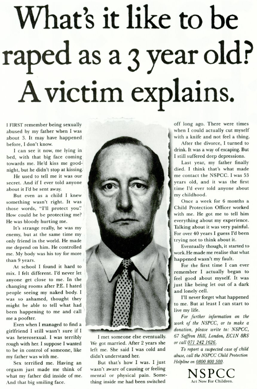
This example is faultless: describing, but not describing; leading you somewhere you don’t want to go; teaching you things in a way that makes you both revolted and somehow grateful. Sure, your day would be easier if you didn’t know that bad things happen to little kids, but they do, so to be given the power to reduce them somewhat is ultimately a good thing.
According to his entry in The Copy Book, the writer Mike Boles says:
The “Rape” ad was all in the preparation. I knew that writing about a man’s childhood experience of rape by his own father had to be authentic. It would be unforgivable if it didn’t come across that way.
Understandably the NSPCC wouldn’t let me have access to a victim of rape. The next best thing was an NSPCC psychologist, someone who knew the emotional journey of the victim.
Once I’d lived with and breathed in theis experience for a few days I was ready to put pen to paper.
I waited until everyone at Saatchi’s had gone home for the night. I wanted it to be dark in the corridors outside my office, and to feel lonely (just like the victim).
And then I wrote it in one go. It took less than an hour, and I made very few changes to that original outpouring.
I saw the ad on crosstracks, heard two women talking about it, one asking the other if she’d read it yet. She hadn’t. I stood behind them and watched as they both quietly read it. It was a real sense of achievement.
London Underground tried to get the ad taken down, as their station platforms were being dangerously clogged up by passengers reading it. That’s the power words can have.
That’s one hell of a headline. From a writing point of view, it’s the perfect friction of style and content. The words are like a hand grenade, but they are written in the style of a direct response ad for printer ink. I always stick to the principle of ‘bendy visual/straight image’ (or vice versa), but this one goes ‘bendy content, straight style’, messing very effectively with your expectations.
I think that sets this whole ad up to help you deal with something you weren’t expecting: that’s not a 3 year old. How does a 3 year old explain anything, let alone something so serious? I think for some of us (especially when this ad ran, when there was far less coverage of this kind of thing), the very idea of that happening to someone so young is also a revelation.
(By the way, we should also credit the art director Jerry Hollens with pairing that headline with that image, and setting it all with the kind of typographical skill that’s beyond my powers of explanation.)
It’s written as a first-person account of child abuse, which, as Mike said, had to be authentic, and he did an amazing job. The words are suffused with a palpable sense of frustrated anger that truly feels as if it is coming from a person who has spent decades trying to process the impossible. ‘He was bloody hurting me,’ says far more than just those five words.
Then he has to tread that fine line of letting us know enough to be disgusted, horrified and sympathetic, but without crossing into anything explicit. The words, ‘but he didn’t stop at kissing’ leave just enough to the imagination, as does ‘My body was his toy for more than 9 years’.
The story continues, with each subsequent paragraph leading you deeper and deeper into this man’s suffering. Your blood runs cold, but Mike’s writing makes you want to read on, hoping to find some kind of resolution to the story, something that tells you what you can do to stop such terrible things happening to anyone else.
And the turn works perfectly. The man found the NSPCC, and some kind of relief from his demons. If you’re suffering as he was you now know where to find help. If you’re fortunate enough that nothing like this happened to you, you now know how to give help.
This won the D&AD Silver Pencil for Copy in 1992. Much as we all wish it were an outdated thing of the past, it is unfortunately still far too relevant, and the writing is just as harrowing today as it was thirty years ago.