Category: Uncategorized

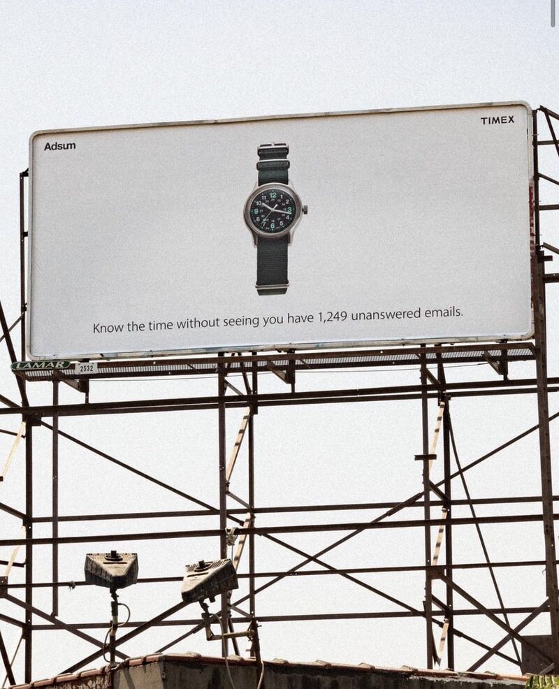
That Timex Billboard: I’m confused.

Last week’s LinkedIn was dominated by two things: a CEO who cried because he had to get someone on his staff to fire some other people on his staff, and that Timex billboard.

The reaction to the CEO thing was kind of fun, but it was the Timex billboard that inspired me to write this post. Actually, to be more accurate, it was the reaction to the Timex billboard that inspired me to write this post. 

I’m confused, but in a good way. It caught fire, but I’m not sure why, so exploring that might help educate me in some way.

(By the way, I’m very aware that writing hundreds of words about the fact that hundreds of words have been written about that billboard is also kind of weird, but here we are.)

Let’s start by talking about the ad itself. Fascinating thing number one is that lots of people were praising it to the heavens. Positive comments on LinkedIn, Instagram, Reddit and even in articles included, ‘Love this – very clever!’, ‘This is brilliant’, ‘Excellent billboard’, ‘I have serious respect for brands that commit to who they are rather than jumping on the latest trend’…

Fascinating thing number two is that lots of people were not praising it to the heavens: ‘Too wordy. Everybody knows what the brand is and what it does’, ‘Clever ad poor execution’, ‘The line feels like the prop the planner wrote’.

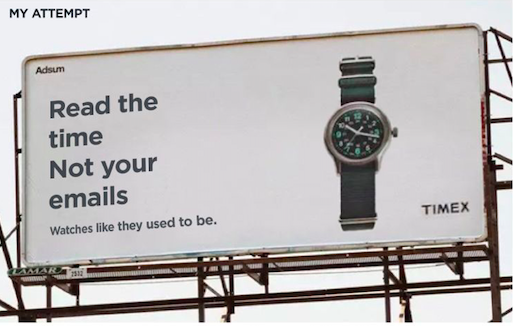
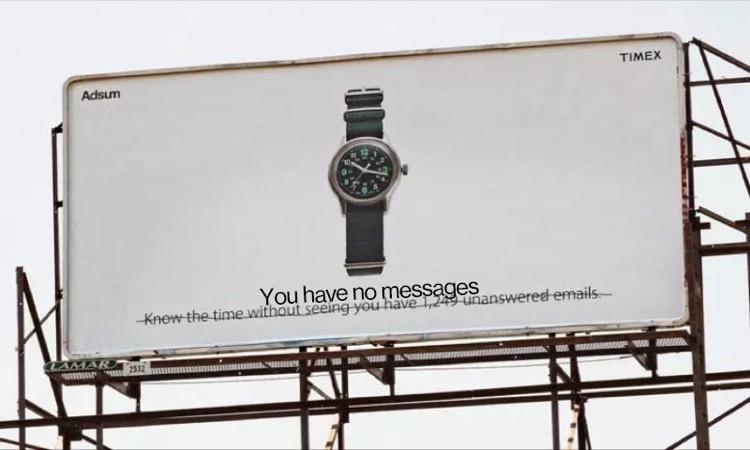
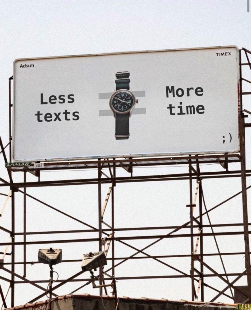
Many people went so far as to rewrite the line: ‘Love the sentiment but a bit long. Some quickfire alts: “Nothing but Time”, “Disconnect In Style”, “Sync With Simplicity”. ‘The line could have been something as simple as “Tells Time, looks timeless”.’ How about “It’s time’?

Many others actually re-art directed it:

(I have no idea who did the above, or the rewrites. I kind of like the last one, but I don’t think i’d understand it without the additional context of the original line.)

I actually wrote my own little post on LinkedIn expressing amazement at the time people spent discussing this ad because it’s actually (drumroll please…) fine. That’s it. Not great, not bad. Fine.

Look, I get it: it went viral. It touched a nerve. It captured a zeitgeist. It inspired 5000 comments on Reddit and hundreds more on LinkedIn. People engaged with it far more than they do with 99.9% of ads. And that means it’s good, right? And any criticism I’m about to offer is surely born of bitterness or jealousy or being out of touch, or having no taste.

Sorry. No. 

I don’t know if it was a slow news week (we are in August, after all. The newspapers call it ‘Silly Season’ because there’s so little to write about, silly stories end up running. Then again, in America it has been an insanely unslow news week, but we all have tiny attention spans these days, so…) but it rose to the top for reasons other than the quality of its strategy, concept, copywriting and art direction, which (see above) are not ‘excellent’.

Here’s a fundamental reason why: if you read any of Dave Trott’s wisdom you’ll know that one of his unarguable maxims is around binary briefing. In short, you’re either the market leader, in which case growing the market is a good idea, or you’re not, in which case growing market share is what you need to do. So if you’re not the biggest-selling watch brand, you need to say something about your watch that makes it different to the others. If you’re not doing that, you’re simply helping the top brand sell more. This billboard reminds you of a fact that applies to literally every non-smart watch on the planet (it only tells the time), so unless Timex is the market leader, this is not the right kind of advertising to create.

Here, for your illumination, are the top selling watch brands with over an estimated $1 Billion in US wholesale sales:

  1. Rolex $4.5 Bn USD
  2. Omega $3 Bn
  3. Apple $2.5 Bn
  4. Fossil $2.3 Bn
  5. Cartier $1.8 Bn
  6. Citizen $1.6 Bn
  7. Seiko $1.4 Bn
  8. Patek Philippe $1.2 Bn
  9. Longines $1.2 Bn
  10. Swatch $1.1 Bn

Quora also tells me that the top selling watch at a group level is Swatch Group, with annual revenues of around $10 billion, but that is split between several brands, including Blancpain, Omega, Longines, Tissot, Mido, Hamilton and Rado. The top seller in terms of number of watches is Citizen.

See? Education! I bet none of you knew all that.

However, I also bet all of you noticed the absence of Timex. It was harder to find comparable figures, but it seems to have annual revenue of $1.2bn wordwide, which explains why it’s not in that US-only top 10.

And that explains why it should grow its brand with something specific and not the category with something generic. You might argue that staking out this anti-smartphone territory will give it some specific brand attribution, but that would be very charitable. That billboard is not well branded (tiny, indistinct logo; a watch that looks like lots of other watches; a small line that’s positioned in a place that makes it hard to read; sharing the space with a co-brand called Adsum), and you might again be very charitable and say that it’s anti-branding, or more in keeping with the lo-fi vibe of Adsum, but this is also $1bn+ Timex, not some obscure little underdog. We’ve all heard of Timex, so why try to hide it when you’re trying to sell it?

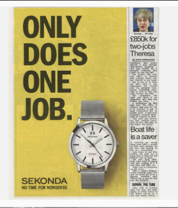
So it’s technically not ‘excellent’ in positioning terms, and that positioning is not even original. Sekonda, a very reliable but inexpensive watch, has been using this strategy for years:

Also, the Timex typography is hard to read and the line is long for a billboard, and it indeed feels like it’s taken directly from the brief (although I kind of like the way it’s not ‘addy’, or trying too hard). I’d also argue that it’s not much of an insight: you can find out the time without being bothered by all the other stuff that’s on your smartwatch. But people like the other stuff on their smartwatches; that’s why that other stuff is there – you chose to put it there and pay a lot for the watch. Most people don’t have 1000+ unanswered emails, but if they didn’t like that situation, they’d answer some of them. It makes no sense.

So the strategy is generic, the copywriting is OK (funnily enough, all the people who had a go at improving it actually wrote worse lines), the art direction is either deliberately trying to look as if it’s not trying or it’s just not good. 

And no offence to whoever is responsible. It’s just another billboard. I could throw a stone in LA and hit ten others of the same kind of quality…

…but again, the billboard went viral and the watch has apparently sold out, but I’m not in the watch world enough to know if this is a big deal, or anything to do with the billboard. Limited edition watch collabs now have people queuing around the block, and you have to get on a waiting list to buy even the lowest-level Rolex, so did the ad help to create the hype, or was it unnecessary? Like all advertising ‘successes’ it’s hard to say. Advertising (promotion) is just one of the four P’s of marketing, so this might have been the sales driver, or it might have been the website, or the price, or something else entirely. People who love this billboard will say it was the billboard, but unless you work for Timex/Adsum you literally have no idea if that is the case.

Part of me wonders if we’ve just realigned our standards so much that this is seen as revolutionary/original/excellent. But it’s none of those things. It’s fine. It’s better than average, but so are millions of other ads. 

So here I am at the end, but I don’t feel I found the answer. In fact, I feel exactly how I did when I first saw the post: like I’ve just seen another decent ad that I’m going to forget as soon as I stop looking at it. But now that I’ve added 1200 words to the conversation I may not forget it for a while.


The Dubious Reliability of Case Studies

I was in Cannes in 2008. That year’s winner of the Outdoor Grand Prix was the game-changing, category-bending, convention-smashing HBO Voyeur. It was far too multi-layered to be self-explanatory, so it needed a case study, and here it is: 

https://vimeo.com/182920917

TL/DR: HBO is all about telling stories so they did that as a live event projected onto the back of a New York building, then added another layer online.

Pretty much every entry for every award now has a case study (side note: judging these things is exhausting. I know you get two minutes to use, but a juror will be delighted if they’re asked to evaluate a concise 1:20 instead), but this was one of the earlier ones.

The reason I remember it is because I was standing around at some party, discussing it with a friend, and he said, ‘Have you watched any of the actual stories?’. I said that I hadn’t and he laughed. ‘They’re rubbish! Watch one. They’re complete crap’. 

I have no idea if they are good or bad or somewhere in between because even though he told me to have a look I simply couldn’t be bothered. Life was/is too short. But even now, fourteen years later, I remember that this event won awards all over the world, and yet there was a good chance the jurors didn’t even know what they were judging. If they just watched the case study, they experienced about 5% of the actual ‘ad’.

And what is a case study but an ad for an ad? It’s aimed squarely at a small audience of senior advertising creatives who are probably less than enthused at having to watch yet another little film about something they can never fully understand. Does it have that stat about ‘media impressions’? Tick. Does it have a (probably local) news anchor covering the story? Tick. Does it have a graphic of lots of Tweets? Tick. Does it have impressed passers-by taking a good look at the giant thingy hanging off the side of the building? Tick.

Of course there’s a good reason for all this: ads these days need to demonstrate their 360-ness in order to look good to a jury. Then they need to express the nice thing they did for the planet. Then they need to convey some stats to show how effective it was. And all of this because the juror almost certainly never saw it in the real world, because a) It probably ran in a country they don’t live in, and b) It probably ran in a relatively obscure digital/experiential media space. 

So the jurors have to rely on what the creatives decide to tell them through the medium of the video. But let’s not forget that those creatives work in – oh yes! – advertising, where they are paid and trained to present the best-case scenario of a product/service/situation all day, every day. Here’s their chance to make an ad about an ad, and that will inevitably mean spin upon spin.

I think jurors are starting to become more cynical and jaded about this, so the canny ones probably learn to screen out the more obvious bullshit, but they can never know for sure, so they probably let a lot of things slide.

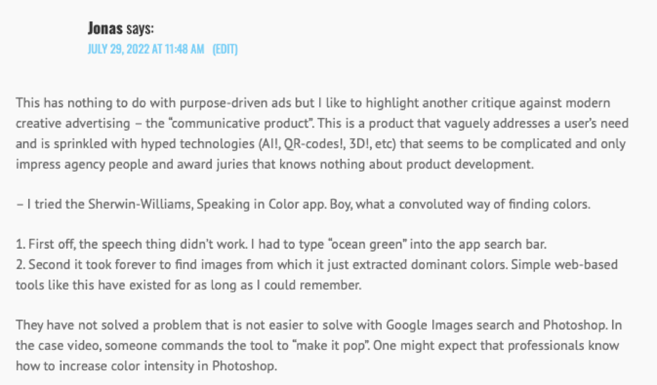
Then again, I was prompted to write about this by a comment on my recent post about purpose-based Cannes Grand Prix winners:

Here’s that case study:

Jonas has kindly done the work that the jurors clearly decided not to, and discovered that this best of the best of the best initiative was actually a bit crap. But now and forever it is a CGP winner, so the bullshitting creatives achieved their goal.

Do I expect every juror to forensically examine everything they award? Of course not; it’s an arduous-enough task without making it ten times harder. But until people delve properly into case study claims, creatives will fluff up the excellence of their work as much as they think they can get away with. 

I’m also aware that the alternative would be kind of weird: ‘Shall we say all the best things we can about our campaign, adding the most positive interpretations of its effectiveness wherever possible?’ ‘Nah. Let’s be scrupulously honest, humble and self-deprecating and hope that wins the day’. This is now where we are, so you have to play the game like everyone else does, otherwise you’ll look poor by comparison.

That said, perhaps when the final Lions/Pencils are being decided, award organisers should check out the reality of certain claims, including the UX, the UI and the actual viewership of that TV news station in an obscure corner of the Balinese archipelago. 

Until that happens, it might be worth taking a look at that HBO case study to see where things might or might not be as they seem (I will emphasise here that I have no idea if these were on the level or not. This is just an exercise to show where unscrupulous case study makers might spin things. This is not any kind of suggestion that the HBO Voyeur team was anything less than 100% honest):

00:25: ‘Street teams passing out curious invitations’. We have no idea to what extent this really happened. You can assume that many people who feature in this kind of footage are agency/production company staff. Even if the ‘passing out’ is genuine you might get better takes with more appropriate (cool-looking) ‘passers-by’ when you use agency staff.

00:35: How long was that projection up for? You tend to need permission for these things, so an agency might get some quick footage (again with ‘members of the public’ who might not be members of the public) to suggest this went on for hours. And ‘two high-def projectors’? Weird flex, but OK.

00:45: ‘Viewers could hold up their invitations to discover clues’. Were those clues clever and interesting, or just a nice addition to the film that no one can check on? Impossible to say.

1:10: You can see trailer footage of the stories that makes them look as interesting as possible. Were they actually interesting? Who knows? And anything that ‘airs on TV’ (yeah, HBO is a TV channel) ‘and in cinemas’ (how many times?) is not a big deal.

1:20: The promo drove viewers to the website. How many viewers? 

1:25: Then we see the UI working perfectly. We have no idea if it really did that, or if the site crashed, or if this all just happened in the Mac room at the agency.

1:36: ‘We got the coolest musicians to compose original tracks’. No juror would have listened to those tracks. ‘Coolest’ is very subjective, but it sounds great, and nobody is going to check up because ‘cool’ and ‘obscure’ are often synonymous when it comes to music. Would it ‘fit the exact choreography’ of what you were watching? Again, who would be bothered enough to check that?

02:00: ‘Viewers are invited to…’ Did they do it? Did they care? Was the story engaging? Who knows?

02:22: There’s a link from the website to a blog called ‘The Story Gets Deeper’. Again, this all sounds so wonderfully multi-dimensional, particularly in 2008, but no juror would ever have checked that blog to see if it was well written etc.

02:35: More clues and cell phone footage that no one would check, and no one would know if any viewers were interested enough to follow them.

02:45: New York Magazine covered it. We all know how PR works, especially when it isn’t a real article. This is just a mention on their ‘approval matrix’ that might have been placed for a fee or favour (or maybe New York Magazine liked it for real!).

02:50: HBO fans shared their passion for it… in ways that are impossible to verify. How many times was it shared by real people? No idea.

03:00: Over a million unique viewers ‘sought it out’ in the first three weeks. ‘Sought it out’ could of course mean that they just Googled ‘HBO Voyeur’, but that does sound good. Not sure how many people constitue ‘half of all HBO On Demand viewers’. Why not use the stat of all HBO watchers? Were there many HBO On Demand subscribers? And how much HBO Voyeur did they have to watch for it to count as part of the stat?

As I said, all those elements could be as real as they were presented, but as they came from an ad agency, you can be fairly certain that they were at the absolute top end of that reality. Why wouldn’t they be? As I also said, it would be weird not to frame everything as positively as possible.

How have things changed in the ensuing fourteen years? Not much, but let’s have a quick look at this year’s big winner, ‘The Lost Class’: 

It is more sophisticated, with great shots and emotional music. They have some genuine big hitters on the news front (MSNBC and CNN, along with pull quotes from Fast Company, The Guardian and Rolling Stone), and that can’t be faked or exaggerated. The only part where it breaks down a little is 1.4 billion impression with zero dollars spent. What exactly is a ‘media impression’? And they clearly spent a bunch of dollars making this and, I would suggest, getting it out on social media. ’66% increase in background checks conversations’? What does that mean and how was it measured? 

The big claim is that it started another big gun control conversation without needing another tragedy. That is quite vague. The gun control situation in America is very complicated. Did the NRA double down as revenge for the humiliation of its leader? Did gun fans take offense? Gun tragedies always lead to people buying more guns because they fear theirs will soon be taken away; did this inspire more of that? Post Uvalde we’ve just had a piece of gun legislation finally pass the Senate. Was that aided or impeded by this? 

It is undeniable that they made a big, famous splash with a sneaky idea that liberal gun control fans would love (MSNBC, CNN, Fast Company, The Guardian and Rolling Stone could be said to be preaching to the choir. What did The Daily Wire and Fox News think?). Did it move the needle in the right direction? Hard to say, but the case study video did all the right things to bring home many big awards.

So now we have to be case study-vigilant, especially as portfolios are now full of case studies, and the people who hire creatives want to see evidence of big-ass case study-worthy campaigns. 

Perhaps we should just accept that the creation of the case study video is a skill in itself, one that every agency now needs to master to have any chance of a a big award. We can all take the claims and stats with a pinch of salt, then marvel at the editing and the use of music, but we should also know that bigger agencies have entire departments that have optimised case study video creation, and have more resources and favours to call in to make them even better. Unfair? Sure, but life isn’t fair.

As someone once said about democracy, case studies are the worst system we have, except for all the others. They are the best medium to explain campaigns that people have never seen, and give societal context for people who may not live in the country where the work ran. But let’s not pretend they are anything other than the sugar dusting on the cherry on the icing on the cake.

We should use our critical thinking to make sure the right questions are being asked about anything dubious, otherwise it’s going to be on us when a piece of work that wasn’t actually very good is held up as an example of the best we can do.

(By the way, 1.65 billion media impressions agree with this post, and it’s going to start at least one conversation between two people standing next to each other in the toilet of an ad agency in Turkmenistan.)


Crap is more difficult than good.

Around ten years ago I was freelancing for a company that wanted some headlines for the apps it was offering on its website. On the face of it the task was simple: take the theme of the app, find some kind of angle, then encapsulate that angle in a short headline.

But the task was actually too easy, which made it difficult.

Let me explain…

When I was an advertising nipper, I worked at the agency that produced the Economist poster campaign. In addition, the creative department sported about ten of the contributors to D&AD’s The Copy Book (basically the global copywriting Hall Of Fame). So what I’m saying is, the bar was high. In my first month I was asked to write a line for a small space ad for a push-up bra. I can’t remember how many I had to come up with before one was approved, but it was a lot, and the same went for Snickers, Sainsbury’s, The RSPCA and every other client that entrusted their advertising to AMV BBDO.

So I was never asked to write anything crap, and if I had done so, I would have faced the scorn or (worse) the disappointment of my CD. Of course I came up with plenty of rubbish, but it usually stayed on my ‘working out’ page, the one that eventually ended up in the bin.

Cut to ten years later: I’m working on this app brief and doing my best to crank out AMV-level headlines. Once I had managed to reach a standard I might refer to as B minus Economist, I turned them in and waited for the feedback. Alas, on this occasion, I was told that my lines were too good. I must have looked puzzled because the CD then gave me an example of what he was looking for: ‘This one’s about pianos,” he said. “How about ‘Tickle The Ivories’?”. 

Riiiiiight.

Now I was really confused. That’s just straightforward. And boring. And not good. But it was also what my temporary boss wanted, so I couldn’t give him my ‘good’ stuff as that would simply be rejected. I had to give him some crappy lines, but that was much easier said than done. How crap would be crap enough? How would I know? Where would I find these lines? I had been trained to write to a certain standard; maybe not quite to the level of The Copy Book, but definitely not ‘Tickle The Ivories’.

So I had a think, tried some more straightforward stuff, got maybe half right and ended that gig soon after. I then had a long stint of full time employment where I wasn’t asked to do that kind of thing, but in more recent years the same kind of request has occasionally popped up again, and I’m still lost.

I sometimes end up as the writer on the social media side of things and every time it happens I go back to trying to write ‘proper’ headlines with an idea, or a bit of wordplay; something that might adhere more firmly to the reader’s mind; something that might communicate a lot in as few words as possible. Then I discover that the CD wants a line like, ‘Find a Brighter Tomorrow’ or ‘Make sure you enjoy nothing but the best’, and I try to stop my face doing this:

I have a good go, but I’m just guessing at what kind of crap is the right kind for the brief. I have no idea if I’m hitting the right notes or playing the piano with a Wellington boot. So I get frustrated notes back from the CD, who doesn’t understand why I don’t understand. I really want to give each one what they need, but it can feel as if I’m learning a new language, one whose words are the exact opposite of the ones I’d been taught.

When CDs explain where my crappy lines have gone wrong, I take their advice with a nod and a smile, but it still leaves me none the wiser. How do you know if something is 3/10 or 4/10 (which in their mind is a 7 or 8)?

Let me be clear: I am not looking down my nose at this work, nor the people who want it – I understand that not every brief is seeking an Economist poster, circa 2003. But the general principle of trying to catch people’s attention and hold a piece of it until they decide to buy something in the category seems to be off the table. We are in blah blah land, and I have no compass. They are paying me, so I want to offer a good return on that payment (and I want the bloody task to come to an end), so there is no point in sticking to my highfalutin principles. I just have to give it my best worst shot.

Sometimes these tasks are the entire job; sometimes they’re just a small part of a larger whole, but they tend to be where my involvement comes to an end. To be good at that thing I’d have to retrain myself entirely, but the problem is that most places still want the ‘good’ work, so it’s like trying to ride two horses at once: a feisty thoroughbred and a flea-bitten old mare, bound for the glue factory.

Anyway, First World Problems and all that…

For anyone who pays my day rate but still wants rubbish, I hope I’m getting better at being worse. If I can master the art of the underwhelming headline I’ll save myself and some of my temporary bosses (and their clients) a lot of frustration. But before that happens I’ll always show them something better, then if they still want the turd, that’s up to them.


Where Did The Time Go?

Have a listen to Dave Dye’s interview with Malcolm Venville. It’s full of great stuff, but there’s a particular detail that caught my ear: they met on a shoot that required three still images of a motorbike. That shoot lasted four weeks.

Which reminded me that advertising creativity used to be given so much time. Maybe a month for three photographs was a little extravagant, but maybe it wasn’t. It sounds like it was, but I wasn’t there, so I can’t say for sure (of course it was).

I never spent a month on one shot (I did go to Miami to take a picture of a woman who was supposed to be on a British beach. Another story for another time) but I do remember getting longer to work on briefs than I generally get today.

In 2022 everything is needed for some kind of review in two or three days, and that’s not great for great creativity.

Here’s an absolute truth about coming up with ideas: the longer you have to do it, the more ideas you can come up with, and the more ideas you come up with, the greater the chance that your best idea will improve.

Your best idea can still end up being the first one you had, but the extra time you spent trying to improve it won’t do any harm; in fact, you might come up with lots more lesser ideas that either help you hone the good one, or give you the confidence to know that, having explored other ground, the first one is still the winner.

On the side of that, you need time to develop ideas. If you come up with a cool central concept (or ‘platform’ as the uber uber ideas are now called), time will give you the opportunity to then come up with the best executional expressions of that concept. The more headlines you write, the greater the chance of your best five being great, and that goes for every executional element: stories, casting, direction, layouts, typography etc. 

And in this time of needing dozens of executions in many media, that need for time is even more pressing. You ought to multiply the time requirement by the number of executions, but instead we tend to divide it, exacerbating the problem.

The other reason you need time is that it is essential to give your subconscious a while to try to solve the problem. As Don Draper explains, when you work on an ad you have to think about the brief deeply, then forget it, then an idea will jump up in your face:

And that takes time – both the thinking deeply and the forgetting, but also watching the idea jump up, then writing it down, then talking to your partner about it, then taking on their improvement suggestions etc. Shrink those days and you don’t even give creatives enough time to do that bare minimum process. Of course we can come up with something in the truncated time frame, but McDonald’s can also come up with an entire lunch in the time it takes Le Gavroche to whip up a marinade. Speed rarely leads to quality, unless you are Usain Bolt.

Some of you may be thinking that extra days or weeks might lead to stewing on an idea, thus corrupting its original novelty value with overthinking. Or you might get bored of something good, sending it to the bottom of your list of favourites, perhaps even killing it. But I don’t think that happens much, and even if it did, you then have to show your ideas to other people, and they’ll be seeing them for the first time, replenishing the novelty value all over again. And you’d need quite a while to get bored of a really good idea/headline etc. We all like great ads from the past that we’ve seen many, many times.

I’d guess there’s a limit, and we all know that deadlines can really get your juices flowing, but as a rule, more time=better work.

Counter to this truism, the timeframe has been shrinking for decades. What used to be a week became three days, then two days, then one. Even on a big brief, a review is almost always expected within 72 hours, and you now have to spend time getting your work in presentable form, which always means a motherfucking deck, complete with some good imagery that you have to spend time finding. Add that time to the review itself and you’ve used up half a day or more prepping instead of thinking (sure, some of the prepping is executional thinking, but it’s still an overall interruption).

We’re also aware that it sometimes takes three months to write a brief, leaving just three days to answer it, and that seems insane, especially when 90% of briefs these days hardly appear to be the result of three months of stellar thinking. I was once told to hold on briefing my department while the strategy director went back and forth with her boss, improving the brief almost imperceptibly. I chose to ignore that and immediately gave my creatives what I was sure the brief would end up being. That added three valuable days to their thinking time.

Strategy departments… We want just half of one of your three months to do justice to your superlative thinking. You know it makes sense!

So why don’t we give that incredibly important part of the process the time it needs to produce excellence? You know the answer! Come on… altogether now… Money! Time is money, so a reduction to the number of chargeable hours makes the agency management happy because it makes the client happy. You charge less and, well, you get less: less time, which leads to lesser ideas. As I pointed out above, that’s a rock-solid, ocean-going, unfuckwithable, 24-carat-platinum rule.

In summary, time has been reduced and ads have become worse. Are there other reasons for the lowering of standards? Absolutely (just check this forensic dissection of client briefing from the great Mark Ritson) Does that mean the time thing isn’t a big deal? Absolutely not.

The last decade has seen the weakening of all the struts that hold up the creative process: time, money, focus, mentorship, high standards, protection, talent etc., and we’ve all seen the work get worse. Night has followed day, and here we are. I guess the question is, how much further can things fall?

Only time will tell.


How all the Nicey-Nicey ads came to dominate the awards.

Last week I wrote that post about how 85% of the Cannes Grands Prix were awarded to for-good/purpose-based/public service/charity initiatives. Then I chucked it up on LinkedIn and received a comment that made the penny drop:

Richard Russell (one of the geniuses behind Honda Grrr) said, ‘Sobering, Ben. But I doubt there are too many in the industry front line that are especially bothered. Yes, it’s rampant now, but I am amused at how we were saying pretty much the same thing in the 80s when Brignull, Abbott, Fink, Singh, etc were scooping all the big UK awards with charity ads. ‘But it’s much easier to win the big gongs with a charity ad’, everyone bleated. And they were right. Then and now. Can’t see that changing much.’

To which, after a bit of back-and-forth, I replied ‘I think this has been a sneaky way of adding the award benefits of ‘charity’ stuff to the difficulty of corporate stuff. Yes, it’s an ad for Mars, or whatever, but now it’s all about saving whales.’

This phenomenon appears to be simply the latest in the timeline of how to game Cannes:

We started with Do your normal day job of trying to sell stuff, enter the best stuff and see if it wins.

Next was Do your normal day job of trying to sell stuff, but when you send the proof in, trim off the ugly things the client wanted, such as the phone number or the address of the local dealership.

Following that was the director’s cut era: Do your normal day job, but however good the 60” or the 30” might have been, get a nice 120” to run once at a friendly cinema, or at 3am on an obscure TV channel. Then you have your epic award entry in its most wonderful form.

Then, as the worm turned with people in the C-Suite taking the Gunn Report seriously for pitch creds, so we then had Do your normal day job, but also deliberately create of ads just for awards. We all remember the ads that were pulled after clients saw them in award books but had never approved them, or ads for clients the agency didn’t even have. But in general it was agencies deliberately taking time off from the day job to specifically create the award ads.

This was exacerbated by the new need for case study videos. No matter how small or insignificant your ‘ad’, you now need to wang on about it for two minutes, usually throwing in some added bullshit for good measure: ‘Sales increased 300%!’ Yes, they went all the way from two to eight. And what is a media impression, anyway? And who counts 1.2 billion of them?

Finally we have where we are today: Do your day job, but either make it a charity ad that is supposedly a non-charity ad, or just do a charity/non-charity ad on the side of your day job.

I’m sure everyone reading this is aware that it’s much easier to to make a charity ad that people care about than it is to make a washing powder ad that people care about. Dying children or disappearing rainforests are obviously much more interesting and persuasive topics than what temperature gets your socks whiter than white.

Back in the day (not that long ago, I think) Cannes did not allow charity ads to win Grands Prix. That, incidentally, is why my old boss, Peter Souter, did not get the biggest of all prizes, despite making this all-time great ad: 

Charity vs not-charity was thought to be unfair, so charity ads were in their own ‘product’ slot, but could not get higher than a Gold. But then they added Glass Lions and White Pencils and the whole ‘For Good’ section of Cannes, along with Titanium, which, judging by this year’s winner, also allows charity entries.

At some point during all this, some bright spark twigged that you can turn a corporate ad into a charity ad just by creating/paying for an initiative that might be somewhat related to the corporation, but also (see this year’s Sheba Grand Prix winner) might not.

Actually, as I think about it, even this little twist is not new. Back in 1996, the great Flintham and Macleod produced this excellent campaign to get people to vote:

Who was the client? That’s right: late-nineties nightclub du jour, the Ministry of Sound. I guess someone there cared a lot about voting.

But now everything seems to require that little ‘for good’ bit extra. I’ve been involved in a couple of pitches over the last twelve months and I’ve noticed that the client’s brief includes the criteria upon which the agencies will be judged. It says something like ’20% Strategy, 30% Chemistry, 50% Creative’. So that’s what ad award judging is now. They’d like to see 20% Originality, 30% Concept, 20% Craft and 30% Doing Something Nice No Matter How Much Of A Load Of Old Bollocks It Might Be. 

The phrase that springs to mind is the tail wagging the dog, but it goes in both directions: juries like charity stuff, so let’s turn our corporate ads into charity ads, which then in turn get awarded by juries, so next year let’s make more of them… and the cycle continues.

I put together the following lists by looking up all the winners of the last decade then wrote down the ones I could still remember. Here are the corporate + Nice winners: Like A Girl, Womb Stories, Dumb Ways To Die, Palau Pledge, Fearless Girl, Mouldy Whopper, Meet The Superhumans, Sweetie, Lifepaint, Meet Graham, We’re The Superhumans, Boost Your Voice, The Talk, Trash Isles, Dream Crazy, New York Times (kind of fits in both lists, I think), The Tampon Book, This Is America and Courage Is Beautiful (man, Dove have been playing this card all along, haven’t they?).

On the Not Nice side we have: It’s A Tide Ad, Magic Of Flying Billboard, Epic Split, Shot On iPhone, Nothing Beats A Londoner, Next Exit McDonald’s, Whopper Detour, New York Times (kind of fits in both lists, I think), Wendy’s Keep Fortnite Fresh and You Can’t Stop Us.

(By the way: if you can be arsed to take a look back at the big winners from the last ten years you’ll see just how many of these Best of the Best awardees have faded into obscurity. It makes very clear just how ephemeral this whole enterprise really is.) 

(By the way part 2: I should really make clear that Nice ads aren’t a bad thing as such. Plenty (Meet The Superhumans etc.) are both utterly brilliant and solve a real-life client brief. The problem is the fact that this is starting become unofficially mandatory, whether that was the intention or not.)

So are we going to have to divide awards into Nice and Not Nice in future? If it seemed unfair for the washing powders to have to go up against the starving gorillas in the past, isn’t that the case now? And isn’t that especially so since this is just a little icing on the cake of what the industry really spends its time doing? 

The vast majority of ads are still ads, going about their business trying to get people to do part with their time and money for the benefit of some corporation’s bottom line. If we spend our time and attention on the Nice stuff on the side, then reward that as The Best We Can Do, then how will that make us feel about the real ads? They’ll just become a tedious interruption to our efforts to clean up the Pacific, or get senators to vote for Climate Crisis policies, or shame racists into being less racist. All noble aims, but it’s like giving the Premier League title to the team with the most Goal Of The Month winners. Defending a cross, breaking up an attack and passing to the left wing are also valuable skills.

So I’ll just put a little flag in the sand here on the 5th of July 2022 and hope I’ve just got my knickers into too much of a twist. Maybe I’m overstating the significance of a temporary fashion. Maybe the importance of the horse and pony shows that are advertising awards is not actually that big a deal. Maybe the giant glacier of Not Nice advertising will grind along regardless of who is having an angst party on top of it.

One last note on this subject that will hopefully save me having to write a whole other post: could we please just cheer the fuck up for a bit? Life’s a bit of a grind already without turning the entire industry into a ‘who can wear the least comfortable hair shirt’ contest. Even if you’re doing the Nice stuff, maybe do it with a smile, eh?


Here’s a purpose-based initiative. Where’s my award?

When I was younger there were occasional discussions about what kind of ads would win awards. You had the obvious elements of being original, simple, well-crafted, memorable and all that jazz, but as award schemes started to become more international, there seemed to be a bias towards the kind of things that would win at Cannes (ie, when judged by an international jury of people who may not speak immaculate English).

This led to a few years where people in the UK discussed the ‘Proster’ (sic) – a press ad that was simple enough to be a poster. If your ad had a single image, no words and a logo that often sat in the bottom right-hand corner, then it was more likely to be understood by people from across the globe.

I thought this was a bit of a shame (see my Press juror’s comment in the 2005 D&AD Annual, nerds), but it was just a continuation of a question as old as time: how do you make an ad that will win you a prize? (By ‘time’ I mean since the late 1990s, when ads really started to be made deliberately for awards, and scam began to take off.)

The stories of scam, homogenisation of global work, international jurors who need to have nuance explained to them (which of course course includes English-language natives, who will have no idea how to appreciate a reference to a Malaysian stand-up comedian or a Turkmenistani pun), proliferation of categories and a general lowering of standards over the fifteen years have been told many times, so I won’t repeat them here.

Instead, I’m going to point out a relatively new development that has well and truly conquered the awards scene. 

If you want to win the highest advertising prizes you must, must, must create a piece of work that either contains, or simply is, a purpose-based initiative.

I direct you to the list of this year’s Cannes Grand Prix winners. Out of 27 winners in over 30 Grands Prix, I counted 4 (maybe 3 1/2) actual ads that just sold something produced by a corporation.

The others were either initiatives created by a corporation, or ‘for good’/charity communications/ideas. So that’s about 15% that were not purpose-based.

The lesson: next year, you’d better do something nice, because it ain’t Santa who’s making a list; it’s the world’s ad juries.

Here’s a rundown of the Grand Prix winners and the extent to which they tried to save the world:

The Brand Experience and Activation, Radio and Audio, and Influencer Grands Prix were won by Vice World News for their Unfiltered History Tour. It brilliantly highlights the fact that the British Museum should really give back all the stuff it has stolen from other countries. I’ve watched it a few times, but had no idea it had anything to do with Vice World News (11,813 views so far, by the way). Amazing initiative. Surely not a great ad. 

The Creative Strategy and PR Grands Prix were won by The Breakaway: the first ecycling team for prisoners. Ummm… so they put Pelotons in a jail? Not really – that would be too expensive, but that sums it up. I guess it must have had some great PR to have won the Grand Prix, but with 6,666 Youtube views, no one seems to have been directed to this film. I’ve now watched it twice, but have no idea who Decathlon (the client) is. I could Google a bit harder, but I think that misses the point somewhat. Another so-so ‘ad’. 

The Glass and Creative Data Grands Prix were won by Data Tienda from WeCapital. This initiative allowed Mexican women to build up a credit score based on the hitherto-irrelevant credit they had used in small, local shops. They could then get loans to build businesses. Great! 10,000 women and 50,000 shops got involved, so it seemed to be pretty substantial. On the ‘is it an ad?’ Question, I think the case study highlights an interesting point: if you take too much credit (pardon the pun) for these efforts you look like a shitty company making hay off the back of people’s misery. But you have to let people know who was behind it, or you won’t have any kind of an ad. I assume all the suggested newspaper headlines at the end went on to mention We Capital, so maybe it was a decent corporate communication to go with the great initiative. 

The Industry Craft and Media Grands Prix went to Hope Reef for Sheba cat food. As the Youtube description says, ‘The world’s coral reefs are at breaking point. But, there’s hope. We’ve launched the world’s largest coral reef restoration program, to preserve and restore the beauty in our oceans.’ 8.2m views are not to be sniffed at, but my question is, what does this have to do with cat food? There was a point when it mentioned that ‘more coral means more fish’, and I thought, ‘Yeah, for your cat food’. But it didn’t suggest that was the case, so I’m left wondering why a company that offers Tender Whitefish and Tuna flavours is trying to save fish. Why not just stop selling it as cat food? Is it a good ad? I honestly have no idea.

The first film Grand Prix went to Channel 4’s latest remarkable Paralympics ad. I’m going to make this down as a slight initiative, as the Paralympics have a sort of purpose-based vibe. I know it’s advertising Channel 4’s actual programming, but you know what I mean.  

The second film Grand Prix was a bloody ad! Yes it was! With no initiative stuff at all! How did it slip past the jury? Crazy stuff, full of moments that actually demonstrate the products’ benefits (check the credits at the end), and with 34m views! Well done, Apple!

https://www.youtube.com/watch?t=70&v=GC5Gmkn92Bg&feature=emb_imp_woyt

The Titanium GP went to Long Live The Prince, for the Kiyan Prince Foundation/EA Sports/QPR/Match Attax. This reimagining of Kiyan’s life had he not been killed with a knife at 15 is an ad for the Kiyan Prince Foundation, so it’s not an initiative for something else, but it is a ‘for good’ communication. 

The Creative B2B Grand Prix went to Speaking in Color for Sherwin-Williams Coil Coatings, which allows you to use your voice to describe something, which they then interpret with AI to create a colour or palette for your paint. It does say, ‘Defined by human experience, it redefines how people connect with colour’. So I don’t think that’s an initiative, although I think they’re trying to make it sound like one. 

The Creative Business Transformation Grand Prix went to Piñatex, Dole/Ananas Anam, an initiative (Phew! We’re back to those) to create a sustainable leather substitute made from the cellulose fibres extracted from pineapple leaves. Seems like a good thing. Is it much of an ad for Dole? I don’t know, but it’s going to have to do more than this to compensate for its terrible crimes against humanity (financing death squads in Colombia etc.). 

Next, another actual ad with no initiative! The Creative Ecommerce Grand Prix was won by Wingstop/Thighstop, a chicken wing shop that pivoted to selling thighs when wings ran out. Nothing else to say. 

The Creative Effectiveness Grand Prix was won by an initiative to help farmers grow organic crops. The Contract for Change was actually tied very tightly to Michelob Ultra, as they guaranteed to buy the organic barley that was a more risky choice for farmers to grow:

The Design Grand Prix was fully ‘initiatived’. Penguin Books’ ‘The Portuguese (Re)Constitution’ uses the ‘blackout poetry’ technique: several poets and illustrators passed the blue pencil over this constitution until some words were highlighted, celebrating the freedom of expression. Yeah… it’s all a bit complicated, but bottom line: it was the design of a purpose-based book.

The Digital Craft Grand Prix went to Backup Ukraine, from Polycam x Unesco. It’s an app created for Unesco which allows people to digitally scan architecture and monuments in Ukraine that are under threat of being destroyed in the war. Obviously purpose-based (and obviously a great cause).

The Direct Grand Prix was won by Coinbase for its lo-fi Superbowl ad. No purpose-based initiative there! 

https://www.youtube.com/watch?v=1zLsUhOCqyU&feature=emb_imp_woyt

The Entertainment Grand Prix was won by Eat A Swede, Ikea, which was – yes, you’ve guessed it – an initiative! Creative Review describes it as a ‘mockumentary for Ikea that appears to show Swedes eating lab grown human meat, in order to raise awareness of the impact climate change will have on the global food supply’, so who am I to argue?

Even the Entertainment Lion for Music was ‘for good’. This Is Not America ft. Ibeyi is all about protesting police brutality:

Entertainment Lions for Sport’s Grand Prix was an initiative to create a training system for those who are menstruating:

And the Film Craft Grand Prix was for a German supermarket called Penny. But was it about selling peas or Coke? Of course not! It was a purpose-based thingie with plinky music about dealing with the pandemic:

Of course the Grand Prix for Good was a ‘for good’ thing:

As was the Grand Prix for Good – Health:

As was the Sustainable Development Goals Grand Prix: 

Health and Wellness’s Grand Prix was a ‘for good’ initiative where a company made a mosquito repellant whose packaging killed mosquitos when chucked in a dumpster:

The Innovation Lions Grand Prix was an initiative to create a home that’s more resilient to extreme weather:

https://www.youtube.com/watch?v=NHqvrpGXugQ

Mobile Lions’ Grand Prix was for Real Tone by Google, an initiative which captured darker skin more accurately on its Pixel phone’s camera.

https://www.youtube.com/watch?v=XhUgcYw9cj4&feature=emb_imp_woyt

The Outdoor Grand Prix went to Adidas’s Liquid Billboard, which created a swimming pool for women in Dubai, who could now wear Adidas’s more inclusive swimsuit range. Yes, It was a for-good initiative.

OK, we’re nearly at the end. The Pharma Lions Grand Prix went to an initiative called I Will Always Be Me, which allowed people with Motor Neurone Disease to save their voices before they lost the ability to speak (initiative!):

Finally, the Print and Publishing Grand Prix went to an initiative called The Elections Edition, from Annahar Newspaper, which skipped a day of publishing and donated the paper and ink to create election ballots:


Why Ads Aren’t Funny Anymore

I highly recommend the latest episode of Dave Dye’s podcast. It’s a chat with Orlando Wood, who has written two books on the links between psychology, creativity and advertising.

When I commented on it via Twitter, Dave said, ’It occurs to me that, although they seem different, all of our ad blogs, yours, mine, George’s, Dave T’s, Gregg Benedict’s, etc are essentially the same – Don’t forget this thing, it works.’

Yep. Or to put it another way, we like to point out where creative advertising could be better, while trying to offer solutions that often seem self-evident and easily accessed.

I wrote a post about this entire subject a while ago, so if you want to have a wallow in the weirdness of our collective insanity, go right ahead. 

In that post I explored some of the thinking behind the madness, but I didn’t really discuss humour, and the reasons why there’s not so much of it about. So here’s my attempt to do just that:

The Oscars Reason

Have you noticed that comedies very rarely win the Oscar for Best Film? Look at recent nominees: maybe CODA is a slight comedy, but it’s mainly a drama, and so is Licorice Pizza. Jojo Rabbit is a proper nominated comedy, albeit a black one. The Big Short is funny, but is it a ‘comedy’? Kind of. Ditto The Wolf Of Wall Street and Django Unchained. But that’s it: one proper comedy and a few funny dramas out of the last 100 nominees.

I think that’s because comedic artistic expression is both very hard, and not considered as positively as something serious. It’s thought to be trivial and silly, so you have to expend far more effort to do do it well, and you get much less credit for the result.

There are quite a lot of articles that go into the disappearance of the movie comedy (TL/DR: they are less profitable and Marvel-esque blockbusters have driven them out of cinemas and and onto streaming services), but I wonder if we have become a more serious planet in the last ten years. There’s a climate crisis, a pandemic, various wars and an explosion of political resentment and disagreement in many countries. Funny ads could help to alleviate all that, but they might appear out of step with the cultural vibe.

The Difficulty Reason

Very good comedy is a real craft that requires great writing, casting, editing and direction, and it’s harder to seem funny in the initial script, especially when it is now often passed around as a deck to be read rather than a presentation to be performed.

Maybe clients have seen many supposedly funny scripts fall flat, and subsequently found themselves drawn more towards a straight manifesto that’s read out over some stock footage. They’re hard to love, but they’re easy to visualise before they’re produced (you can knock them up in a ripomatic on a laptop these days), and you can easily swap out or alter lines right up until five minutes before you supply them to go on air. They can accommodate the wishes of all the client’s departments, which makes everyone’s life easier, but also makes the ad duller.

You can’t do that with a comedy. It’s impossible to pre-produce that magic alchemy of script, performance, timing and direction, so everyone has to take a leap of faith, and people (especially clients) don’t like doing that if there’s a cheap, easy non-leap of faith alternative.

Write a script with people dancing and everyone can imagine it because it’ll be like the other fifty dance scripts currently on air. The same with the serious purpose-based initiatives and the po-faced celebrations of how your chocolate bar or loo cleaner is changing the world.

The ‘Our Biscuits Are A Big Deal’ Reason

Dave and Orlando mentioned that clients probably prefer a script that says their crumpets are the best thing since sliced bread, rather than one which self-deprecatingly recognises the true insignificance of practically everything on the average supermarket shelf. They make fish fingers all day; fish fingers are very important to them; why wouldn’t they be important to the rest of the nation? Because they’re just bloody fish fingers, but try telling that to people who think about and talk about nothing but fish fingers, all day, every day. Good luck!

The Victim Reason

Comedy also needs a victim. In the past the Doofus Dad has often taken that role (idiot dad that we all roll our eyes at because he’s childish or irresponsible), but it might just as easily be a clichéd societal convention or a crappy musical genre. However, that means someone, somewhere might get offended, and then express that offence on Twitter or Instagram. No client wants that! It’s a PR disaster! Fiona in Basildon actually likes the music of Steps, thanks very much, and she’s mobilised eighteen Facebook friends to protest the pisstakey use of Tragedy in  your latest jam commercial. Quick! Pull the ad, and let us never speak of it again. And we must now apologise. Profusely.

That’s a situation best avoided, so instead let’s just be safe, and nice and not funny, because funny can be provocative, and ‘provoked’ people like causing a stink on social media to take revenge on the provokers.

The John Lewis Reason

Humour seemed to disappear around the same time as the rise of the serious/tear-jerky John Lewis ads. Some very talented people created an entirely new genre: the 60-second heart-warmer, and every client seemed to want one of their own. ‘That worked, so give us one’, is a common refrain from many clients (and many CDs), and the dominance of the John Lewis-alike may well have knocked the entire industry off its axis.

And if your biggest ad of the year is going to be one of those then you’re unlikely to spend the rest of the year being ha-ha funny; the two things would make your brand inconsistent, and many clients (and many CDs) do not like an inconsistent brand. So the tail kind of wagged the dog until it almost became weird to stand out with a throwaway gag (yes, standing out is a GOOD THING, but it also requires ‘BRAVERY’, and people don’t like being ‘BRAVE’ because it’s KINDA SCARY).

So it’s obvious why humour has fallen by the wayside: it’s difficult, expensive, hard to communicate in a deck, trivialising, guaranteed to annoy someone you want to sell things to, and not like a John Lewis ad.

That’s a pretty hard tide to swim against, but I would urge you to try because I like funny things, and, funnily enough, so does literally everyone else on earth.


How Long Till Your Current Job Ends?

The other day I was reading an article about the longevity of stardom. It asserted that stardom can only last for three years, after which stars can remain famous, but only as a kind of reminder of what people liked their three years of stardom.

I mentioned this to my wife, and we then considered various stars and the degree to which they reinvented themselves at the three-year mark: George Michael with three years of Wham, three years of Faith, three years of Listen Without Prejudice, then a kind of retirement; Bowie with three years of Ziggy/Aladdin Sane/Diamond Dogs, three years of Berlin, three years of Let’s Dance, then another kind of retirement; Eddie Murphy with three years of tyro parts like Beverly Hills Cop and 48 Hrs, three years of superstardom (Coming to America etc.), then an enforced sabbatical imposed by making shitty films no on wanted to see, and a late-career return with three years of dressing up in fat suits.

My wife went on to say that she’d read an article that said Baby Boomers tended to stay in their jobs for twelve years, while Gen X-ers were six years, Millennials were maybe three years, and Gen Z were looking like one-and-a-half.

I assume this reduction has something to do with the grotesqueries of late-stage capitalism, as it increasingly robs us of stability and security, the better to enrich the already copiously enriched. But that aside, our attachment to jobs, and by extension, corporations, is worth examining.

When I worked at AMV BBDO I remember having a chat with Mary Wear, who told me that she and her then-partner had a policy of staying at each job no longer than three years. She then split up with her partner, who may have have then pursued his own three-year stints at Mother and Lowe before founding his own agency. Mary, however, stayed at AMV for a good few years, but with different art directors, perhaps each partnering her for something like the magical three years. So it wasn’t necessarily the agency that dictated the length of cycle. Sometimes it was the art director. 

I look back at my own career in this context and see quite a few three-year chunks: an art director, another art director, an agency I co-founded, a period of freelancing, ECDing Media Arts Lab in London, doing something similar but larger in LA, starting another agency etc.

It makes me wonder if there was some kind of natural progression to that time frame. Unlike Mary, I wasn’t conscious of making moves at the thousand-day mark, but perhaps there was a kind of corporate circadian rhythm that made me feel as if it were time to move on. Some of those changes were not by my choice, but is it possible that I was subconsciously sabotaging my circumstances, readying myself for the chrysalis and attendant reinvention?

Going back to the article my wife read, are we all leaning towards shorter stints at each place, or do we keep the timelength with which we started? There could be an arc to any situation, one that we adhere to without realising: a beginning, a middle and an end, with each new act feeling appropriate at a certain time. ‘Here comes year three. Time to start packing my parachute and putting out feelers for another position. Or to look for a new copywriter who can refresh me…’

It’s also possible that people get tired of people after a certain amount of time, and we collectively conspire to move on and be moved on. Or at least the excitement of the new is bound to fade over that time: just look at Madonna’s 3-year cycles, often starting with something provocative (the lyrics of Like a Virgin, the video for Like A Prayer, the Sex book) that echoed to faintness before she found another way to ‘shock’ us. 

Does going over the allotted time simply lead to a kind of disappointment or failure? Do you have a different timeframe that dictates your career? Do you try to jump before you’re pushed?

I need more data. I’ll add a question to wherever I end up posting this, but do feel free to comment with your own experiences…


Let’s face it: older people are kind of crabby and gross, and younger people are just idiots.

Come on! Let’s just get it out there: older people are icky and lame. They are often covered in a layer of dust. They need help going to the loo (which is why so many smell of wee). They have no idea what Zoom, Twitter or Charli D’Amelio are. They talk about things that happened in the last century. They look at you funny when you insist on creating an 80-page deck to convince a fifth-rate director to take on your 6-second blipvert. They don’t know how to create DAOs, and they think crypto is a pyramid scheme for the terminally credulous.

But on the other side, look at the kidz: their faces are buried in their TikTok feeds instead of an old One Show annual. They have no idea how to craft anything, or what ‘craft’ is. They think ‘Create The Future Together’ is a great endline, or maybe a great strategy, or possibly a great campaign idea. They spend more time comping visuals than thinking about why they’re comping those visuals in the first place, and they think that a Cannes Bronze is actually something of value.

In short, both are making advertising worse. One is too expensive while the other is too ignorant. One is too stuck in their ways while the other flits from fad to fad. One thinks everything was better in the 1990s while the other has no idea what happened in the 1990s.

But other than the people who are 30-35, everyone is too young or too old, so maybe we should try a bit harder to make the best of both worlds rather than condemn the worst.

As luck would have it, I just read an article that might help us with that. Although the title is ‘The kind of smarts you don’t find in young people,’ it’s really an explanation of how the brains of younger and older people have separate specific abilities, both of which are essential to the creative process:

In the mid-20th century, psychologists set about finding an explanation for a great mystery. Researchers had long noted that some skills—analysis and innovation, for example—tend to rise quickly very early in life and then fall through one’s 30s and 40s. Meanwhile, one’s knack for combining complex ideas, understanding what they mean, and relating them to others rises throughout middle age and can stay high well into old age.

The two groups of skills originate in two basic types of intelligence: fluid and crystallized. The first is essentially the ability to solve abstract problems; the second represents a person’s knowledge gained during a lifetime of learning. In other words, as a young adult, you can solve problems quickly; as you get older, you know which problems are worth solving. Crystallized intelligence can be the difference between an enterprise with no memory that makes lots of rookie errors and one that has deep experience—even if the company is brand new.

In a neophiliac industry like advertising, new stuff is always highly prized. From Second Life to NFTs to the latest bands, influencers and pop-ups, adland always likes to jump in first and ask questions later. Is it right to recommend the latest fashion to a client? Sometimes, but many agencies feel compelled to do that without considering or waiting for the consequences; after all, by the time you’ve done your due diligence, your new thing is longer new.

But older people are more predisposed to seeing the patterns that point to the mid- and longer-term futures of what is currently untried and untested. Sure, it’s not as whiz-bang to move slow and fix things as it is to move fast and break them, but older people have seen the fashions come and go, so they tend to have a better idea of how your current circumstances might play out in the weeks or years to come.

The point is, as a general rule, using the old to optimise the implementation of the new makes a lot of sense. Yes, that might seem like clipping the wings of the crazier ideas, but it also might mean that strategic or creative rigor is applied, leaving less chance for errors or problems further down the line. As that article says:

Companies would do well to install master teachers throughout their business. Don’t target people who pine for the “old days” in their careers and abilities. Instead, look for elders who recognize that it is healthy and normal to see some of their capabilities decline with age, and that this presents an opportunity to foster those abilities in others. Older leaders should be enthusiastic about making great teams, developing others’ ideas, sharing knowledge openly and generously, and making prudent judgments based on their own deep experience.

Obviously, doing this requires hiring or retaining more older people, and I’m fully aware that such a practice is heresy for many agencies. Even though St Luke’s recently took on my friend Mark Denton as the Oldest Intern In Advertising for a month’s placement, that was still unusual enough to be worthy of lots of ‘How’s That Ker-Azy Idea Going To Work Out???’ articles, while further agencies giving it a go seem to be thin on the ground.

But oddly enough, it’s one of the closest things I’ve seen to the ‘master teacher’ suggestion in that article. Mark’s conclusion, ably assisted by another elder statesperson, The Ad Contrarian, is that he could be a ‘Brain In A Bottle‘, a kind of Yoda, sitting in the corner of the creative department as a wisdom resource for his more callow colleagues. We saw how things worked out for a month, but what about a year? Twelve months where course corrections could be made and feedback could be taken on might well add more value than whatever a ‘Mark’ might cost. Advertising is always exhorting clients to be brave. Shouldn’t we take our own advice occasionally?

One other factor might be the fear and competition bred by the situation: young people have to use whatever edge they can to get their job, and when that happens they know that they only succeed by having their idea chosen over that of the other team on the brief. So may the best team (or the team that creates the most sellable idea) win, which means that the other team loses. That is the implication of every day in the agency.

For the older ones, you know that every raise increases the size of the target on your back and the number of knives aimed towards it. No one says no to a raise, but we all know that the higher the salary, the more you stick out to the network CFO in Manhattan, who just needs to cut costs by 8%, and can see that one easy way of doing that is to delete the names of you and your partner. What is the magic danger-number, and when does the axe-person start looking around? Nobody knows, but your career is generally spent inching closer to the guillotine, and it’s coming for us all.

So if you take those two situations and run them simultaneously, you get fear and competition instead of something that might be far more useful: collaboration. We’re taught from the start to try to be the last team standing, but an atmosphere that gets us all to try to improve each other’s work would surely be better for both the work and our mental health.

Instead we take our place on the conveyer belt, watch as the people some distance ahead fall off the end of it, and brace ourselves for that inevitability. But if the more experienced people were retained and given the chance to continue contributing to the young, that might improve the system and the advertising for everyone.

Mentors, mentees, education, growth, improvement, success.

It’s not exactly a new idea, but then sometimes the things that stand the test of time do so for a reason.


Your Idea Is Nothing Without Execution

Last week I was listening to the peerless Graham Fink on his second episode of Behind The Billboard. If you haven’t had a listen yet, stop reading this now and rectify that scandalous situation. Then listen to episode 1. I’ll wait.

You’re back? Good.

Wasn’t it brilliant? There were many excellent anecdotes, but the part that really stuck with me was an almost throwaway comment at the end where Graham quoted Hugh Laurie as saying, ‘There’s no such thing as great ideas; only great execution of ideas’ (the actual quote and interview are here). Graham went on to say that there was a big difference between having ideas and getting those ideas made exactly as you want, or even better. 

He added that we never really present ideas to clients that are above 8/10, but then you go into execution, and that’s when you crank it up a few notches with great photographers, typographers or directors.

OK. There’a a lot to examine there, so let’s start with the main point; the one that says execution supersedes concept…

Many years ago I went to Watford (West Herts College) to study Copywriting and Art Direction under the great Tony Cullingham. He instills in his pupils the opinion that concept is 90% of the endeavour. The other 10% is the actual writing or art direction bit (the execution).

And he’s not alone in that thought. We’ve all heard those creative department insults: ‘Yeah, but what’s the idea?’ or ‘There’s no fucking idea’, suggesting the primacy of the conceptual underpinning, but you only have to go back to my penultimate post (and this one I wrote seven years ago on a similar theme) to see that we don’t even agree on what an ‘idea’ is. This incredibly valuable currency of the ad agency is… what exactly? 

If we go back to Hugh’s suggestion, and Graham’s agreement, it’s not that important. 

According to the winner of the Commercial of the Year at last week’s British Arrows, it’s ‘Show models dressed in Burberry jumping and dancing around a street while snowballs land on them’. You might say that fashion advertising doesn’t usually have ‘ideas’, and you’d be right, but this is undeniably a brilliant ad. It was liked, shared and awarded all over the place. It might even have sold some clothes:

https://www.youtube.com/watch?v=QbmW76Cp4s8

As far as the concept went, Riccardo Tisci, Creative Director of Burberry, said, ’It’s about that fearless spirit and imagination when pushing boundaries.’ That sounds like bollocks to me, but the end result, like great fashion, is all about emotion and attitude, so it makes sense to skip the logic of a conceptual foundation. This is all about execution, and the distance between ‘People dance around in a snowball shower’ and the finished ad is like the distance between a Cadbury’s Creme Egg and a Fabergé Egg.

So is the idea ever important? Well, Good Things Come To Those Who Wait, Mac vs PC, Beware Of Things Made In October and Write The Future make very effectively the argument that it is. But Burberry, Flat Eric and Whassup are equally powerful on the ‘no idea’ side of things.

So why don’t we just get it out in the open? Sometimes advertising ideas matter, and sometimes they don’t. It’s OK not to bother with a solid concept, but if you have one, great. No biggie either way.

But idea-wise, what really does matter are the thousands of little creative contributions that happen between brain and reality. Let’s stick with the Burberry example: many, many ideas happened even after someone suggested dancing around in the snow would demonstrate the fearless spirit and imagination one displays when pushing boundaries. What kind of street? How many models? What size snowballs? When do they fall? What are the dance moves? Who goes where? Who should shoot it? Who would be a good DOP? 

And those are just the basics. You’ll then have: which lens do we shoot with? How heavy should the greens be in the grade? Should we shave three frames off the end of that shot or that one? Four frames? Five? Back to three again? How far should we roll up the second dancer’s cuffs? What expression should the dancer at the back have at 1:23.06 seconds? Should the camera move this far to the left? Another inch? Three inches? Three feet?

And even then there will be another thousand questions that pivot from those answers, but you get the idea. (Yes, I said ‘idea’. That was deliberate.)

So many ideas happened to improve this ad, and yet there was no discernible ‘Watford’ idea underneath it all. Then they made something similarly idea-less a year later and it was just as loved:

https://www.youtube.com/watch?v=iCbfq_-cd-g

And it was all in the execution. So Hugh and Graham were right. Kind of.

I remember having a conversation with a colleague ten years ago. He had come up with an idea for a story and he asked me if there were people who would write a book or script based on that idea. He wanted to be an ‘ideas’ guy, who just thought up basic premises, which he would then pass on to a supposed executor.

I told him that if there was something like that I was not aware of it. Sure, there are staff writers, or people who accept commissions from studios (‘We just bought the rights to this biography of Marilyn Monroe. We’ll pay you X to write the script’), but that’s not the same as ‘I just had an idea for a story. Could you spend weeks/months writing it on the off-chance someone will like it enough to buy it?’ For a start, most executional writers have their own ideas for stories, ones that they would be happy to spend hours getting just right. In addition, great ideas are so easy to find, here are 100 of them, left on my blog eight years ago by a commenter, who said ‘Shit ideas are ten a penny. The problem is, so are good ideas’.

The example I always give is, if I came up to you in 1990 and said, ‘I’ve had this idea for a book about a theme park with real dinosaurs that are brought to life by adapting and developing their genetic coding’, would you have thought, ‘Well that sounds like a massive bestseller that will become the highest-grossing film of all time’? Probably not. You’d want to see what the characters were like, how exciting the plot could be, what kind of dinosaurs there were, etc.

I could even say that a man parks his car outside a bank, and that would still require answers to questions like, what kind of car? What kind of bank? What is the man wearing? What is the weather like? Are there any passers-by? How old are they? What city are we in? What year did this take place? Any one of your answers could make the scene better or worse.

So execution is a very large proportion, of the final work.

Which brings me to the second thing Graham said: that we never really give a client any idea that is above 8/10, and usually more like a 6 or 7. And that means that’s the level of what you tell your partner, or your CD. I can tell you for sure that paragraphs of ideas are not particularly helpful. At best they can get someone to say, ‘OK, write it into a script and show me what you mean. Stress test it’. Then, in some form of execution, it can be judged with greater clarity.

There are thousands of rejected ideas for Happiness Is A Cigar Called Hamlet, Good Things Come To Those Who Wait, and Mac vs PC. There is a smaller number of ads that got made, then binned because the execution didn’t live up to people’s expectations of the idea. There are also great ideas, executed to everyone’s satisfaction that then appeared before a public that did not not give a toss. At every step of the process you are dealing with subjective interpretations of ‘funny’, ‘quick’, ‘irreverent’, ‘cool’ and hundreds of other abstract notions. The idea just gets you to the next stage of execution, where it can get better, worse or stay about the same.

Imagine you saw the script for Guinness Surfer. Could you have executed it with the same brilliance as Tom and Walt, Jonathan Glazer, Johnnie Burn, Ivan Bird etc.? Part of the buy-in from the Guinness client must have been the track record of the agency, especially the creative department. Otherwise they’d be looking at a few paragraphs about a surfer waiting for a perfect wave, and have no idea (there’s that word again) if it was going to be worth committing a giant budget to its execution.

The idea stage is where you can change anything for tuppence (your chargeable hourly rate notwithstanding). Changes in commitment are equally cheap and insignificant. A chat over a pint of beer can lead to a joke that doubles the quality of the script. Ten more ideas can appear between lunch and home time. A client’s feedback can alter the whole thing, or be argued with until the idea is better, worse or dead. Then you just go again, for no more than your hourly rate. The idea stage is where you can watch a short film to pass the time and decide that, with the addition of your client’s logo, what you are watching could be the ‘idea’.

But execution is where the rubber hits the road. It’s where the real money is spent. It’s where the commitments are made from which you cannot return. It’s what takes the most time. It’s where specialists form a team that elevates something invisible to something tangible. It’s where you can make something great or something shit, no matter whether your ‘idea’ is great or shit. 

Let’s not say one is better or worse, or more or less noble than the other. The idea is necessary to get to the execution, but the execution is absolutely necessary to make the idea any good.