The difference between copywriting and art direction
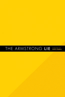
The other day I was looking at this poster:
It’s nice and clean, and stopped me enough to read it and give it some thought.
But I wasn’t thinking about the cheating cyclist; I was thinking about the freedom art direction has over copy.
It’s often said that great art direction is about the creation of a ‘new page’ – a layout no one has done before. This is intended to grab the consumer’s attention by standing out from the other things he sees and intriguing him enough to engage.
But that’s not quite the same as the copywriter’s job.
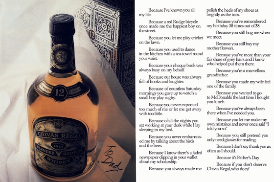
Yes, the writer also has to grab and intrigue, but that must happen after the art director does his job. If the layout doesn’t bring the reader in then the consumer will never even get to the great writing. If your eyes scan the landscape then it’s the art director’s job to draw them in so that they hopefully read something like this:
But writers don’t have all the colours of the rainbow and all the images in history (including new ones yet to be seen) to assist them. Instead they have the rearrangement of those 26 letters and however many words (yes, including the odd neologism).
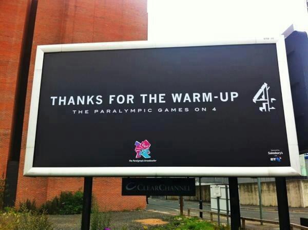
You could rearrange the familiar into the unfamiliar in a bid to pull the rug out from under someone’s thoughts:
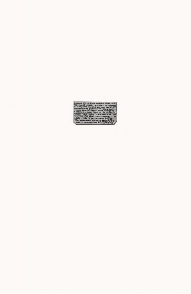
Or you could shock (brilliantly):
But in the end you have to use language, which is already familiar, to attempt to create the same power of originality as art direction.
And that’s what I mean by not working in the same way.
Creating a verbal version of the new page (the new sentence?) is something of a given. Despite the clichés that infiltrate copywriting, even quite poor ads will have a sentence you’ve never seen before. The problem is that it’ll still be boring, or arranged in a familiar structure.
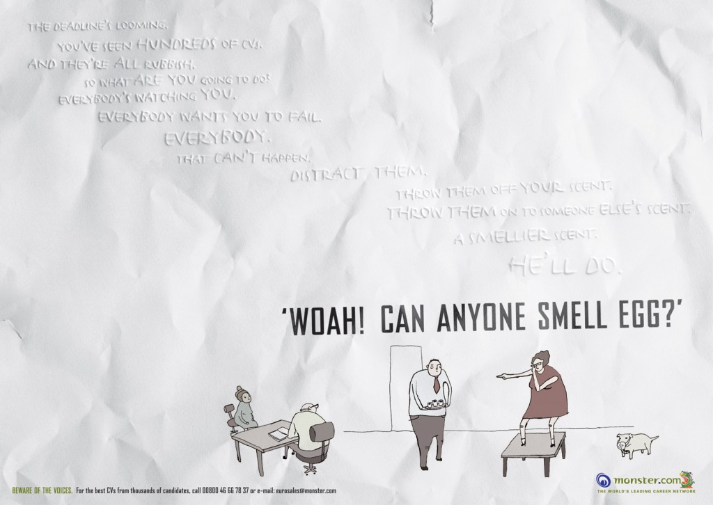
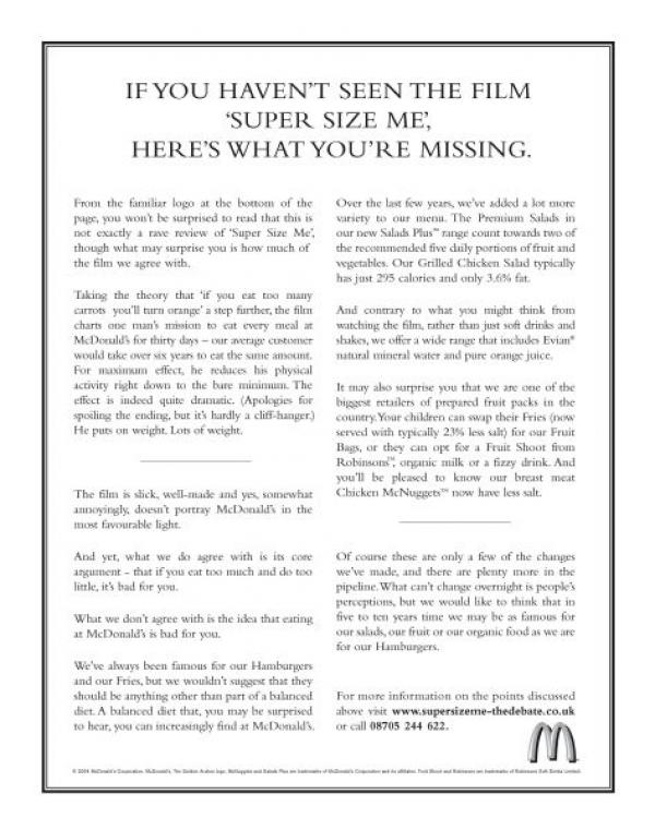
To have newness you need to establish a tone of voice you’ve never read before:
Or use an unexpected tone for a famous client:
So the principles of copywriting and art direction exist in similar territories but those guidelines are used in very different ways to create different processes and achieve different effects.
Maybe that’s why the best ones are usually different people.

Pictures are so BACK 🙂
He’s loving the pictures. Remember the heady feeling when you discovered the clone button on Photoshop?
I always found art directors were a bit more bellendy than copywriters. As a rule of thumb.
It seems obvious now but Bernbach was the first person to spot this.
Before then art assistants sat on a separate floor.
Copywriters wrote the headline and copy (with a suggested visual) and sent it down to the art floor (the equivalent of the studio) for the art assistant to finish up.
Bernbach saw that pictures should sometimes dictate the words instead of just being decoration for them.
Now no-one can imagine it ever being any other way.
…you can tell a copywriter put that collection together….very light on pictures.
If I was in charge I’d have a bunch of creatives, not necessarily in teams, who come up with the ideas and then a bunch of people who’s sole job it is to craft the ideas, whether that’s copy or art.
We’d call the first lot ‘planners’ and the second lot ‘the creative department’.
More posts like this please : ) less about books.
Troll.
The quest for the ‘new page’ has led many an art director up a blind alley that ends up inside their own rectum. Sometimes the best job that art direction can do is leave people to read the words. Over-fussy or trying-too-hard art direction often gets in the way, and art directors would often be better served by starting with, ‘What’s the best way to make sure that someone actually reads this sentence?’ rather than ‘What makes for the most snazzy or unusual page?’ More often than not, they try to achieve it by adding more things- pictures, illustration, fancy typography – what what is often forgotten is the simple art of letting powerful words sit on a page.
No 10 – I completely agree. Sometimes the client gets lost in all of this as the agency goes after the award or tries to justify its fee rather than concentrating on the sale.