Month: July 2016

Bout a mile off old mill road In that spot nobody knows, park the truck and we take off running. Hurry up, girl I hear the weekend.

Enjoy this one-take funny/sad short (thanks, K):

How to clean up graffiti.

Did Wes Anderson design North Korea? (Thanks, J.)

Bruce Lee Jnr:

This is quite fun:

Dude dancing in car (thanks, T):

Headfucking paradoxes (thanks, K).

Great shots of English cities in the 70s (thanks, T).
An oral history of Stand By Me.


Creative Dreams vs prosaic budgets

The budget for your creative endeavour is always an interesting chicken-and-egg situation: do you write something in the knowledge it probably can’t be filmed, then hope, or do you compromise your idea to ensure it fits within the available budget? Oh, and in most situations it’s pretty much impossible to know exactly what the budget is or what it will make available. Go!

Throughout my advertising career I’ve either been given a sketchy neighbourhood idea of the budget or no idea at all, and in some ways that’s how it should be: I don’t know what a cherry picker costs vs a helicopter; nor do I know in advance the price of that that critical music track. My job involved coming up with the best possible idea then working with the production department to make it happen in the best way possible.

But if I come up with, say, an idea about waves made of white horses for my Guinness brief, should I be aware that such a thing would be impossible to shoot without £1m, or should I just think up what’s best and go from there? If the client then turns round and says I’ve got £150k, what am I supposed to do? The two options would be either to trash the idea or to work out how to make it for less (animation, for example). But even then, what would I know about the limits of those two options? The Guinness example is a good one because this question came up after the shoot. The waves had been shot and looked so majestic that the CEO of the agency agreed with the client that the extra £250k it would cost to add the horses was now unnecessary as they already had a spectacular ad on their hands for much less than expected. On hearing this the creatives said they’d resign if the horses were not added and the rest is advertising history. Was it worth spending the extra money? Clearly. Was that 100% obvious to everyone before the money was spent? Clearly not. So the point at which creative vision hits financial reality is a big grey area where one side needs to quantify and value something which is impossible to quantify or value, and the other side has to take a leap of faith.

If a producer says I have another £100k, how can I know what that will buy me in terms of the overall quality of the execution? Should that be spent on a great track, or a so-so track and another week of post? This ad is an interesting example of how hard it is to make that decision:

It looks like a million dollars but actually cost much less because the director loved the ideas and wanted to make it work. So the buildings at the beginning are just painting on panes of glass that were shifted around. And they could only afford to film one crash, so they only had a single shot at getting it right (fortunately they did). It wasn’t cheap, but the compromises in budget were mitigated by an increase in creativity and a willingness on the part of the director to make it happen. This may be the point where the favours accrued on previous full-price jobs are called in to allow for more editing time or extra post. The ad makes the people involved look good so things are shifted around to make sure the finished article is not a let-down.

This issue occurred to me because of a conversation I’d heard about how it applies to the digital world. How much does something cost when it’s ‘only’ going to run online? Usually a production budget is worked out to be around 10% of the media spend, so when that media spend is relatively small (online vs proper TV) that proportion becomes unworkable. After all, a motion picture ad is a motion picture ad, whether it’s viewed on a TV, a computer or a phone. And what about the other ideas that live in less conventional media? How much is a Snapchat Story? What about an Alternate Reality Game? A new product that syncs with the car you’re selling? A giant event that takes over a city square? An installation on the side of a skyscraper? An app that depends on a Michael Jackson song? No idea. Does that mean you shouldn’t think of those things? Obviously not; they seem to get made regularly enough. But having some idea of what a budget can afford will presumably be what stops you wasting time planning a five minute underwater shoot helmed by James Cameron when your client is the local caff.

The question is, where do you draw the line? A pound of gumption or creativity can be worth thousands of pounds sterling, but there has to come a point where you discover that your great idea that needs the involvement of Jennifer Lawrence has zero chance of involving Jennifer Lawrence.

Experience helps you understand when you’re getting in over your head, but putting the shackles on your brilliant idea before it’s had a chance to live is never going to result in greatness.


John Lewis has a lot to answer for

For several years now the ad industry has expressed its jealousy of the John Lewis campaign. initially it simply showered it with awards, then it started to copy it until it was impossible to move for 60-second portions of sentimentality, soundtracked by some soppy git singing an acoustic version of a song you liked until you saw the ad.

The interesting thing about this is the extent which it showed how hard it is to do those things well. If you don’t have a shit-hot creative department and Dougal Wilson to hand it can be very hard for your JL knock-off to rise above 7/10.

However, I kind of hoped we were out the other side of this ‘genre’. Then I saw this:

It’s so John Lewis it might as well be for John Lewis. Little kid? Check. Sentimental expensive song? Check. 60 seconds+? Check. No dialogue? Check.

Alas, it copies the formula but misses everything that makes a JL ad good:

First off, there’s no story. It’s just a little girl walking through an airport. Where is she going? Where is the story going? She’s getting on a plane (yawn) and the story is going nowhere.

Next, the track. I love David Bowie enormously. I got married to Kooks and I even bought the bloody Tin Machine album, but this is not his best track. It’s boring and limp, kind of like the ad.

There are literally no charming or insightful touches (and I include the anvil-heavy swimming-goggles-as-flying-goggles gagette). Check the shot where two people kiss (50″): no emotion, nothing to engage with, nothing for us to take away. She looks in a shop window, she sprays some perfume, she walks about a bit seeing people of no consequence… I’ve watched it a few times just to check I haven’t missed the hidden meaning behind any of this, but I’m pretty sure that’s it: we’re supposed to share in her wide-eyed amazement at visiting an airport for the first time, but like all visits to airports, nothing much happens.

And a owl? A owl?


Now in my younger days I used to sport a shag. When I went to school I carried lunch in a bag, with an apple for my teacher ’cause I knew I’d get a kiss. Always got mad when the class was the weekend.

Slavs squatting in tracksuits (thanks, D).

Utterly brilliant Slightly Wrong Quotes (thanks, T).

Listen to how music taste evolved (thanks, W).

Peter O’Toole and Richard Harris drinking stories:

The Coen Brothers: Green:

One dude’s comprehensive guide to finding your passion.

Dana Carvey quick impressions:

Graphic designer redesigns a movie poster every day (thanks, L).


The science of the poster

My favourite medium is the poster. It gives a poor idea nowhere to hide so the good ones have to be exceedingly good. Also, distilling a message down to a few words, or no words, is a real skill and a necessary exercise in the simplification we strive for in every other medium. If it can work as a poster it can probably work elsewhere, but the reverse is not necessarily the case.

So I found this article on the power of the Netflix image fascinating. It’s about the images people choose from to select their programs, but it goes into all the standards that a billboard has to meet: capturing someone’s attention quickly; conveying a lot with a little; the importance of regional nuances; using emotional imagery to elicit an emotional response…

And you might think they have it easy; after all, people are already on Netflix looking for something to watch, and Netflix already knows their browsing history, so it can serve up the kind of things that might be interesting to someone who likes similar stuff. But Netflix exists in a very crowded marketplace (over 400 scripted shows clutter the airwaves and the internet) and must therefore ensure that its offering provides satisfaction on a regular basis. ‘Sure, I enjoyed House of Cards, but what have you done for me lately, Netfl– Oh look! HBO has a great new show!’ Cutting through the clutter is a very real issue.

This is also an interesting junction of data and creativity: they have a bunch of images, test them in real time with a variety of tightly-focused audiences, and put out the ones that work best, something for which they have conclusive proof. Of course, billboards can’t work in the same way, but I’ll bet most advertisers pay nowhere near the same level of attention to the success of each execution they put out.

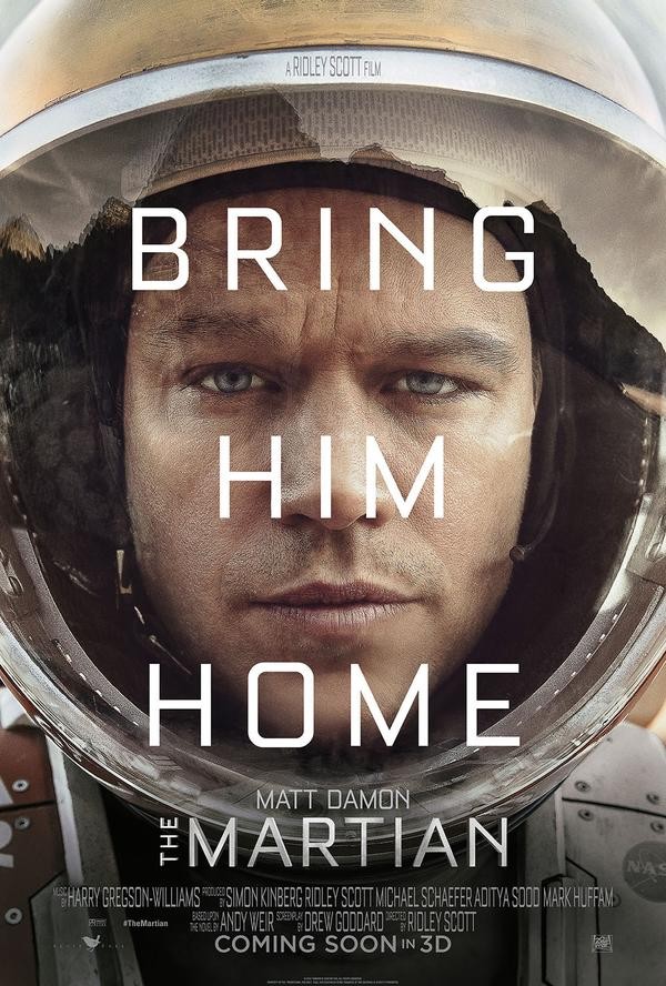
This leads in to a pet obsession of mine: movie posters – where this Netflix stuff meets regular advertising stuff. Although some think recent posters have started to become homogenised, the ability of studio marketing departments to distil a complex story into a single image (and maybe a few words) is something I admire a great deal. And sure, I imagine that there have been as many complicated and ugly posters as beautiful and iconic ones, but try using a single image to convey 120 minutes of a man trapped on a planet reluctantly growing plants with his own poo:

the-martian-poster-600x888


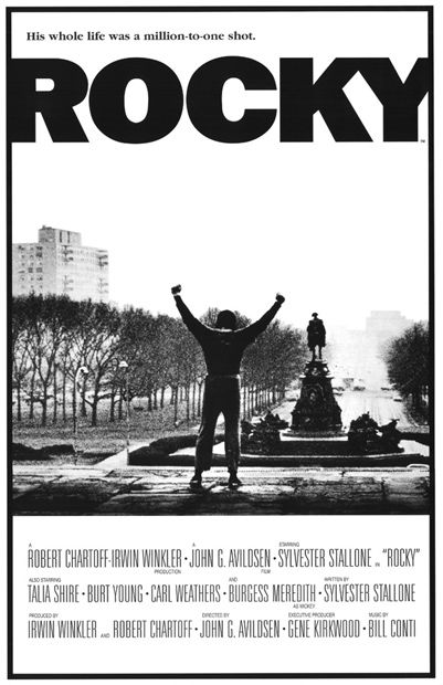
Journeyman boxer flights the odds inside and outside the ring? Better make it gritty and melancholy. See how the image fades off into the distance? That’s Rocky’s hopes, that is.

xmsdu4bjdvxrgrq6rzyr

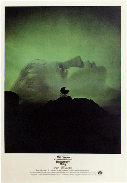
Creepy film? Creepy poster, but it’s also intelligent, so we don’t want any slasher bullshit. And make the image massive to draw you into the tiny words. That way the whole thing is even more unsettling.

zfl61ozws2p8zyafdjks


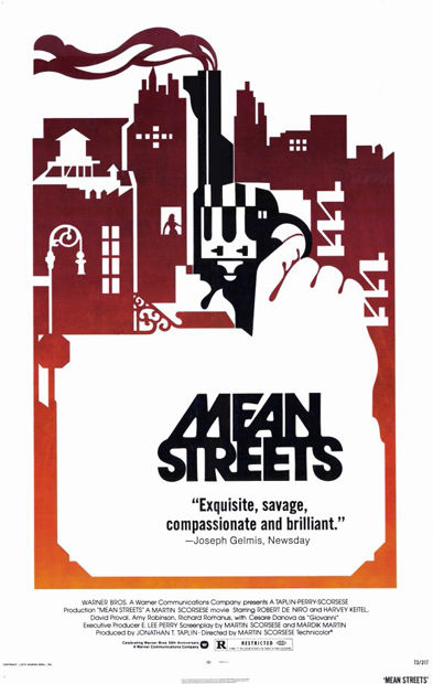
All of you who have done the old visual collision, bow before perfection:

scdadgqhxuhvvqhxcvin

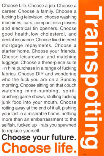
And when the script is this good, forget all the rules of simple imagery; just chuck it up there for all to read:

p4exiqyweegiuctm5maz

When it comes to posters, choose simplicity, choose emotion, choose power.

Choose to look at what movies do and perhaps be inspired.


Splendid new ad for C4’s coverage of the Paralympics

You don’t need me to explain why it’s so good, but it continues the great job of the last one, albeit in a joyously different way.

You remember the last one, don’t you? Still sends shivers down the spine…


Welcome to your life. There’s no turning back. Even while we sleep. We will find You acting on the weekend.

How Taxi Driver ruined acting (thanks, A).

Cool sculptures made of discarded doll parts (thanks, T).

Fantastic men’s fashion ads from the 1970s (thanks, A2).

People from old movies dance to Uptown Funk (thanks, J):

Every goal from Euro 2016 animated:

Charlie Kaufman speaks about his career.

Andrei Tarkovsky’s polaroids (thanks, R).

Samuel L. Jackson’s beginners guide to Game of Thrones (thanks, P):

A ton of stuff about Pet Sounds (thanks, T).


Chekhov’s Gun

Anton Chekhov stated that there should be nothing significant in a story that is either unnecessary or replaceable:

Remove everything that has no relevance to the story. If you say in the first chapter that there is a rifle hanging on the wall, in the second or third chapter it absolutely must go off. If it’s not going to be fired, it shouldn’t be hanging there.

You know the kind of thing…

Daniel’s crane move in Karate Kid.

The glasses in Chinatown.

Buzz Lightyear’s ‘falling with style’ in Toy Story.

But this kind of foreshadowing can go in good and bad directions.

Great movies set up elements you’re generally unaware of because they exist in nuance and character:

In There Will Be Blood Daniel Plainview accepts the story of the man who pretends to be his brother because he invests great importance in the connections of blood that have thus far eluded him.

In Schindler’s List Oskar Schindler saves 1300 Jews from the Holocaust by using the deceit and subterfuge that made his fortune in the early years of the war.

In Citizen Kane Kane’s ultimate unhappiness comes as he searches fruitlessly for the father he was taken from at the beginning of the movie. (Rosebud is another gun in the first act, but as it is mentioned all the way through we can hardly forget its existence or watch it make an unexpected reappearance.)

But bad movies… Shit… They chuck them in there like monkeys flinging turds:

My least favourite is in the film Signs. Just watch this clip and see how little trust the director has in the audience; how many shots telegraph the bat, and the line ‘Swing away’, which is another first-act gun in a collection that looks like the woodshed of an NRA fanatic:

Just as poor is Jurassic World: the moment in the beginning where Owen calms the raptors is repeated towards the end. Then again, the whole thing is a dismal remake of the 1993 original.

Finally, in Pixels Brenner has to win an ‘important’ Donkey Kong game because he lost an ‘important’ Donkey Kong game as a kid. Yawn.

All films use the start of the movie to create the end, but if that use is artless and crass the whole movie can feel like a lazy mess.

So there you go: make your guns as subtle as possible and they won’t go off in your face.


It’s called the rump shaker, the beats is like sweeter than candy. I’m feelin’ manly and your shaker’s comin’ in handy. Slide em across from new york down by the weekend.

Auctioneer beats (thanks, S).

Japanese Trump commercial (thanks, S):

25 gifs explaining how everyday things work (thanks, K).

What happens when you light 10,000 sparklers at once (thanks, T):

The stupidest thing John Hegarty has ever seen (thanks, R).

Hummingbird is pals with dog.


Get a scholarship at the School of Communication Arts 2.0!

Hi Ben,

Hope all is well. I’m a long time reader of your blog and a creative in London, but right now I’m plugging a scholarship competition I am looking after for my old course.

We have just launched our 2016 competion for a place at School of Communication Arts 2.0, worth 12k in tuition. The competition was launched in 2014 in memory of a former student, and it is organised and judged by course alumni.

The URL is http://www.danwallacescholarship.com and the brief is going live tommorrow.

We would love to get the word out to your readers if this is something you would be interested in putting up on your blog?
All the best,
Lewis