The science of the poster
My favourite medium is the poster. It gives a poor idea nowhere to hide so the good ones have to be exceedingly good. Also, distilling a message down to a few words, or no words, is a real skill and a necessary exercise in the simplification we strive for in every other medium. If it can work as a poster it can probably work elsewhere, but the reverse is not necessarily the case.
So I found this article on the power of the Netflix image fascinating. It’s about the images people choose from to select their programs, but it goes into all the standards that a billboard has to meet: capturing someone’s attention quickly; conveying a lot with a little; the importance of regional nuances; using emotional imagery to elicit an emotional response…
And you might think they have it easy; after all, people are already on Netflix looking for something to watch, and Netflix already knows their browsing history, so it can serve up the kind of things that might be interesting to someone who likes similar stuff. But Netflix exists in a very crowded marketplace (over 400 scripted shows clutter the airwaves and the internet) and must therefore ensure that its offering provides satisfaction on a regular basis. ‘Sure, I enjoyed House of Cards, but what have you done for me lately, Netfl– Oh look! HBO has a great new show!’ Cutting through the clutter is a very real issue.
This is also an interesting junction of data and creativity: they have a bunch of images, test them in real time with a variety of tightly-focused audiences, and put out the ones that work best, something for which they have conclusive proof. Of course, billboards can’t work in the same way, but I’ll bet most advertisers pay nowhere near the same level of attention to the success of each execution they put out.
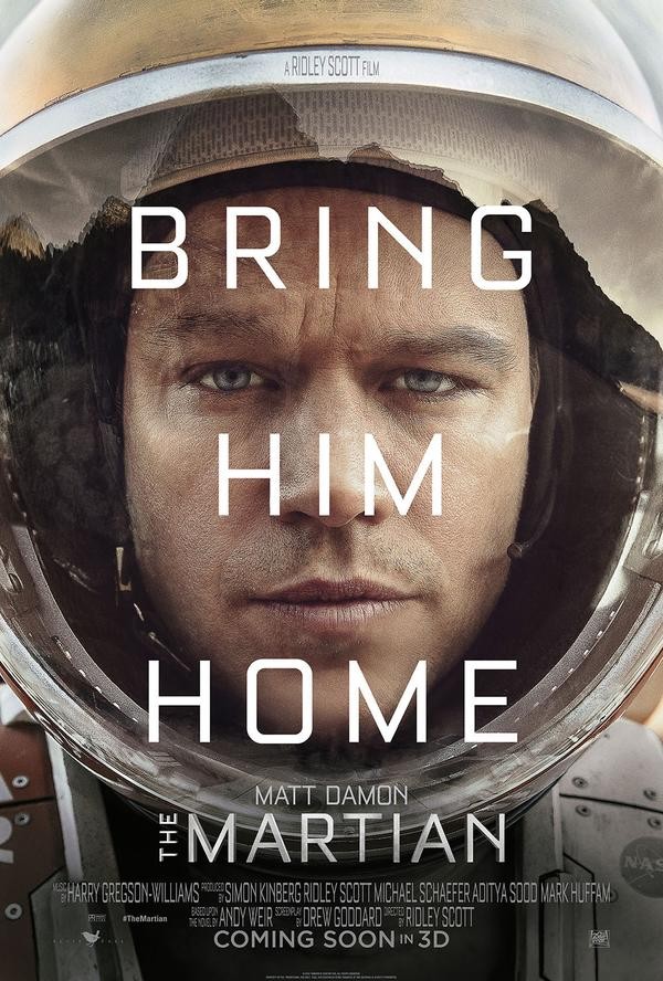
This leads in to a pet obsession of mine: movie posters – where this Netflix stuff meets regular advertising stuff. Although some think recent posters have started to become homogenised, the ability of studio marketing departments to distil a complex story into a single image (and maybe a few words) is something I admire a great deal. And sure, I imagine that there have been as many complicated and ugly posters as beautiful and iconic ones, but try using a single image to convey 120 minutes of a man trapped on a planet reluctantly growing plants with his own poo:
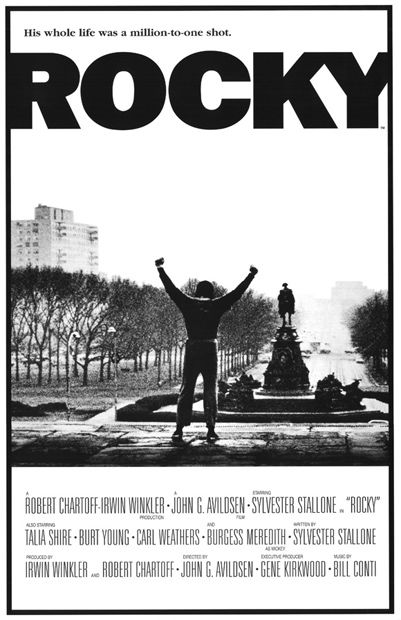
Journeyman boxer flights the odds inside and outside the ring? Better make it gritty and melancholy. See how the image fades off into the distance? That’s Rocky’s hopes, that is.
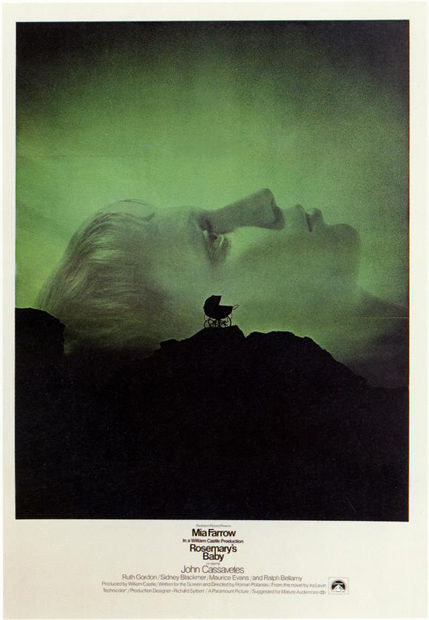
Creepy film? Creepy poster, but it’s also intelligent, so we don’t want any slasher bullshit. And make the image massive to draw you into the tiny words. That way the whole thing is even more unsettling.
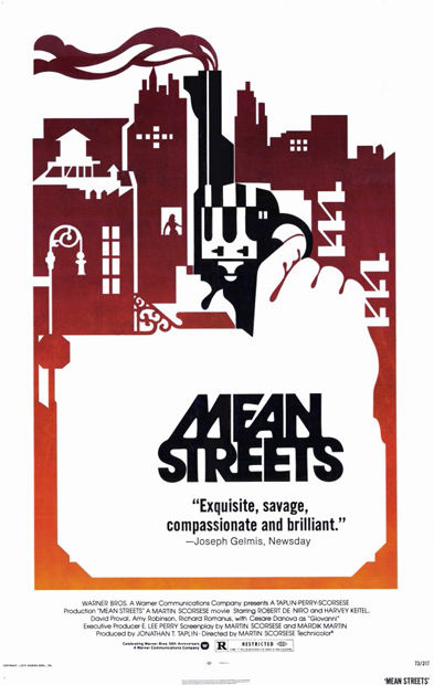
All of you who have done the old visual collision, bow before perfection:
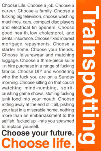
And when the script is this good, forget all the rules of simple imagery; just chuck it up there for all to read:
When it comes to posters, choose simplicity, choose emotion, choose power.
Choose to look at what movies do and perhaps be inspired.