Month: April 2015

Can someone explain this to me?

Screen Shot 2015-04-04 at 08.39.39

I find those logos fascinating.

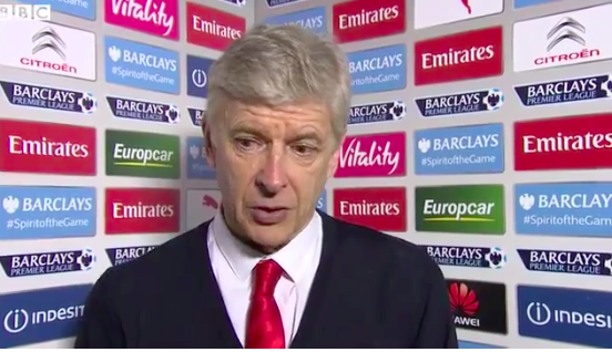
Obviously you get more if you pay for more, but how much is the placement worth?

And how do Puma feel about getting two placements you can’t really see?

And what the hell is Vitality?

And does anyone ask the people not to move about too much for fear they might obscure a 50k logo?

Are seven Emirates logos really doing any more than six, or five?

Is anyone other than me paying any attention to them?

Huawei just paid for one with not great placement, but their logo is more clearly visible than Puma’s. Did they pay more than Puma?

Did anyone see this and use Barclays’ #spiritofthegame hashtag?

Why does Barclays use two different logos?

Would they sell their logo space if, say, Twix wanted one of their much-coveted central stripes?

Is there anything left that could really do with having a nice juicy logo slapped onto it?


seeing the picture beyond the picture

There are layers to a top-class game of football:

People who don’t really care for the sport just see 22 men kicking a ball around on some grass. They have no interest in, or comprehension of, the intricacies of the game.

Then you have people who follow the game a bit. They know that there are four defenders who cover different parts of the pitch even though they work together in a unit. They’ll understand wingers and strikers and stuff like the offside trap.

Beyond that would be people who have perhaps followed the game since they were kids. They know the context, they read the sports pages, they understand whether a game really matters and why. They’ll also be aware of the positions with a bit more sophistication: is a team playing 4-4-2 or flooding the midfield? Perhaps the inferior team is having to ‘park the bus’ against a more skilful group of attackers.

But then there are people who understand the whole thing: they see who’s moving where and why; they understand how a false nine drops deep or why a number 10 plays in the hole. Essentially, stuff like this.

So different people watch the same thing but see completely different things. It’s the same with movies: if you were a top-class cinematographer you would appreciate nuances and achievements with the lighting and framing that an average punter might not. And in music someone might catch all the obscure references David Bowie has jammed into a track, while someone else might just sing along to the catchy melody.

In advertising I find it fascinating to look at situations that I experienced as a junior from an entirely new perspective. Back then I just saw what I believed to be a good idea without the wealth of experience that allowed my CD to more accurately judge the same idea perhaps to be ‘shite’. That CD might also have the greater context that says going for a crazy triple-pike-with-tuck idea might not be wise considering the current mood of the client, instead plumping for the more direct effectiveness of a swan dive, or indeed a bomb. The CD might also think that an idea from a junior team might indeed be better, but the safer idea from the expensive seniors has a better chance of being executed to a higher level of quality.

The CD is seeing the patterns that the junior cannot see, but equally those patterns may be invisible to the Head of Planning or Account Management. They might not even be that clear to the CD, who could be going on instinct and might not even know exactly why he chooses this photographer over that one, or at least it may be much harder to articulate.

So the better you become, the more of the game you can see. But does that make you better at it? Not necessarily. If it did, all the Bowie nerds and footy geeks could be producing Hunky Dory or sitting in the dugout at Emirates. Having said that, you can’t be Bowie or Wenger without seeing the patterns; you just need the extra bit that then gives you the belief and ambition that makes you think you can apply them successfully.


Dove: beautiful/average

Here’s the latest Dove film that supposedly attempts to make women feel good about being what society has made them believe is ‘average’. Or something:

https://www.youtube.com/watch?v=7DdM-4siaQw

This is actually a very complicated issue that is being dumbed down through oversimplification (here’s a Guardian article on the ad and one from Buzzfeed that was removed under controversial circumstances that make Unilever (and Buzzfeed) look a bit cunty). A giant conglomerate (Unilever who, as I have mentioned many times, makes Lynx/Axe, the product whose advertising has objectified women more than any other) attempts to advertise one of its brands by marking two doors either ‘Average’ or ‘Beautiful’. That way we can see how women feel about themselves and make some kind of statement that society has been bad or wrong for making women feel as if they are average instead of beautiful. Apparently, according to a survey commissioned in an entirely unbiased manner by Dove, 96% of women regard themselves as average

There’s a behind the scenes film, but it’s more concerned with showing how difficult it is for the (mostly male) team behind the ad to travel to lots of different countries in a short space of time. So I am left with some questions…

What do the doors lead to? A shop? A museum? A lap dancing club? Why are women going through them at all? This is important because if I saw two doors marked ‘Average’ and ‘Beautiful’ on the front of, say, a department store I wouldn’t even think I was supposed to be making a choice about how I supposedly feel about myself. I don’t believe all the ‘Averages’ really thought they were downtrodden, depressed women with low self esteem who demonstrated this feeling by their choice of door.

In addition, there are plenty of women in this film who are objectively beautiful (including the very first one and one who appears to be a model at 3:17). Where were the 25-stone ladies, or the old age pensioners? Would they have messed the film up a bit by being clearly ‘average’ (or below average)?

Why ‘Beautiful’ vs ‘Average’? By definition most people are average: average intelligence, average height, average beauty. That’s what average means: the typical value in a set of data. It’s a long time since I did statistics as part of my degree, but depending how you want to impose parameters, a full 50% of people might well fit into any definition of average, with 25% of outliers, in this case ‘ugly’ and ‘beautiful’, at either end. It seems to me that many of the women making the average choice did indeed fit into the definition of average in terms of their physical appearance. And here’s the important thing about that: THERE IS NOTHING WRONG WITH THAT. Unless we’re going for the Disney definition of beautiful in which we say that ‘we’re all beautiful inside’ etc. (which really has nothing to do with Dove, which exists purely to enhance your outward appearance) then there are people who are more or less beautiful as far as a generally agreed definition of certain traits of physicality (eg: long, shiny hair instead vs bald, or smooth, clear skin vs covered in varicose veins). Dove ain’t saying that bald women with varicose veins are ‘beautiful’, so what are they saying? That women should definitely evaluate themselves on the basis of physical appearance, but they should be more positive about it. Is that a good thing for the objectification of women in general? I would argue not.

So I have some doubts about the mechanics of the experiment, and I have other questions about whether or not it really empowers women or makes them relate to themselves in a more positive way.

What I have no questions about is this: many giant companies will fling out any old bollocks to cynically manipulate people into parting with their money. The less we fall for it, the better.


Stab and step and repping and run, packing a weapon is wild. Peace to the brothers on Rikers Isle. Tough enough and trembling, blend in like the weekend.

The influences of Star Wars (thanks, A):

Awkward boners (thanks, J).

Where do airport codes come from? (Thanks, D.)

Professor Stanley Unwin meets the guy who does the voices for Bill and Ben (thanks, A):

Quite the artwork (thanks, T):

So much great Apocalypse Now shiz.

Aaron Sorkin on loving dialogue (thanks, B):

https://www.youtube.com/watch?v=_fT3FbSiJu4

The anatomy of a Facebook status update (thanks, P).

Tom Cruise: stuntman (thanks, J2).

Henry Miller’s writing advice (this is really good. Thanks, G).

DHMIS4 (thanks, J):


Side project time…

Brydon writes:

misterMrs is currently looking to partner with a talented pattern maker or clothing designer, preferably in the LA area. 

Founded by husband and wife duo Brydon & Sharlene Gerus, misterMrs is a wardrobe for postmodern humans. A bold stance against the frivolous cycles of fashion that hold no meaning. 

Clear your closet. Clear your mind. Simplify your life. 

Comprised of a 5 piece all black wardrobe cut uniquely for men and women, misterMrs empowers you to focus on the things that matter while not having to sacrifice on style. 

Sharlene is an account director who has worked with some of fashions biggest names in fashion, including Mario Testino and Vogue. Brydon is an international art director who has created many campaigns for the world’s greatest and most loved brands. He is also the founder of the ADCAN awards. 

please get in touch at info@mistermrs.com

Screen Shot 2015-04-06 at 22.47.43


A niche request? Yes, but if you are in that niche, this is the thing for you.


RIP Ron Brown

Who was Ron Brown?

I think many of the people who knew him would answer with the sentence, ‘David Abbott’s art director’. That’s how the title to this remembrance piece begins and, if we’re going to be honest, that’s what defined him professionally.

But Ron Brown did not merely exist in the shadow of the greatest ad man this country has ever produced – he was too good at his own job for that to happen. Of course, he had some fantastic words to play with, but he sure knew how to bring them to life. And let’s face it, David could have chosen any art director on Earth to work with, but he chose Ron, and not only as an art director, but also as a business partner and friend. That’s an endorsement that says more than all the awards (and there were many) they won put together.

Here are two of my favourite of his press ads:

unnamed


6a00e5532538c48833010535e7b339970c-320wi


Neither has a headline but they work all the better because of it. Was that David’s idea or Ron’s? Whoever it was only one of them had to make the end result work.

If memory serves he continued at AMV for maybe five years after David left, gracing the agency as a charming, friendly connection to a time when the industry was populated with gentlemen. He was a genuinely lovely bloke and always had time to offer advice or chat about the old days.

RIP Ron Brown’s copywriter’s art director.


‘Volvo’s’ reflective paint: *sigh*

Here’s someone else’s post about Volvo’s reflective paint.

In case you don’t have time to read all that, here’s the two word summary: it’s bullshit; Grey London has simply rebranded someone else’s product with a Volvo logo. Why? Could it possibly be to win a Cannes Lion or two?

According to the Wired article on the subject:

The spray-on reflective paint appears to be a simple rebranding of Albedo100’s Invisible Bright product. LifePaint is a branding partnership between Volvo, creative agency Grey London, and, of course, Albedo100. In other words, it’s possible to get a similar (if not identical) product here in the US. It’s just not branded as LifePaint.

If you’re wondering why, if LifePaint is intended for fabrics, there’s a brightly glowing bike in its promotional materials, that’s probably a little bit of misdirection on Volvo’s part. Albedo100 also has more permanent solutions in its stable, including “Permanent Metallic,” which is designed to be sprayed onto bikes, signs, and stenciled patterns. That could be what’s lighting up the bike, rather than LifePaint itself.

Yes, kind of odd to recommend the temporary fabric paint for your bike when there’s a more permanent metallic version. Also  interesting that the website doesn’t mention Volvo developing the paint at all (probably because it didn’t). To clarify, this is like Persil Automatic ‘rebranding’ Dyson vacuum cleaners or London Zoo ‘rebranding’ Cadbury’s Animal biscuits. And now that I’ve written that word so many times, I have to say that I’ve never even heard of a ‘rebranding‘ of this nature. I’ve only ever heard of companies rebranding their own products (Jif to Cif or Marathon to Snickers). Is this really a rebranding? Or even a ‘branding partnership’? WTF is a branding partnership anyway? So many questions for a simple purchase/borrowing of one company’s product by another much larger company for purposes that seem really quite strange…

On the positive side, this story has been all over the internet, so I guess it’s caught the imagination of the public, or at least the related websites that are hungry for a story. I suppose it’s also good for the people who have obtained a can of the spray and used it to possibly avoid being hit by a car on a London road at night.

On the negative side it’s unclear how many people fall into that category. The site doesn’t let you buy any, and it appears only to be available as a freebie at a few bike shops around London (I wonder why it’s not for sale. Is it perhaps too expensive for Volvo to subsidise the product of another company to look like they care about road safety? After all, Volvo is a massive corporation that could surely put some distribution muscle behind such a worthy innovation). It all seems a bit weird and complicated with a bunch of inconvenient difficulties being masked by subterfuge.

And that brings me on to the other negative side of this: I’d be delighted if someone at Grey London corrected me, but it appears very much as if someone at the agency came across this niche safety product and persuaded its vaguely related client to… um… Here it gets a little hazy: have they persuaded Volvo to ask to kind of licence the product or promote it (paid or unpaid? No idea) somehow? Clearly they don’t actually make it and equally clearly they haven’t bought the paint manufacturer or its patent so that they ‘own’ this innovation, so I’m a bit confused. What’s in it for Volvo and what have they done to bask in the reflective (pun very much intended) glow of this product? Also, I recall from my time at AMV that Volvo hasn’t traded on its safety angle for many years. They wanted to move away from that, so is this a first step back into that territory? Via the medium of someone else’s spray paint?

If I were a slightly cynical person I’d have to say that this looks a lot like Grey saw a Lion opportunity and did what many scamsters do: they retrofitted someone else’s brilliance onto one of their clients in order to spend a lot of time walking up to podiums at awards shows.

It’s like this:

That was originally a short film by an excellent animator called Tim Hope. The film was bought, a Playstation logo was added to the end and awards were won. However, that happened in the pre-YouTube days, where every ‘inspiration’ was not so easily found. Since then, after the Cog rip off furore and its many, many children, the slapping of a logo on an existing piece of work has been somewhat frowned upon. Despite it often producing some excellent advertising it has also produced a great deal of dismay and embarrassment because it made our job look easy and its practitioners lazy. After all, if you could just spend a few days trawling the internet for whatever’s interesting, find a tenuous connection to your client and put its logo on the end, why would you deserve to be well paid? A creatively-minded student on a zero-hours contract could get pretty close to what your six-figure adland creatives are supposedly capable of, which is why so many creative departments now look as if they’re composed more substantially of the former than the latter.

Has it caused such problems? Well, take a look at creative salaries these days and compare them to their pre-internet juiciness. Coincidence? It might be, but of course it isn’t. The people who pay our wages listen as we call them up, cravenly rubbing our hands together like Uriah Heep, as we beg ever so ‘umbly for the chance to run this little knockoff spot at 3:30am on Granada Men and Motors. Then they think we’re just a little bit more pathetic than they thought we were before the request. Then they remember the whole incident when it comes to financial negotiations. Of course, they didn’t come right out and say it when the figure at the bottom of the contract was a little less than last time, in fact it may not even have been a conscious decision, but somewhere in the back of their minds they thought a bit less of us and acted accordingly.

This can of paint bollocks is just another example of that. I’m sure it’ll be voted into awards shows from London to Lebanon, then held up by stupid people as an example of what we can achieve if we’re allowed to innovate, to truly be let off the creative leash, but in the end it’s just another nail in the coffin for advertising’s credibility. It’s not solving a business problem for Volvo, and the only skill it’s demonstrating on Grey London’s behalf is the ability to produce award-winning work from the easiest of non-briefs, then negotiate permission from a client to be allowed to play a silly little game called ‘Win The Pencil’.

I think it’s appropriate on Easter Sunday to say Jesus fucking Christ…


Fuck you, I won’t do the weekend.

Obama talks drugs with the creator of The Wire.

Fine Cameron satire:

And more of that from the peerless Cassetteboy:

Loads of great Third Man stuff.

The gif connoisseur (thanks, J).

Really enjoy the hell out of National Corndog Day (thanks, G).

What was Bowie doing at your age? (Thanks, J).

Tunnels were planned from the Playboy Mansion to Jack Nicholson’s home (thanks, J).

Tarantino profiles supercut (thanks, J):

And Pulp Fiction up close (thanks, J):

Great article on why Tidal will fail (thanks, D).

Gluten-free gallery (thanks, B).