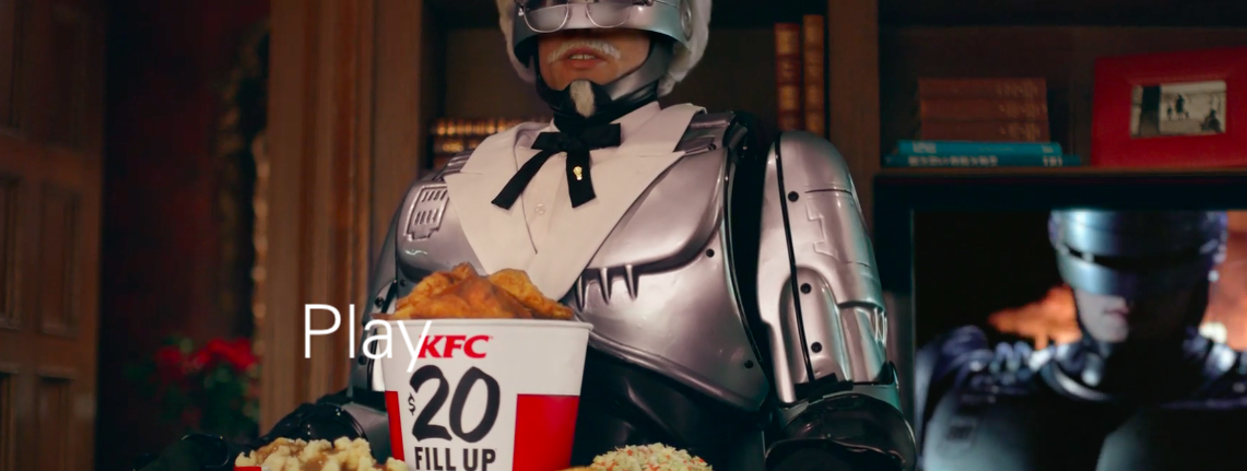
My favourite ads of the decade, number 7: KFC.
The best thing I can say about W&K’s relaunch of KFC is that I simply cannot believe any of it actually happened. And by ‘any of it’, I mean one insane new twist to the campaign after another.
It makes the ideas of ‘brand consistency’ and ‘matching luggage’ look utterly ridiculous. Of course, it has brand consistency in spades, but not the kind of execution-to-execution similarity most mealy-mouthed marketers mean. It doesn’t give a fuck about the typeface or whether there’s a piece of punctuation in the same place each time. Instead it insists that each execution brings the crazy, the cool, the likeable, the conversation-worthy, the original, the distinctive, the noticeable, the envy-inducing and the sheer fucking brilliant.
If you’re not jealous of this work, a) you don’t have a pulse, and b) you have no idea what makes advertising great and how hard it is to do. This is integrated work taken to another level, by an agency on top form. And it wasn’t just indulgent wankery: a decade of declining sales turned into four years of growth.
Congrats to all involved.
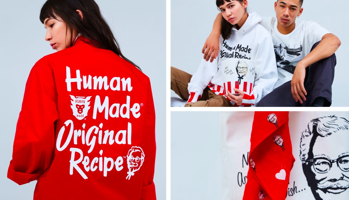
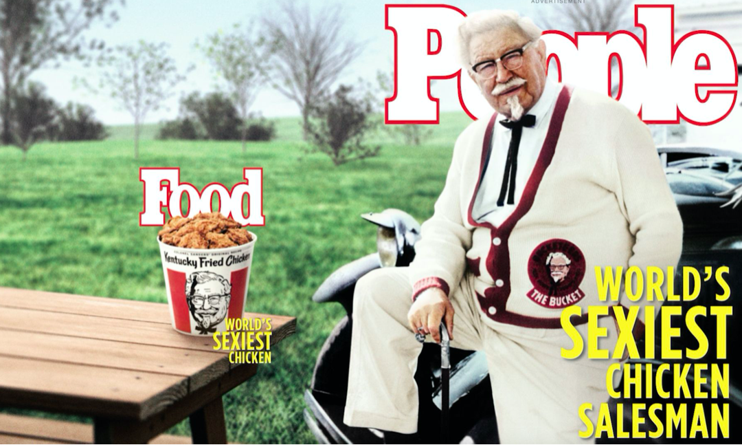
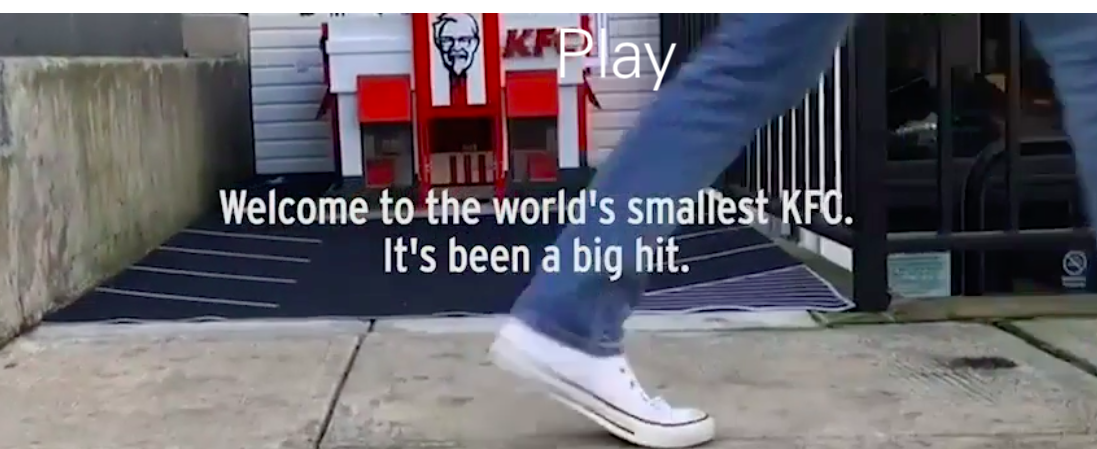
Some of the greatness can be viewed here, but these images should give you an idea of the breadth and depth of the work:
