That Timex Billboard: I’m confused.
Last week’s LinkedIn was dominated by two things: a CEO who cried because he had to get someone on his staff to fire some other people on his staff, and that Timex billboard.
The reaction to the CEO thing was kind of fun, but it was the Timex billboard that inspired me to write this post. Actually, to be more accurate, it was the reaction to the Timex billboard that inspired me to write this post.
I’m confused, but in a good way. It caught fire, but I’m not sure why, so exploring that might help educate me in some way.
(By the way, I’m very aware that writing hundreds of words about the fact that hundreds of words have been written about that billboard is also kind of weird, but here we are.)
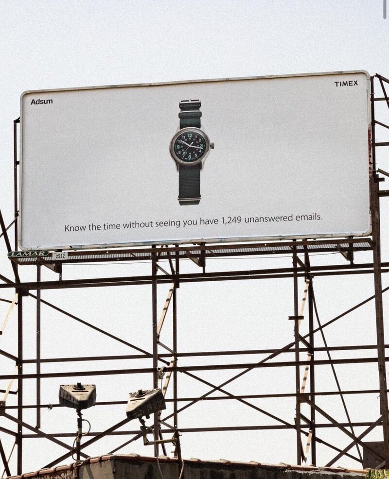
Let’s start by talking about the ad itself. Fascinating thing number one is that lots of people were praising it to the heavens. Positive comments on LinkedIn, Instagram, Reddit and even in articles included, ‘Love this – very clever!’, ‘This is brilliant’, ‘Excellent billboard’, ‘I have serious respect for brands that commit to who they are rather than jumping on the latest trend’…
Fascinating thing number two is that lots of people were not praising it to the heavens: ‘Too wordy. Everybody knows what the brand is and what it does’, ‘Clever ad poor execution’, ‘The line feels like the prop the planner wrote’.
Many people went so far as to rewrite the line: ‘Love the sentiment but a bit long. Some quickfire alts: “Nothing but Time”, “Disconnect In Style”, “Sync With Simplicity”. ‘The line could have been something as simple as “Tells Time, looks timeless”.’ How about “It’s time’?
Many others actually re-art directed it:
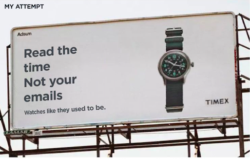
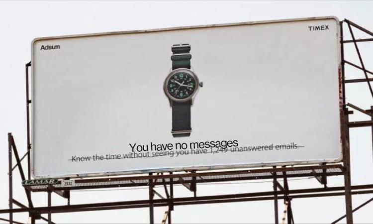
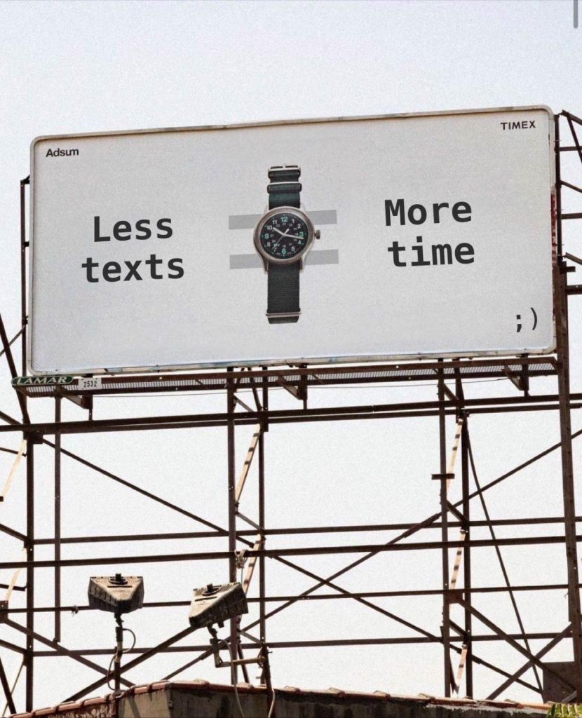
(I have no idea who did the above, or the rewrites. I kind of like the last one, but I don’t think i’d understand it without the additional context of the original line.)
I actually wrote my own little post on LinkedIn expressing amazement at the time people spent discussing this ad because it’s actually (drumroll please…) fine. That’s it. Not great, not bad. Fine.
Look, I get it: it went viral. It touched a nerve. It captured a zeitgeist. It inspired 5000 comments on Reddit and hundreds more on LinkedIn. People engaged with it far more than they do with 99.9% of ads. And that means it’s good, right? And any criticism I’m about to offer is surely born of bitterness or jealousy or being out of touch, or having no taste.
Sorry. No.
I don’t know if it was a slow news week (we are in August, after all. The newspapers call it ‘Silly Season’ because there’s so little to write about, silly stories end up running. Then again, in America it has been an insanely unslow news week, but we all have tiny attention spans these days, so…) but it rose to the top for reasons other than the quality of its strategy, concept, copywriting and art direction, which (see above) are not ‘excellent’.
Here’s a fundamental reason why: if you read any of Dave Trott’s wisdom you’ll know that one of his unarguable maxims is around binary briefing. In short, you’re either the market leader, in which case growing the market is a good idea, or you’re not, in which case growing market share is what you need to do. So if you’re not the biggest-selling watch brand, you need to say something about your watch that makes it different to the others. If you’re not doing that, you’re simply helping the top brand sell more. This billboard reminds you of a fact that applies to literally every non-smart watch on the planet (it only tells the time), so unless Timex is the market leader, this is not the right kind of advertising to create.
Here, for your illumination, are the top selling watch brands with over an estimated $1 Billion in US wholesale sales:
- Rolex $4.5 Bn USD
- Omega $3 Bn
- Apple $2.5 Bn
- Fossil $2.3 Bn
- Cartier $1.8 Bn
- Citizen $1.6 Bn
- Seiko $1.4 Bn
- Patek Philippe $1.2 Bn
- Longines $1.2 Bn
- Swatch $1.1 Bn
Quora also tells me that the top selling watch at a group level is Swatch Group, with annual revenues of around $10 billion, but that is split between several brands, including Blancpain, Omega, Longines, Tissot, Mido, Hamilton and Rado. The top seller in terms of number of watches is Citizen.
See? Education! I bet none of you knew all that.
However, I also bet all of you noticed the absence of Timex. It was harder to find comparable figures, but it seems to have annual revenue of $1.2bn wordwide, which explains why it’s not in that US-only top 10.
And that explains why it should grow its brand with something specific and not the category with something generic. You might argue that staking out this anti-smartphone territory will give it some specific brand attribution, but that would be very charitable. That billboard is not well branded (tiny, indistinct logo; a watch that looks like lots of other watches; a small line that’s positioned in a place that makes it hard to read; sharing the space with a co-brand called Adsum), and you might again be very charitable and say that it’s anti-branding, or more in keeping with the lo-fi vibe of Adsum, but this is also $1bn+ Timex, not some obscure little underdog. We’ve all heard of Timex, so why try to hide it when you’re trying to sell it?
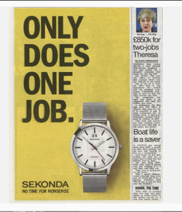
So it’s technically not ‘excellent’ in positioning terms, and that positioning is not even original. Sekonda, a very reliable but inexpensive watch, has been using this strategy for years:
Also, the Timex typography is hard to read and the line is long for a billboard, and it indeed feels like it’s taken directly from the brief (although I kind of like the way it’s not ‘addy’, or trying too hard). I’d also argue that it’s not much of an insight: you can find out the time without being bothered by all the other stuff that’s on your smartwatch. But people like the other stuff on their smartwatches; that’s why that other stuff is there – you chose to put it there and pay a lot for the watch. Most people don’t have 1000+ unanswered emails, but if they didn’t like that situation, they’d answer some of them. It makes no sense.
So the strategy is generic, the copywriting is OK (funnily enough, all the people who had a go at improving it actually wrote worse lines), the art direction is either deliberately trying to look as if it’s not trying or it’s just not good.
And no offence to whoever is responsible. It’s just another billboard. I could throw a stone in LA and hit ten others of the same kind of quality…
…but again, the billboard went viral and the watch has apparently sold out, but I’m not in the watch world enough to know if this is a big deal, or anything to do with the billboard. Limited edition watch collabs now have people queuing around the block, and you have to get on a waiting list to buy even the lowest-level Rolex, so did the ad help to create the hype, or was it unnecessary? Like all advertising ‘successes’ it’s hard to say. Advertising (promotion) is just one of the four P’s of marketing, so this might have been the sales driver, or it might have been the website, or the price, or something else entirely. People who love this billboard will say it was the billboard, but unless you work for Timex/Adsum you literally have no idea if that is the case.
Part of me wonders if we’ve just realigned our standards so much that this is seen as revolutionary/original/excellent. But it’s none of those things. It’s fine. It’s better than average, but so are millions of other ads.
So here I am at the end, but I don’t feel I found the answer. In fact, I feel exactly how I did when I first saw the post: like I’ve just seen another decent ad that I’m going to forget as soon as I stop looking at it. But now that I’ve added 1200 words to the conversation I may not forget it for a while.
I certainly agree that all the people who thought they were improving the line just made it worse. I also agree the art direction is very generic/unmemorable. However, the thought behind the ads apparently struck a nerve. Sometimes that happens. If the watch sold out it did its job A digital ad that had that effect would be hailed as “Revolutionary.”
Adsum is a NY based clothing/lifestyle brand that uses a collab strategy for part of their collection. As such, it would seem the ad was purchased under the adsum brand banner with timex playing second fiddle in the overall branding.
My attempt would be:
Time. Less text. [Watch) Timeless.
I had the same thoughts about the last Predator film when I saw that people found it “WOW”, “modern classic,” and “a masterpiece”. It’s fine. It’s watchable. There is so much stuff around us… we are flowing in so much diarrhea that if a turd flows on top of it, it becomes a model of excellence.
Three of my new copywriters are aged 20-23. They came from digital agencies. I did a little training for them. I showed them the lege artis campaigns – they saw for the first time the Economist, Guinness, Innocent, etc. campaigns. I wanted to demonstrate that copy could be captivating, inspiring, human, and funny. More than “low prices”, and #. Although they found it “really interesting,” one of them told me: “This is old stuff. Today, you don’t need it. I don’t need it for my supermarket newsletters”.
So, I spent my Saturday rewriting all of his newsletters to prove my point. On Monday, the client was ecstatic. “From now on can we do the newsletters in this style?” – she said. I proved my point, right?
At the end of the week – when we bill the client, we got the question: “Why does it take you 6 hours to write 8 newsletters when according to the contract, you need no more than 2? From next Monday, I want my newsletters done in the old way” So, yeah, I think as old folk, as “boomers,” we care about things that are not important anymore.
I’m starting to wonder if this was intentionally bad, which seems to be the trend now (though you could also point to lack of education – or care – as lubomir states), which would be genius considering it’s virility – and we would all be the punchline.
Just found this article while looking into ads that poke fun at AI like that billboard about how AI couldn’t do this. Thought I’d let you know because this may be a cool time to bring this blog back up.