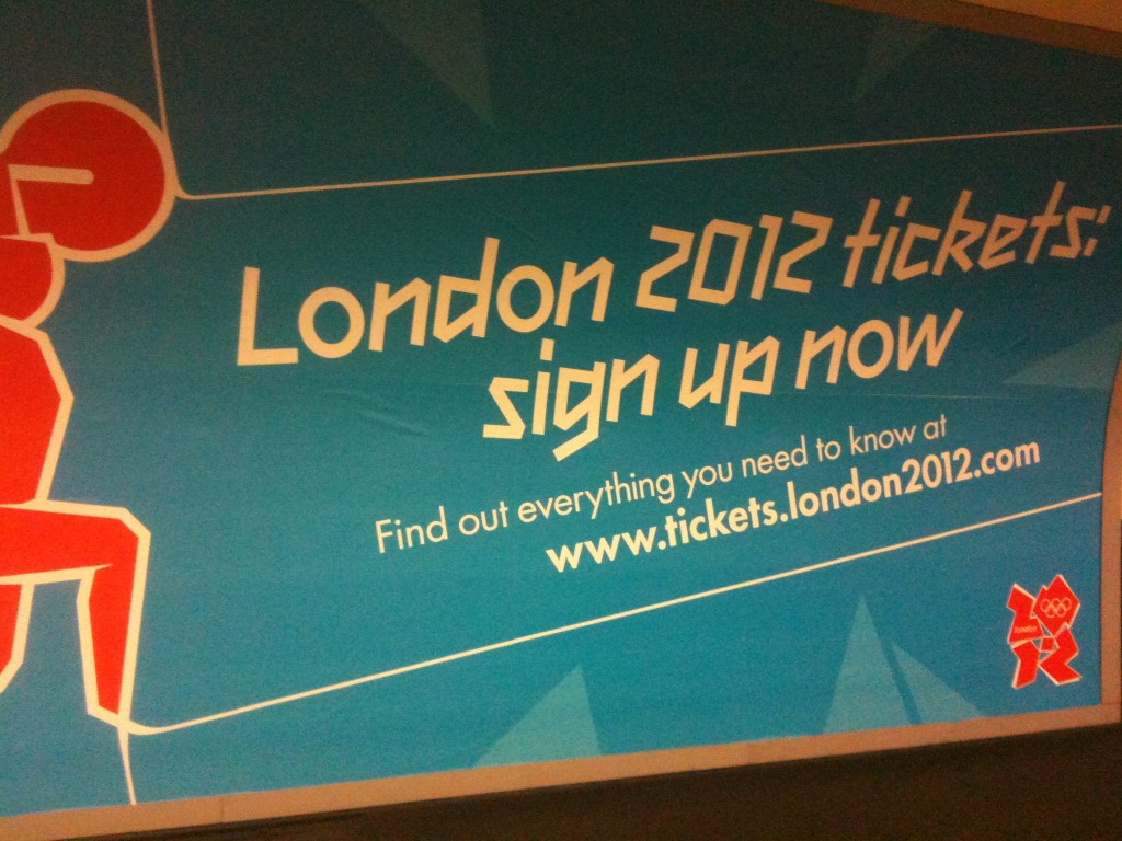
If you thought the Olympic logo was shit (of course you did), check out the Olympic typography:
Posted in Uncategorized
Is that the worst typeface in the world or what? It makes Comic Sans look like American Typewriter.
Sorry, I’ve just noticed that there are at least three fonts on that poster (that’s often another indication that your typography is shit). I meant the one that looks like it was put together by a bunch of top typographers whose hands had been burned to stumps in the same Magimix accident in which they acquired motor neuron disease and were brutally blinded in both eyes.
I hereby christen it ‘Olympic Abortion Sans Bold’.

I actually like the logo – in a jazzy, 80s way. It reminds of The Fresh Prince of Bel-Air, which is no bad thing when it comes to branding for high-profile sports events.
The font is technically, probably quite heinous but has the same appeal. It’s a bit celebratory and looks like ticker tape/medals/tape you run through (do people still run through tape?) I think everyone’s being a bit po-faced about the design.
And I think that’s 2 weights of Futura there – come on, that’s permissible!
hey ben, we live in a remix culture. that is what those trend reports said. ergo, no one should have a problem with two or even three typefaces crammed in. and that olympic abortion sans bold is fucking cutting edge and goes nicely with the picassoesque image showing a tall guy helping a wee guy to close his zipper. do the vatikan send a team? either way, shut up you fools 🙂
Chalk another triumph up to The B men. That’s right, it’s another one from Bodkins. The client said he wanted something leany forward and spikey, then he showed us the font he had drawn himself. So we did that.
Kerching!
While the typeface’s oblique form lends it a sense of movement and urgency, it’s a bag of shite really. I mean look at the ‘doesn’t-look-like-it’s from-the-same-font’ lower case ‘o’. Shameful.
Yeah…surely that ‘o’ should be a sort of cacky rhombus.
There’s two fonts. 2012 and Futura.
The headline font was signed off by the client before it was tested. I think it was Wolf Ollins.
So the typographer isn’t too blame, and I wont even get into the brand guidelines. They pretty much decide the outcome of an ad before you’ve even started. And the client is a flaky as a kid with Eczema.
And take it from somebody whose worked with the Olympic branding.
And no, I didn’t do that work. But you should no the facts before you speak Benjamin. You’re talking about it, so it has obviously got your attention, even if it is in a bad way.
No wonder we didnt get the world cup!
What I do not understand is that they had a perfectly good logo for the bid, why couldn’t they have used that for the games.
–
It had the classic river Thames shape in the Olympic colours winding through the number 2012. Job done surely. Also as that logo was awarded in a competition, surely politeness would be to give the agency a crack at the biggie, rather them give it to Wolf Ollins or Bodkins (the safe pair of hands.
—