No diggity! You know what I like the playettes. No diggity, no doubt. Play on playette, play on playette. Yo Dre, drop the weekend.
Posted in Uncategorized
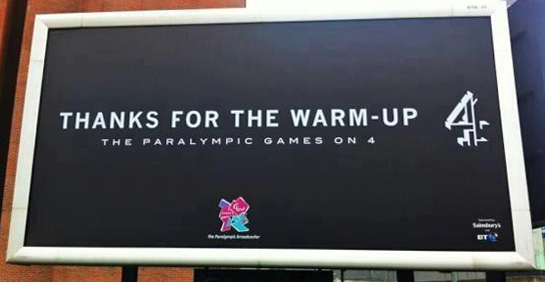
My favourite ad of the decade made me think the exact opposite of what I had thought before I saw it. An opinion I’d held for decades disappeared in the space of 90 seconds, replaced by a better one; one that was more inclusive, compassionate and wise.
You see, I used to think ‘handicapped’ people were actually handicapped. I remember when the ‘PC’ phrase ‘differently abled’ popped up in the 1990s, only to be dismissed with laughter: these people weren’t different abled; they were disabled. They were lesser. Disadvantaged. Worthy of not much more than sympathy and pity.
Well, in 2012 an incredible piece of strategic reframing, married to a fucking brilliant piece of film, said bollocks to all that:
The message is perfect, and it’s the ultimate case of ‘show don’t tell’, so you have to accept that these people are just amazing, more amazing than the athletes you’ve admiring for years.
You can’t do any of that stuff with your four working limbs, but they can, no matter what ‘disadvantage’ they might be dealing with. I’ll admit that I feel like a bit of a failure when I watch this, but weirdly enough, I also feel utterly inspired and invigorated.
Great strategy, great message, but also great craft. To convey the right tone here takes superlative direction, impeccable photography, smart editing, a brilliant track, and little moments of witty sound design that keep you transfixed from the first second to the last (I particularly love the five seconds in the middle that show three ways people end up in the Paralympics: a car crash, a bomb and a pregnancy, but with no undercutting sentimentality).
The campaign was accompanied by this excellent poster:
And of course that all led to another classic ad four years later:
Also fantastic, but as it could never have the strategic surprise of 2012, for me it didn’t quite have the same power. However, the fact that they expanded the whole message with so much fun, verve and creativity meant that it was a worthy successor.
So that’s my number one ad/campaign of the decade. Thanks to everyone who made it, and the other eight on my list. You all showed us just what the industry is capable of: entertaining, thought-provoking, behaviour-changing, funny, touching, emotional, transcendent brilliance.
My thirteen-year-old son thinks Old Spice is cool. He’s too young to remember the old days when it was a cheesy joke. He just knows it as that body spray stuff with the really, really, really funny ads:
So many classics, and they’re all part of why I love this campaign, but I’m mainly talking about The Man Your Man Could Smell Like:
I don’t know how many times I’ve seen that ad, but like Skittles Touch and Guinness Surfer, it’s one I could happily watch again and again. Maybe it’s the writing; I’d never heard anyone put English words together like that before, and I still haven’t. Maybe it’s the performance; listen to the way he says ‘The tickets are now diamonds!’. Funny every time. But it’s probably the in-camera special effects; even though I know how they’re done, I still can’t quite grasp them:
OK, so it’s funny and endlessly rewatchable, but look at what it did: in 30-seconds it took a pathetic, laughable, dead old brand, and made it strong, cool and alive. There’s nothing logical about body spray ads – they’re offering a smell, and you can’t smell through the TV. And even when you go to shops and take a sniff, one person’s Old Spice is another person’s Lynx/Axe Apollo. The scent doesn’t really matter. You just need to be able to justify your choice if someone asks what that smell is, or sees a can in your bathroom. This ad made that easy.
And it’s Proctor and Gamble. I know they’ve done some great stuff recently (see It’s A Tide Ad), but before TMYMCSL that entire company was known for scientifically making the worst, dullest, most detestable ads on the planet. I once did two days freelancing at Grey London (before it was cool), where I learned of the P&G formula for ad structure. It was fucking depressing.
So this is a perfect example of the power of advertising. It showed us what great creativity could do for a nothing product. It showed a massive, boring company how to resurrect a massive, boring brand. It showed our industry that there were no bad briefs; only bad answers to them. And it showed us all, that in the midsts of the digital confusion that began to grow around our feet like weeds, that a 30-second piece of brilliance was capable of making something famous, successful and, yes: cool.
It’s what we’re all supposed to be aiming for, every day.
They hit the bullseye.
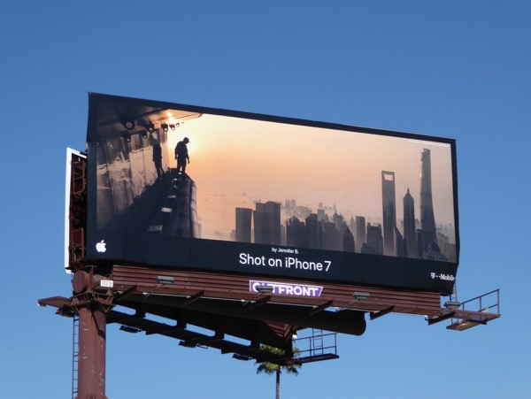

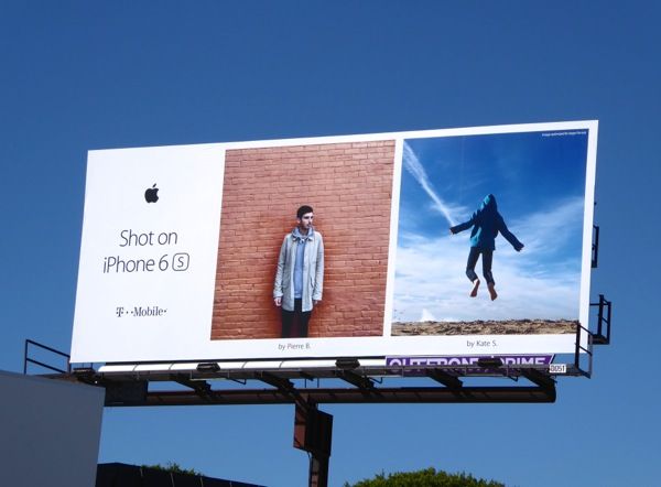
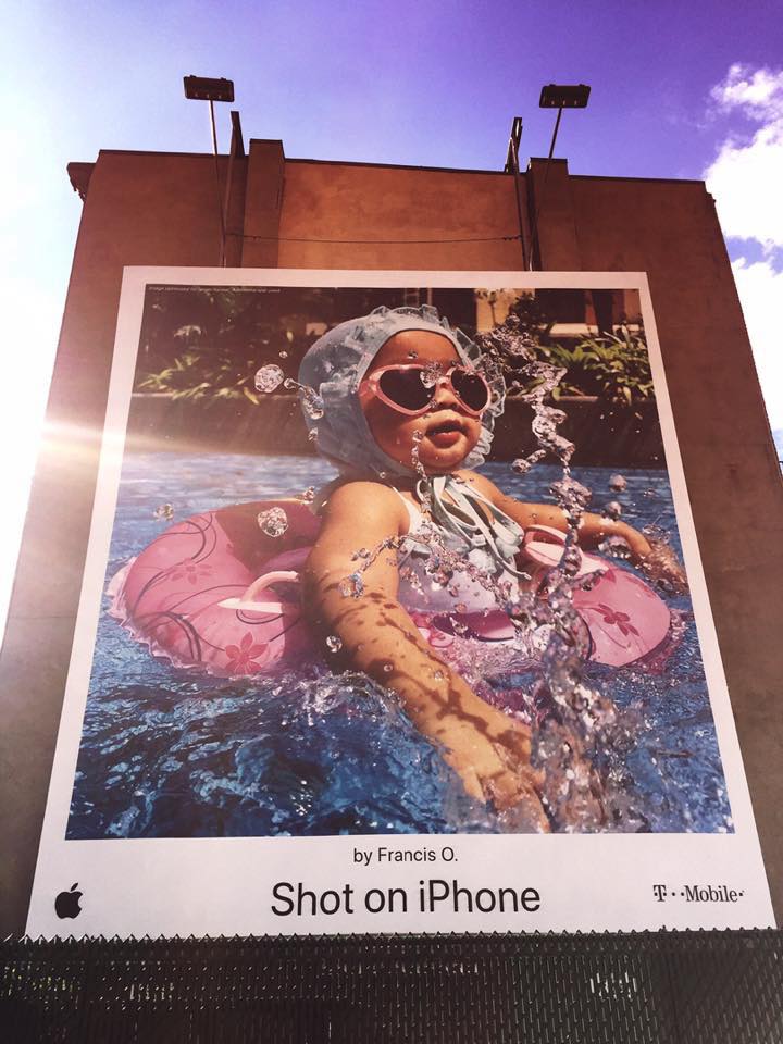
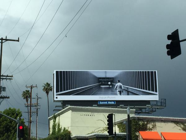
OK, so I’m a little biased. This campaign originated from my former agency, TBWA/Media Arts Lab, and I was one of many people who had the privilege of working on it (actually, one of the things I love about Shot on iPhone is the way in which it has allowed so many people to contribute to it. Big shout out to all my MAL brothers and sisters and aunties and cousins etc.).
Each year’s theme requires some conceptual thinking, but the original idea of displaying some of the photos shot by iPhone users didn’t exactly feel Earth-shattering. In fact it had been discussed at various points for a couple of years leading up to its actual launch, and I don’t recall anyone ready to die for it. It wasn’t an obvious winner like Mac vs PC or Think Different, but it soon became apparent that it would be a classic so long as we were prepared to exercise a different discipline: having the courage and confidence to get out of the way of something that was already brilliant.
So when it was finally framed as a ‘World Gallery’, it had the strength and substance to allow something apparently simple to get on its feet, head out into the wild blue yonder and spread its wings across the world. You’ve probably noticed that it’s still running several years later, and there’s been no drop in quality (some of my favourites are from this year’s ‘On Tour’ campaign).
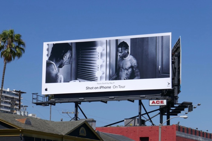
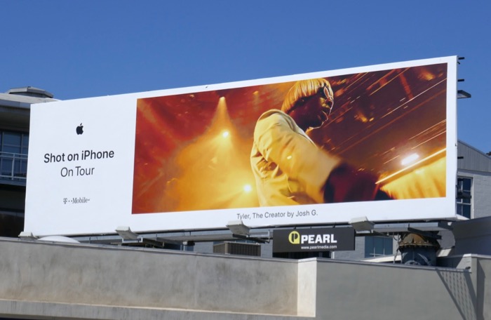
So a campaign for the biggest company in the world has run for half a decade (so far), creating hundreds of executions, in dozens of countries, using the whole range of emotions, and will always be supplied with fresh material, and isn’t even limited to the still image:
And I haven’t even mentioned what I like best about it.
The number one reason I love this campaign is that when its foremost creatives were collecting their Cannes Grand Prix, I was hundreds of miles away, smiling at one of the stunning executions on a grim, rainy day in Shepherd’s Bush.
Yes, it runs for real, and improves any environment it graces, from Seoul to Southwark to San Francisco. How many poster campaigns can you say that about?
Like tomorrow’s number 3 choice, this is a very interesting campaign from the point of view of advertising and how to create it.
When I was at college, I was taught to prize the idea above all else. ‘Yeah, but what’s the idea?’ was the most withering put-down you could apply to someone else’s work, and for good reason: conceptual rigour was the (supposed) underpinning to an campaign’s strength and longevity.
It took me a long time to realize that this was not only bullshit, but that many of the greatest ads of all time had no discernible concept. From VW ‘Lemon’ to Budweiser ‘Wassupp’, execution could easily trump idea.
Which brings us to The Truth Is Worth It from Droga 5 and The New York Times. I don’t know what the team originally presented, but the idea, ‘Show what journalists go through to get the stories that appear in the NYT’ doesn’t sound that interesting or original.
Then you see the finished ads, and you realize technique and craft is all you need. Top-class writing, editing and typography take these stories and make them far more compelling than anything you read in the paper or see in the news.
I don’t think I’ve ever seen writing or typography like this before. It hooks you, adds to the story, and makes you think far more than straightforward words would. Every letter has been thought through to give us an improbable combination of matter-of-fact honesty and emotional heft.
One further point: this campaign appeared at a time when the New York Times was under fire from and undermined by some pretty powerful people: the stakes were much higher than the average toilet roll ad.
I’m not sure the team could have come up with anything better.

I can’t seem to move for decks.
Every time there’s a new stage in the creative process, a new deck is started. Sometimes (shudder) it’s a Google Doc; if I’m really lucky it’ll be in Keynote. But sure enough, if ten minutes have passed, somebody, somewhere is starting a decky old deck for me to contribute to.
Like everything I complain about in this series, I’m going to point out the fact that at some point, way back in the mists of time (usually the 1990s, but in this case I feel like deck proliferation didn’t really start until five years ago) there were no decks, and yet really, really good ads still managed to happen. How? Like the action of Russia, it is a riddle, wrapped in a mystery, inside an enigma.
I finally hit peak deck when I was asked to prepare one for sending to a potential director. I didn’t understand the task, so I tried to elicit further explanation without looking like a thickie. Apparently it’s now usual to get decked up when asking a director if they’ll lend their talents to your ad. It’s like the exact reverse of a treatment, in that you start off by telling them how much you love their work before presenting your vision of the ad to see if it might pique their interest.
Now, I’ve made quite a lot of TV ads in my time, and never have I felt the need to persuade a director to get involved via the medium of a deck. Like the treatment, I would expect all that to be covered in an initial meeting, where some back-and-forth would take place over what’s often referred to as a conversation. You can explain that you want to reference Boudu Sauve Des Eaux, and they can tell you they were thinking more Bad Boys Two, and you can meet somewhere in the middle. If you do that by deck the whole thing is implied to be far more set in stone, and not to be messed with, limiting the parameters the director might feel able to worth within.
Also, the only time it ever seemed appropriate to add extra persuasive material to your script was when you wanted turn-of-the-century Glazer, Budgen or Kleinman. You might then add a kind of arse-licky note to see if it might get you a little closer to the front of a very long queue. Sending ‘pretty please with a cherry on top’ decks to no-marks? Odd…
But that’s just one of the modern decks. The main ones are internal, where a lower team night be putting together a presentation for someone further up the chain. This is where we experience the real horror of deckitude: collaboration.
Because a deck is open to many people (the strategy people might do slides 8-12; the account team the opening and closing etc.) it is subject to ‘contributions’ from those people. So you get delightful ‘comments’ from people you’ve barely met (the comment is made, then a notification is emailed to you, then you address the comment with a further question, or you resolve it and move on to the next one) and everything is a lovely, friendly democracy, where no one’s opinion is more or less significant than anyone else’s. Some cheeky fuckers from other departments might even change your work without asking you, FFS.
And you might finish a deck, or think it’s finished, but then the person who’s been away for a few days finally comes back, has a read, and changes things based on zero awareness of the previous 342 comments and resolutions. And you don’t really want to spend a morning explaining why you can’t make the suggested changes, because then you won’t really look like a team player (COLLABORATION ÜBER ALLES!!!!!!) and it’s what used to be referred to as a ‘massive fucking waste of time’, time that could be better spent on weird, extraneous tasks like, I dunno… making the work better.
But then you have a deck. And you pore over every detail of that deck. But then the person you’re presenting to had an earlier meeting that ran over, so they’re going to skim it on their phone in the car to the airport, and you might as well not have bothered.
Then there’s the length.
My God, is there ever the length…
A deck isn’t really a deck until it’s over 25 slides, but I’ve seen some (I kid you not), that clocked in at the several hundred slide mark. Even at 30 seconds a slide (not a chance in hell), you’re talking four hours. And if you’re talking four hours you’re also talking boredom and toilet breaks and suicidal tendencies. People will often justify those extra slides by saying ‘We’ll whiz through these’, only to find that the person you’re presenting to would actually prefer to ‘whiz through’ your favourites and dwell deeply on those fascinating graphs about projected reach in Q4 of year three.
We’re supposed to be all about economy of expression, masters of communicating important shit in as few words as possible, but when it comes to decks there’s no upper limit. You need the kitchen sink, the belt and braces, and woe betide you if you leave out uncle Tom Cobleigh and all.
Does that make us look good at what we do? Don’t answer that. Instead I’d like you to respond via a Keynote deck for a half-hour meeting that will take a minimum of 45 minutes to go through.
So could we please declare a moratorium on decks? There’s already enough work to do without literally multiplying our output by three, and concentrating harder on aligning the images to the template borders in slides 10, 11 and 12 than working out what those images should be and how the hell they relate to the concept. If we all jump off the coming-up-with-ads process two hours earlier to kern the fuck out of the intro slides we’re not helping the client or ourselves. We’re just wasting precious time on the twin Gods of 2019 advertising: quantity and ‘collaboration’ (always in inverted commas for reasons that are grimly obvious to everyone reading this).
Any time we could return to quality and specialisation (and decks for pitches only) would be fine by me.
Does my list have eight ads, or nine? To tell you the truth, in all this confusion I’ve forgotten myself. But being this is a 44-advertising blog, and could blow your head clean off… Hang on… Clean? Is this a Tide ad?
Ever since Lee Clow, Steve Jobs and Apple invented the ‘Superbowl Ad’ in 1983, there’s been intense interest in the commercials that run during America’s biggest TV occasion. It’s where the big clients pay the big budgets to look big in front of the biggest audience.
But in recent years it’s been a bit desperate. Apparently there always has to be a ‘winner’, but it feels a little like the Superbowl advertisers have been going through the motions, with nothing really taking the occasion by the scruff of the neck.
Until 2018.
Yes, only a massive advertiser like P&G could have the resources to pull it off, but look at the crazy shit they bought: an ad that mercilessly skewers the clichés of advertising genres and tropes (many of them used by P&G); an ad that bleeds into ads for other brands; and an ad that pulls the rug out from under you again and again and again.
And the spots are funny. Properly, funniest-ad-of-the-year funny. The team, client and agency didn’t just rest on the cushion of a great, expensive idea; the rammed home excellence in execution, in one spot after another.
So, for dropping a grenade of pure, culture-shifting brilliance into the biggest advertising occasion of the year, it’s one of my favourite ads of the decade, and it’s a Tide ad
Way back in 2015 I was briefing a few teams on iPad. Some of the work was due to run on preroll, so I brought up the fact that we all hate that media space with a passion, smashing the ‘Skip Ad’ button like an epileptic woodpecker until the offending crap leaves our screens.
I had no idea what the solution might look like, but to me it seemed essential that the first few seconds should grab the viewer’s attention with enough power to divert them from the ‘Skip’ button.
During the development process the perfect answer arrived, but it wasn’t from one of my teams; it was from The Martin Agency on behalf of their insurance client, Geico. (To be honest, the whole Geico campaign is probably worth a ‘best of the decade’ mention. It’s consistently some of the best stuff that runs properly on TV over here.):
I concede that they didn’t manage to maintain the level of humour through all three executions (funny how hard it is to do that. From the outside it looks like it would be easy to come up with another 10/10 hilarious one of these, but like Economist lines, further classics are much harder to come by than it might appear. In fact, kudos to the team for coming up with a campaign idea that seems like it would be easy to continue) but the reason I love these so much is partly the ads themselves, but to a greater extent it’s the genius of turning something so hated into something so loved.
99.9999% of preroll is both dreadful and loathed. If I gave you the brief to make it so loved and memorable that you would look forward to it, laugh out loud at it and share it, I think you might consider that to be a tall order. But that’s what Team Unskippable did. And not only was it all those good things, the spots were fully branded and actually worked really well:
Geico Senior Marketing Director Amy Furman said the ads have clocked more than 14 million views, and clearly got people to check out Geico. “The campaign ran during some record-level mobile and online quote time frames, and I think that can be attributed back to the campaign,” she said. Moreover, “there was a huge amount of sharing, not the kind we always get when repurposing our TV ads.”
So that’s why they earn their spot on this list: they’re clever, funny, effective and original, but they were also able to turn a blast of diarrhea into vintage Krug, a feat I have yet to see emulated.
I know the chorus to the Dumb Ways To Die song.
So do my kids.
So do millions of people who are never going to be hit by a train in Melbourne.
How many ads have their own Wikipedia entry?
How many ads feature sick deaths, yet still appeal to kids?
How many ads feature a song written by the copywriter, that charted in three countries?
How many ads have won the most Lions at Cannes? One, obviously.
How many ads have been banned in Russia for inciting suicide AND spawned three video games?
How many ads have inspired 85 parodies?
How many ads have reduced ‘near-miss’ train accidents by 30%?
How many ads have given us a range of toys and pajamas?

How many ads gave us a song that was used in the 45th episode of the seventh season of the Chinese dating show ‘If You Are The One’ during a contestant’s introduction video?
How many ads have shaped culture like Dumb Ways To Die?
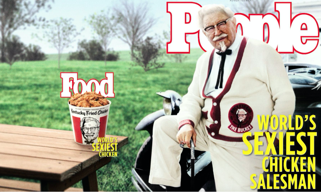
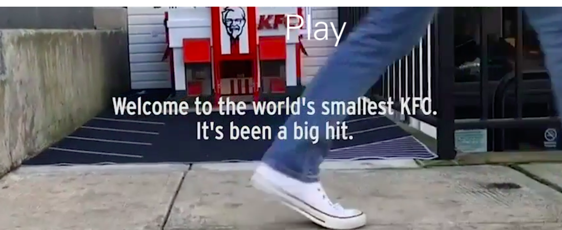
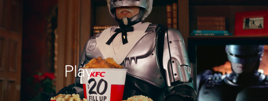
The best thing I can say about W&K’s relaunch of KFC is that I simply cannot believe any of it actually happened. And by ‘any of it’, I mean one insane new twist to the campaign after another.
It makes the ideas of ‘brand consistency’ and ‘matching luggage’ look utterly ridiculous. Of course, it has brand consistency in spades, but not the kind of execution-to-execution similarity most mealy-mouthed marketers mean. It doesn’t give a fuck about the typeface or whether there’s a piece of punctuation in the same place each time. Instead it insists that each execution brings the crazy, the cool, the likeable, the conversation-worthy, the original, the distinctive, the noticeable, the envy-inducing and the sheer fucking brilliant.
If you’re not jealous of this work, a) you don’t have a pulse, and b) you have no idea what makes advertising great and how hard it is to do. This is integrated work taken to another level, by an agency on top form. And it wasn’t just indulgent wankery: a decade of declining sales turned into four years of growth.
Congrats to all involved.
Some of the greatness can be viewed here, but these images should give you an idea of the breadth and depth of the work: