Execution vs Campaign

Have advertising standards fallen over recent years? Obviously, by which I mean it’s clear that Bronzes of the past are now Silvers and even Golds. So far, so blah, but I feel I need to poop the current party just a little further.

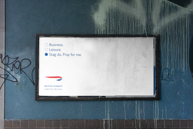
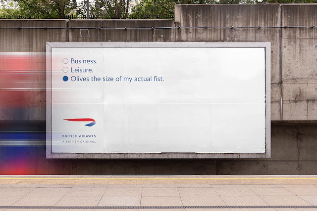
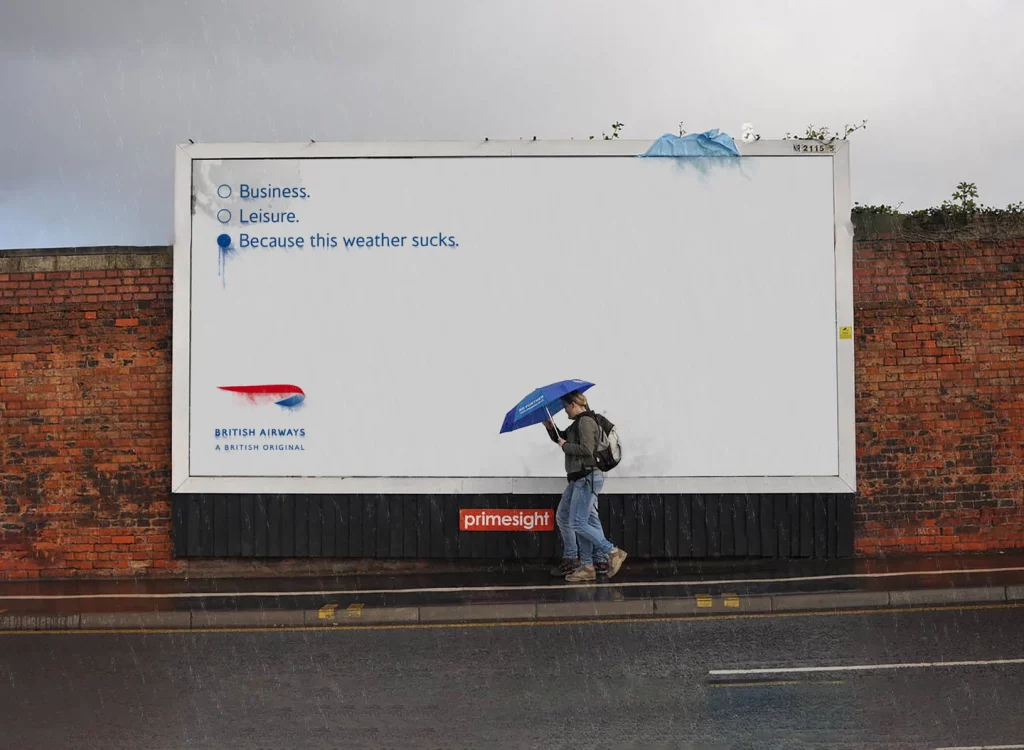
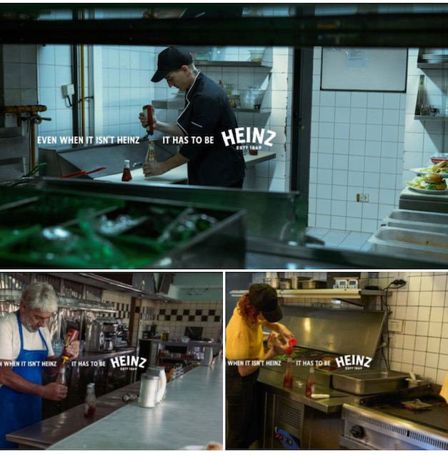
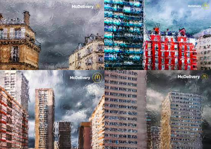
There’s been a spate of highly-awarded, or at least LinkedIn-wanked-over, campaigns that have a glaring fault. See if you can spot what it is:

That’s right: these campaigns are simply the same execution multiple times (one of them might also be a scam campaign, but that’s another point for another post that I’ve already written several hundred times). Sure, they’re slightly different, in that they are set in slightly different places, but that’s not really enough, is it?

I grew up at a time when ‘It’s the same ad three times’ was a withering, campaign-killing insult. If someone said that to you, and you possessed any self respect, you would pop back to the drawing board and add a fresh element to differentiate each one.

It might be a new visual, a new line, or an entirely new angle to the concept, but it would not be a slight change of location. The point of creating and paying for a new execution should be to add a further dimension to the campaign; a new point that can express additional information or entertainment.

You might love the above campaigns, but you’d be hard pressed to argue that each subsequent execution adds any more than a soupçon of further enjoyment to any you’ve already experienced. I would in fact wager a great deal of money that unless these executions ran next to each other, no member of the public would think there was any difference between them at all.

I have a feeling some of you might want to point out that the McDonald’s executions show that you can deliver to an office as well as a home, but big deal: that’s information anyone with an IQ over three would already know, so it doesn’t count. 

‘Ooooooh look! I saw that they delivered to houses but I had no idea they delivered to places of work!’ said nobody, ever.

You might ask about the reasons behind doing a second or third utterly pointless execution, or, on the flip side, the reasons behind stopping at three or four. Why not do eight? Fifteen? Thirty? Is it the expense? Sure, but someone needessly paid for number two and number three. Where’s does their largesse end? I have a depressing feeling that the answer is that these can now be entered for campaign awards as well as those for single executions. And maybe when pitch time rolls around four basically identical executions on a creds slide might look better than just one.

And that’s what I mean by falling standards. The creative teams, CDs, ECDs etc., along with account people, clients, award juries and LinkedIn masturbators have all given these campaigns a mighty slap on the back. I’m out here as a lone voice in the wilderness, pointing out something that to me seems blindingly obvious: they are a really, really good ad (except maybe the suncream one, which smells strongly of scam), but a mediocre campaign.

I imagine some of you think I’m being a picky bastard who, like some sad Oasis fan, won’t shut up about how much better the old days were, but I don’t care. Come at me with a decent refutation of my point and I’ll get back in my box.

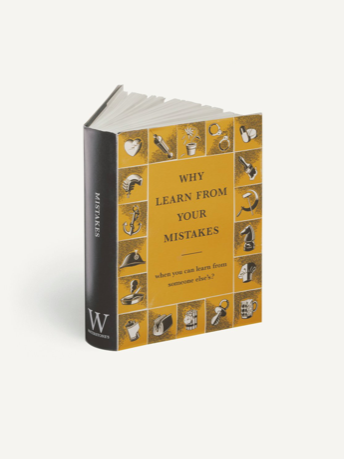
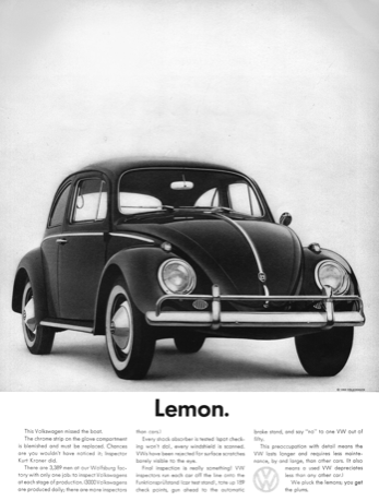
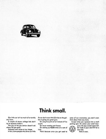
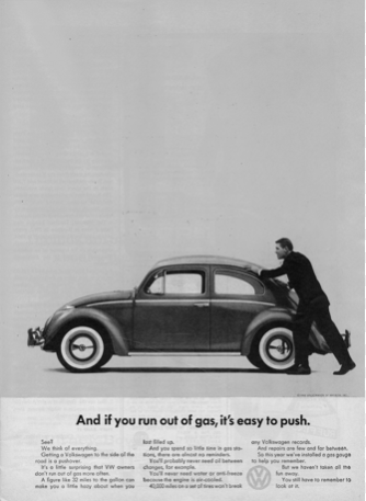
Until then, here are some campaigns that are proper, actual campaigns. If you can’t spot the difference between these and the others, then I’m afraid I don’t know what else to say.

Etc…


The Greater Inclusivity Of An Industry That Usually Needs To Include As Many People As Possible

Every ten years The British Film Institute releases its survey of the greatest films of all time. 

For decades the number one film was Citizen Kane, although it dropped down to number two in 2012, replaced by Vertigo. However, last December something seismic happened: the 34th best film of 2012 became the top film of the latest survey.

For the uninitiated, Jeanne Dielman, 23 quai du Commerce, 1080 Bruxelles is a three-hour-long feminist masterpiece about a housewife who also happens to be a prostitute. Is it better than Citizen Kane? Well, that’s where things get interesting.

For the 2022 survey the BFI widened their survey considerably, with 1,639 participating critics, programmers, curators, archivists and academics each submitting a top ten ballot, up from 846 in 2012. This meant many more women and a much wider range of nationalities contributed, and their choices angered many traditionalists.

Where was Raging Bull? Dr Strangelove? Wild Strawberries? And what was the 2019 upstart Portrait of a Lady on Fire doing at number 30, ahead of Some Like It Hot?

Well, all those maligned films were made by straight white men, and this snapshot of 2022 has less respect for their supposed greatness.

As I looked through the survey, full of films by women and people of colour, I couldn’t help wondering what would happen if a similar list was created for advertising. 

Thinking about the so-called greats of yesteryear, the vast majority were created by straight white men (interest declared: I am a straight white man). Did that make a difference to the extent to which they were appreciated? Straight white men on award juries voted for ads created by straight white men and, unsurprisingly, found that they liked them, but would they hold up today? Sure, some might seem dated, but we don’t excuse films on that basis; many cinematic greats hold up today, even though they were made a century ago.

Of course, there aren’t quite as many critics, programmers, curators, archivists and academics to ask, but we do have a society that appears to be having its say. We now have advertising that is far more inclusive, diverse and aware. Is it as good? That depends on who you ask and how you assess.

The more I think about older award winners, the more I wonder if there was a consideration of quality based on an unspoken collective standard that was dominated by the opinions of straight white men. That’s not to say they they were all bad, or that they all need to be reassessed in the context of 2023, but you can find plenty of knockabout violence, casual sexism, and life generally viewed from their point of view. 

If you didn’t like that kind of thing then you were, in one way or another, ‘wrong’. The sports, booze, video game and car ads were the best of the best, and if you found merit in something else, then you were less likely to win prizes or promotions.

We can never really know for sure, but the awards world has certainly changed. There’s certainly been a move away from the those attitudes, with John Lewis and its knock-offs, Channel 4 Paralympics, Like a Girl, Fearless Girl, Libresse, This Girl Can, Nothing Beats a Londoner (much more inclusive Nike advertising), globally inclusive work from Apple, and (for better and worse), much more social purpose.

A full-on allegory can be found in the output of Unilever, which went from the most sexist campaign of all time (Lynx) to the compassion of Dove’s Real Beauty work. That change happened in the late 2000s, and if you want to go into more detail, simply follow Lynx’s ads over the last twenty years and see how much less offensive they have become.

So something happened. Maybe juries became more diverse. Maybe society responded to Brexit and Trump. Maybe the new mouthpieces of social media strengthened marginalised voices. Maybe we evolved. But it’s now hard to imagine many of the ads of the 90s winning awards today. Straight white men are still in many leadership positions, but far fewer than there used to be. Many of that generation are aging out of the industry, and the ones that remain are having to get with the new programme. 

Corporations understand that one wrong move towards intolerance or sexism could provoke a twitter storm that might affect their share price, so they’re not going to accept that kind of work. The old guard might decry it as ‘woke’, but as we all know, anyone who uses the word woke in a pejorative sense is almost certainly not worth listening to.

I find myself watching TV ads from Britain and America, marveling at the fact that all-white casts are practically non-existent, in the same way that POC casting rarely happened in the 1990s. Even if you lament the disappearance of 1990s-style ads, you can probably appreciate that this is a good thing for society as a whole.

So here we are, standing side-by-side with Jeanne Dielman, casting a glance in the rear view mirror at the disappearance of a set of values that have had their time.

Of course, more change is on the way, but we should be optimistic about the future. As Martin Luther King, Jr. reminded us, ‘The arc of the moral universe is long, but it bends toward justice’. 

As a straight white man, I can’t wait to see what happens next.


To orientate your details, or to not orientate your details. That is the question.

I have a confession to make: I am not detail orientated.

I have another confession to make: I am very detail orientated.

It’s an interesting trait, in that it’s part of almost all job descriptions I ever read, yet no one really discusses it, and it seems to now be some assumed skill that all managers should possess, but I think it’s not quite that simple.

Chris Rock has an interesting point (about 3:30 here) where he says he’s conservative on some issues and liberal on others:

That chimes with me because I feel like ‘detail orientated’ isn’t a single ability that covers everything. Some things, usually the ones that interest you most, can elicit a different level of attention. For me that usually happens when I’m writing, when a decision between a semi colon and a comma can cause me to fret for hours.

But for much of the rest of my career I have been non-D.O., and proud of it. That’s because I think the process of creativity requires both big picture perspective, and a certain degree of pixel fucking.

The advertising creative process can be seen as a kind of funnel, where there is room for your biggest, widest thoughts at the beginning, but also ‘move that VO a gnat’s to the left’ at the end. Concept vs execution, you might say. 

(It might also be copywriting vs art direction, where the former leans a bit more towards the front of the process, while the latter comes in more in the later parts of telecine colour shades and picking up all the minuscule errors that need to be covered up in post. A bit of a generalisation, but I think it holds.)

I’m not saying that I am less focused on detail by choice, but I’ve also seen much creativity strangled by the need/want to fixate on things no consumer will ever notice at the expense of the bigger picture.

Advertising creativity works in a very finite box of time, resources and money. You can’t do everything forever, so you must pick and choose your battles. Hours and hours on getting a cough exactly right might not be worth the sacrifice in other parts of the sound session.

Then again, I entirely get that a tiny detail can elevate an ad from B- to A+. The tricky thing is that there’s no right or wrong about any of those decisions, so maybe those three frames would be better on that take, but maybe it won’t make any difference. 

To illustrate that point, an anecdote: a while back I was involved in a wide-ranging project in which we decided to give a small budget to lots of creators instead of a big budget to one. In theory we would have a fascinating campaign that would approach the product from many different angles.

I worked on this project with the person I would describe at the biggest pixel-fucker I’ve ever met, and he wanted to control the process as much as possible (I should add that we worked for an agency that prided itself on fucking pixels till the cows came home, and he was the tip of that spear). I have to say that this project was probably his kryptonite, in that we had neither the time nor the money to address every single issue to his satisfaction. Anyway, he orientated his details while I tried to keep tabs on the overall communication. 

The funny thing was, we had so many projects on the go that one of them was simply forgotten. We literally never followed up with the directors while they got on with making their ad. Then it arrived unexpectedly one day and was absolutely brilliant. From the minimum of attention to detail (ie: zero) we allowed people to spread their wings and give us their best without sitting on their shoulders and criticising everything. It actually stood up to another film we were making at the same time for the same product, which had 100x the budget and twenty creative people fiddling about with every frame.

So you can skip the detail orientation and let the magic happen. In fact, sometimes, that’s exactly what you should do.

Another job I finished a while back involved my boss kind of taking over the edit. He saw our cut then spent hours moving frames here and there. Now, I get that he thought he was improving things, but after an hour or so I couldn’t see the difference he was making. Was it better? Maybe to him. Would any consumer notice? Almost certainly not. Was it worth the extra consequences where we then felt he didn’t like the job we had done, or resented his meddling? Dunno. In that second hour I began to think he was just insecure, and making these changes because he didn’t know what he was doing. In the end we had an ad that was broadly the same, but a reduced level of respect for the boss. #Consequences.

I’ve written before about how some of the greatest films of all time were made on the fly: Godard would literally write the script for A Bout De Souffle on the morning of filming, changing the plot as he went along; Fellini would direct as the actors were acting, shouting so many instructions that all the dialogue had to be replaced in post, compromising the authenticity of the sound; and many a film has been reworked in the edit to sort out an initial mess that happened despite so much D.O.

Then again, you have David Fincher’s method, where he will use post production to perfect the most mundane of shots. Stanley Kubrick would routinely demand 70+ takes to ensure a line of dialogue was correct. In Throne of Blood, Akira Kurosawa hired a team of professional archers to shoot real arrows at Toshiro Mifune so that his reactions would be authentic. Mifune had nightmares about it for months after filming.

So I guess there’s a case to be made for details vs non-details. Perhaps that’s why you need two or more creatives, some of whom sweat the small stuff while others focus on the bigger picture. 

The problem now is that the fragmentation of media means that there are so many more executions that need attention. I’ve done social campaigns where lines have been placed in illegible positions. Was the art director being lax, or did he just not have enough time to concentrate on 100+ shapes and sizes? Doing that requires yet another D.O. skill set, one that can apply attention to detail over and over again in a limited amount of time, but how many people are good at that?

Yes, someone is paying for us to make everything as perfect as possible, but now there is a much greater chance of things slipping between the cracks, partly because there are so many more cracks, but also because spotting those cracks can become exhausting, and it’s a very different art director ability to choosing the perfect photographer or shaping an edit.

Supposed detail orientation covers so many different skills and brain types, all working in a limited space, that it’s an irresponsible ask.

Then again, I just say I am very D.O. because sometimes I am, and if the person hiring isn’t detail orientated enough to pick me up on that, well that’s just the perfect lesson in why it’s not quite what it seems.


We Can’t Change Culture Like We Used To

When I worked at Media Arts Lab we had some sort of statement of intent about the advertisng we produced on behalf of Apple. I can’t recall the exact wording but one element of it was the promise that our work would aspire to change culture. And much of Apple’s advertising did just that: from Mac vs PC to Silhouettes to Shot On iPhone, that was what MAL and Apple aimed for on every brief.

It was ambitious, sure, but why aim lower? Advertising has spent much of its modern existence holding its own against the other stuff that has sought our attention. There are many American examples, such as Yo Quiero Taco Bell and The Pepsi Challenge, while the UK changed the public’s behaviour through many John Webster characters, GGT endlines and number one singles from Levi’s ads.

We still manage it now, with the aformentioned Shot On iPhone and the annual announcement of a new John Lewis Christmas ad, but the culture-shifters seem to be fewer and further between.

Which makes sense. Back in Webster’s day there was not nearly as much competition for our attention, so advertising made up a much larger slice of what might interest us. In the UK there were just four TV channels, so whatever happened on them was a much bigger deal, and more likely to be seen by a larger proportion of the public. 

Now we have everything from Facebook to TikTok competing for our attention, not to mention old favourites like books, music and films. Despite being able to exist alongside most other interesting things, advertising now feels more fragmented, and thus smaller and less significant than it used to. That means our ability to influence culture has been reduced.

You could say that we had it easy in the past, with less competition for eyeballs, but maybe the fact that we were all affected by advertising made creatives feel that cultural significance was both possible and what we should aim for. I recall a friend of mine writing a Tango ad with a silly action in it, with the express intention of getting kids to copy it in playgrounds. And I remember trying to create my own John Webster ad, featuring a cartoon dog. Both of us fell sadly short.

I’m not saying we don’t attempt that anymore; in fact this new McDonald’s commercial could achieve that very aim:

https://www.youtube.com/watch?v=arlXqMg4FO4

But I also think that one of the reasons it’s getting so much positive coverage from the online ad community is because of how unusual something like this has become. Office workers may well spend the next six months raising their eyebrows at each other, but that’ll be a rare moment of cultural influence for our industry.

The reasons why this has happened are obvious, but I’ll explain anyway:

In 2008, social media began its inexorable rise. That accelerated the expansion of digital advertising, which is a personal experience rather than a mass media one. If your work is shown mainly in the privacy of a phone or laptop, and no one knows if they’re seeing the same ads as anyone else, your ability to impact culture with that work becomes virtually non-existent.

The second thing it did was give a platform to millions more members of the public. Whether alone or via a Twitter pile-on, the voice of the public suddenly became much louder and more immediate, giving rise to what some call ‘cancel culture’. I think this increased chance of a problematically negative reaction made us retreat into our shells. Far safer to crank out a chest-beating-but-bland manifesto, or inoffensive dance-based ad. They may not have the impact, but at least they won’t require an apologetic tweet from the CEO.

The other thing about culture is that it’s a two-way street: it both influences and responds to the rest of life, so for the last fifteen years, advertising and the rest of public communication has had to read the room before working out what to say, and, alas, that room has been grim.

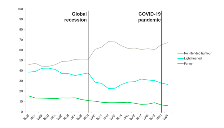
Here’s an interesting article on that very subject. It analyses the reduction in the number of funny ads that have appeared in the last fifteen years.

We’ve all noticed that situation, but this graph…

…clearly shows that it blew up in response to something specific, by which I mean the 2008 crash. Fascinatingly, although a decade and a half has passed since then, the funnies have yet to return.

As far as the UK goes, you could look at the societal conditions of 2008-2023 and concede that things have not improved: the governmental response to the crash was austerity, which has yet to end; Brexit followed, with the public either being sad that they lost or, oddly, angry that they won (possibly because they didn’t really ‘win’ anything, other than perhaps a xenophobic foot-shooting exercise that continues to this day); four years of Trump was stressful for most people across the world; the Climate Crisis reached a tipping point of depressing acceptance; there was that little pandemic thing; Liz Truss crashed the economy; fuel prices have risen; inflation looks like it’ll take us into a recession; everyone seems to be on strike.

Phew!

Worrying about the future has become the default mind state for much of the public, so it makes sense that funny ads have taken a back seat: the ad industry looked around and decided that pratfalls and one-liners might have seemed like turning up at a funeral in a clown car.

Could lighthearted ads have lifted the mood? Perhaps, but instead we entered the heartwarming, laugh-free John Lewisification of advertising. I’m generalising a touch, but overall, the serious 60-second tear-jerker rose to prominence as the 30-second yukfest took a back seat. 

In addition, the empowerment of Channel 4’s Paralympics work, Nike’s Nothing Beats A Londoner and Sport England’s This Girl Can was brilliant, but not funny (yes, there were kind of funny moments, but ‘funny’ is not the first adjective you would use to describe those ads, or Womb Stories, or The Last Photo), and we all know about the millions of ever-so-serious purpose-based initiatives. 

I would argue that serious ads are, on average, less impactful. They require and elicit less obvious reactions, so a communal spread of approval can’t be kicked off with laughter. Instead we all sit with our own private version of being impressed, so the overall effect is always going to be smaller. Sure, that didn’t stop John Lewis changing the entire industry, but using one example to draw a conclusion about something enormous doesn’t really hold water.

So here we are: a smaller fish in a bigger, more complicated pond, surrounded by negative news coming at us through a firehose. Our response has been a little like what happens when you keep getting hit in the face: confusion, wondering what you did wrong, and working out how to avoid it happening again, when in truth you’re dealing with a brand new set of circumstances that has upturned most of what you thought you knew.

The digital revolution has impacted all of us in so many unforeseen ways, but the difference it has made to mass culture is the one that has changed advertising the most. We may have more sophisticated tools at our disposal, but they haven’t allowed us to better at our jobs.

Then again, that doesn’t mean that doesn’t mean improvement is impossible. That truncated period of change might have given us the illusion that the difficulties of the current circumstances are here to stay. In reality, the extent to which that is true is up to us.


David Abbott: The Podcast Series

About a year ago I was listening to a podcast called The Plot Thickens. The subject was the messy production of the movie The Bonfire of the Vanities. As the story unfolded I realised that the format – a documentary of a subject told over several episodes, with interviews featuring the participants – might lend itself to something in the world of advertising.

About ten seconds later I knew that ‘something’ ought to be David Abbott.

For those of you unfamiliar with his work and legacy, David was arguably the greatest advertising person the UK has ever produced. He is without doubt the greatest British copywriter of all time, and that achievement alone would make him a worthy subject of a retrospective, but he was also one of the founders (and subsequent Chairman) of one of Britain’s best ad agencies, which is still going strong. He’s a former President of D&AD, and the recipient of its President’s Award, and he managed to produce a ridiculous 247 pieces of work worthy of inclusion in its annuals. He gave us JR Hartley looking for his book on fly fishing, Bob Hoskins reminding us that it’s good to talk, and The Economist poster campaign, still the gold standard for both copywriting and billboard advertising, despite ending in 2005.

But if you listen to these episodes, you’ll discover that he was also a brilliant account person, strategist, leader, friend, and, improbably, comedian.

He really deserves a biography, and if anyone reading this would like to take the subject on, perhaps here is a good place to start. However, in the absence of a 500-page book, I suppose this podcast series is the next best thing.

My plan was to speak to people as possible who had worked with him and build up a portrait of David over a few episodes, so I started with my version of the ‘low hanging fruit’, by which I mean people whose email addresses I had to hand: Peter Souter, Dave Dye and Paul Burke. I hadn’t really intended to go much beyond them, but as they offered their thoughts, feelings and opinions of David, I soon realised I’d have to find others.

Next was Mike Griffin, a friend of mine who worked for David for many years. He mentioned other possible interviewees and the ball was well and truly rolling: Brian Byfield (David’s former art director); John Field (David’s head of production for over twenty-five years); John O’Driscoll (a creative who worked for David at both DDB and AMV, and the co-creator of the website David Abbott Said, from which I took the first two episodes); John Kelley (John O’Driscoll’s former creative partner, who worked at AMV through most of the 1980s); Cathy Heng (a great art director who began as a junior under David at French Gold Abbott); Jeremy Miles (former Vice-Chairman as AMV, who started there as a junior account person on Sainsbury’s); Mary Wear (a senior creative hired by David in the mid-1990s); Ken New (head of media at AMV and a close friend of David’s); Alfredo Marcantonio (former client, then creative colleague and friend) and Tim Delaney (another of the UK’s greatest copywriters and creative directors, who was almost contemporaneous with David).

I also spoke to Peter Mead and Adrian Vickers, the M and the V of AMV. Their telling of the early days of the UK’s best agency is worth the non-existent ticket price alone.

I’d like to thank them all for the kind gift of their time.

We begin with two episodes of David in his own words, all taken from Davidabbotsaid.com, a site I urge you to visit because it contains exactly the same interview, but alongside footage of David. I hadn’t planned to include it, after all, it already exists and is easily accessible, but during the edit I felt that there was an enormous David-shaped hole amongst all the excellent testimony. That hole has been filled, and you can now hear David’s voice in convenient podcast form.

Although I started this in December 2021, the process of tracking people down and interviewing them, along with lots and lots of editing, all while spending a great deal of time on my day job, took longer than I expected. I tried to collect the words into themes, giving us the opportunity to spot threads and patterns that might inspire further impressions. They are loose and imperfect, but they basically hang together to form discrete narratives.

I added my own thoughts in one episode because I crossed over with David for six months as a very junior copywriter back in 1998. I won’t repeat here what I said there, but I just wanted to make one thing clear: no matter how completely I managed to do this, I could never really convey the totality of David Abbott. Next month my Creative Review column will act as a companion piece to this post and the podcast episodes, offering a 900-word primer for the uninitiated, but it still won’t be enough.

Mary Wear said it best when she pointed out that the truly wonderful thing that David did was to encourage us to aspire, but not in the current advertising sense of wishing you had the latest phone or a six-pack beach body. Instead David gently, intelligently and brilliantly encouraged us to aspire to be better people. Better spouses, better parents, better kids, better pet owners, better cooks, better friends… and all in the service of improving our own lives and the lives of those around us. It was purpose-based advertising before that became an excuse for chocolate bars to save whales, and every word he wrote was linked to the commercial improvement of a product or service.

But just because it’s impossible to entirely capture David, that doesn’t mean it’s not worth trying. If you listen to these episodes you should get a much greater sense of who he was and how he contributed to us all, especially those of us who have worked in advertising.

If you’ve ever felt The Economist could make you a bit more interesting, BT could help you stay in touch with an old friend, or Sainsbury’s could provide the ingredients and inspiration to create an excellent meal, you now know who to thank.

I hope you enjoy listening to the episodes as much as I enjoyed putting them together.

I have done my best to add them in chronological order, so here’s the last of the seven, called Final Thoughts. If you have trouble with iTunes or this site, you can also find the whole series on Soundcloud.

If This Is A Blog Then What's Christmas?
David Abbott: The Podcast Series
Loading
/


David Abbott Podcast Episode 6

This is the sixth episode of my series of podcasts about the great David Abbott.

This one is called ‘David’s Department’ and explores what it was like to be a creative working under David.

I’ll link to the episode here, but you can also find the whole series on Soundcloud.

If This Is A Blog Then What's Christmas?
David Abbott Podcast Episode 6
Loading
/


Which Ideas To Offer, And When To Offer Them.

If you’ve worked in advertising for longer than five minutes, you’ve come across the dilemma of which ideas to present to your partner/CD/Client.

The choice tends to come down to three elements: quality, quantity and time. Do you ever show anything you don’t 100% believe in? Sure, if the audience is your copywriter; not if the audience is your client. Do you offer a pile of ideas? Maybe for a single headline, maybe not for a fully fleshed-out 360-degree campaign. What do you do when the deadline is approaching but the Brilliant Idea Fairy has yet to pay you a visit?

There are many variations on those choices, so let’s check out a few, starting with what you should consider when it comes to sharing ideas with your partner…

  1. Show them everything. Just put your brain on loudspeaker and chuck it all out there under the truism that there are no bad ideas, and that anything, no matter how crappy, might spark off a better thought from your AD or CW. In many ways this is a good path to take, especially in those desperate hours when you’re on the third round of the same brief and the well has run dry. In these situations you should both be at your most charitable/receptive, and be willing to listen to any old shite because it’s probably more useful than silence (although, if memory serves, I have heard and offered some ideas that were actually worse than silence).
  2. Show them the stuff you think has some proper merit. This doesn’t just mean only telling them the ideas you think could end up with a Cannes Grand Prix (or some increased sales. Crazy idea, I know!); it means explaining the idea along with some reasons why it might be good, and some extra ways in which the scope of the concept might expand. If you think an idea is good then you need to present it in such a way that it is both understandable and exciting (just like the final ad), so maybe think it through somewhere quiet first (eg: lav, park, lav in a park), and mention it when your other half is in a receptive frame of mind, and not when they’ve just told you their beloved puppy has been run over.
  3. Show them stuff that you don’t like, but you know others will. Sometimes, when the clock is ticking and you know your CD is a talentless idiot with no taste, you might be tempted to please him or her by offering that crass, dull, unoriginal rip off of an old One Show winner. It’ll make the boss happy, and by extension it might make your partner happy, but then you might have to make it, and watch it go on air, and explain to your disappointed family that you wrote it. When you get through round one, there are many other rounds to follow, and when every good director turns it down, every other team in the agency avoids asking what you’re up to, and everyone in the country hates you for making them watch something awful, you might start to wish you’d kept your mouth shut three months earlier.

For the CD we have another few categories:

  1. Show them loads of ideas. There are pros and cons to this, as it kind of implies that you have no ability to sort your own wheat from your own chaff. Then again, most teams aren’t supposed to have that ability; if they did they’d be the CD. So err on the side of volume, as long as the ads you show are defensible in some way. When your CD says “What do you mean by X?” Or “Isn’t this just like that other thing you did?”, you’ll need a decent answer, one that prevents you looking stupid in front of the person who decides whether or not you should have a raise. In my CDing days I’ve certainly found gems in ideas that teams weren’t particularly proud of, and I’ve failed to see the excellence in ideas they’ve clearly thought were brilliant. Let’s accept that tastes differ and a little wiggle room in the decision-making process can go a long way.
  2. Show them only the best of the best. There are pros and cons to this, as it implies you are the proper arbiter of quality and your boss isn’t. Also, if the great idea you show fails to impress, then you look like a tit who has failed in terms of both quality and quantity. Then again (see above), you don’t want to show things you don’t want to make, so don’t make up the numbers with rubbish. I remember an ECD I used to work for who invented something he called ‘The Wheel’. It was like a Trivial Pursuit pie with eight segments, all of which had to be filled with an idea. Yes – you were supposed to come up with eight good ideas for each brief. Eight! Five properly good ideas for a full-on 360 campaign is hard; eight is/was a bit of a joke. Top tip: coming up with ideas like The Wheel and putting them into practice is a GREAT way to lose the respect of your entire department.
  3. Show them half-formed stuff. There are also pros and cons to this method. Most embryonic ideas could end up being good or bad, so it helps to have a bit of proof to understand how the concept comes to life. If I were to say ‘A guy waits for a wave, and when it arrives it’s pretty amazing’, you might now imagine Guinness Surfer, but if I’d said that in 1998, you’d have no idea how good it could be. Your presentation could therefore benefit from some further explanation, or from you being the best TV creatives in the world. That said, unless you’re super senior, you might want to leave room for the CD to add some thoughts that could make yours better. Don’t make it seem like they should do a lot of the work required to make the improvements, but maybe frame it as more of a conversation than a presentation.

Talking of presentations, next is the client.

  1. Only show them what you want to make. I know I’ve mentioned this above, but it’s different when you show the client. It’s possible they have no creative ability, so if you show them the shit one to make the good one look good YOU WILL DEFINITELY END UP MAKING THE SHIT ONE. And it’s almost impossible to take an ad back, so if you show it, be prepared for them to like it and buy it, at which point you are going to spend a lot of time making it. The only flipside to this is the fact that you have meetings and deadlines, and sometimes you don’t have three insanely good ads at the appointed hour. So do you show that ‘quite good’ third campaign that you don’t really love? There might be pressure from account management to do that because they know the client will adore your less good ad (“It features Ant and Dec riding horses? The client loves Ant, Dec and horses! Nice one”), but you must resist. I can’t tell you how many times I’ve seen someone wrongly second-guess a client, so showing only work you want to make is a very good policy, even if it means being one idea light at the meeting.
  2. Show them lots of stuff in the spirit of collaboration. Sure, if you feel confident in the client’s taste, and you can push back against any shitty suggestions they might make. But if you are missing one of those elements, don’t ask the client to join your creative team. That’s not what they’re good at, and they probably don’t like having their ideas rejected by people they think they are in charge of. If you want to collaborate, it helps to set a policy of not trying to solve everything there and then. Take the ‘collaboration’ on board and fix it back at the agency, away from a situation where you have to let them down gently when they suggest building an entire ad campaign around a Diplo remix of Shania Twain’s That Don’t Impress Me Much.
  3. Only show them one idea. Why would you show them anything else? Just look decisive and show, no, tell them what they’re going to be buying. In 2022 that does sound kind of ker-azee because we are now deep into the worlds of multiple routes and the aforementioned ‘collaboration’, but back the day, when agencies had the pimp hand, they would present just one idea, and the client would buy it (or reject it, I guess. Then another one would be written, ruining the whole ‘one idea’ thing, and effectively stretching a three-idea presentation over three separate meetings. Anyway, I never witnessed this, and I digress…). In some ways that makes sense: if you’re buying something from an expert, you probably just want what they think is best, but these days that seems like you’re backing the client into a corner, and making them choose without giving them any choices. In 2022 it would be a bold move, but if you REALLY believe in your one idea then stand behind it, and let me know how it goes.

As you can see from the above, there are different versions of the same practices, and they tend to depend on your audience. The closer you get to the client, the greater the consequences, so make sure you improve your ideas as they continue up the chain.

And don’t forget that the ultimate audience is the actual, y’know, audience, ie: the general public. They only get to see the final version of the concept that made it through all those gatekeepers, and if they like it, everything else is academic.


Conflict Cuts Both Ways

When I helped to start Lunar BBDO, it was created to be a ‘conflict shop’ for AMV BBDO. They had the account for The Phone Book, but also Yellow Pages, two broadly identical products, so we handled the former, allowing them to keep the latter.


The idea is that an agency shouldn’t have advertise two products in the same category because that will create conflict regarding which insights and ideas they might use for each one. In addition, the research and competitive knowledge they would have on each of the businesses could potentially be quite damaging for one or the other. For example, if the Phone Book’s account team knew that Yellow Pages was about to go entirely digital, that would give them a massive advantage over their biggest competitor.


So whether it’s cars, chocolate bars or travel agents, companies tend not to choose an agency that helps their competitors.


That said, when I worked at AMV, they were the biggest agency in the country, which meant they already had an account in most categories, limiting their potential for growth. This is where some enterprising thinking could suggest that similar products were in fact different. Perhaps one chocolate bar was aimed at the premium market, while the other was more everyday, and thus not a true competitor. I don’t know how many companies accepted such sub-differentiating, but it was worth a try.


I was thinking about this the other day, when it occurred to me that we never really consider this issue from the other side: clients often use several advertising/marketing/PR agencies, whose skills overlap. That would suggest that they are in competition with each other, and that often means problematic consequences.


Here’s an example how it works on the surface: client A has three roster agencies, X, Y and Z, providing help in publicising what they do. X, Y and Z have different core abilities (eg, social, direct, events), so they are briefed on different tasks, but when a big campaign needs to knit that work together, they are expected to be very mature about it and play nice with a good old handshake and a friendly pint after it’s all over.


In reality, as almost all of you know, it does not work anything like that. Advertising offerings are now so disparate and amorphous, and agencies are now so desperate to gain and retain any part of the pie, that everyone claims to be able to do everything. Digital agencies do design; design agencies do PR; PR agencies do brand audits etc. 


If you’re a client, not only do you now find it difficult to truly separate your roster of publicity vendors, you probably don’t want to. The competition leads to desperation, which leads to more work produced for less money, just on the off-chance that agency X can be given some of the budget and work that would have gone to agency Z. In many instances, it’s survival of the cheapest and most craven, accelerating a race to the bottom. 


Clients don’t really want to stop their agencies trying to one-up each other, and even if they did, no self-respecting agency would stay in their lane if they happened to have a good idea that belonged in someone else’s. 


And this isn’t even a new situation. In 1999 I worked on a Millennium Bug campaign (Google it, kids), which we were to present alongside complementary work from our direct marketing agency. When we turned up to the meeting with them, they had also come up with some TV ads, the very thing we were supposed to contribute. In those days you could ask them what on earth they thought they were doing; these days, colouring outside your lines is almost expected.


So now competing agencies have to decide who is leading a joint presentation, designing the deck, choosing which work lives or dies and what order it all comes in. This obviously adds extra stress, work and time to the process, particularly as there is often no definitive right or wrong. Eventually a decision must be made, and when the meeting arrives, one agency might try to undercut the work of another, while always looking as if they are actually best pals.


It’s the very definition of the conflict clients seek to avoid. One agency’s endline might now be the backbone of another agency’s TV campaign, but how does the first agency claim its credit for the contribution without looking petty and grasping? If agency X has an amazing insight that leads to fantastic work from agency Y, is it fair to just use that work for free? The clients would say, ‘Sure, one team one dream’. The agencies might ostensibly agree, while thinking, ‘There’s no ‘I’ in team, but there is a ‘me’’. 


At the end of the process, does it make the work better? One on side the sharing of insights and ideas should improve the overall end product, with everyone allowed to select from the best ingredients. On the other, no agency wants to make the other one look good as it could genuinely cost them the whole account. So they might push their own lesser idea that much harder, giving it lots of expensive craft to lift it above the others. Worse work? Perhaps, but at least it’ll be our worse work.


In the end, it becomes a kind of frenemy situation that must be managed with kid gloves. Each agency knows the other has a direct line to the client, so they must be on their guard 24/7. 


How can this be avoided? Well, you’d be asking a client to turn down the extra effort that is born of competition, which is basically free work. Better for them that agencies live with the conflict, no matter how serious the injuries that result.


The evolution of the portfolio.

It’s now the essential collection of anyone creative’s work and achievements, along with a little ‘about’ section that gives you a delightful window into their career, but also explains that they collect ceramic frogs or enjoy traveling to Chad.

Portfolios weren’t always so elaborate. For a start, they used to be made of paper and contained nothing but the work. They almost always came in a faux-leather case, complete with ring binders that never quite worked, and filling them up required finding laminated proofs of your ads, while TV and radio could be collected on additional cassettes that you shoved into a sleeve at the back.

There might have been a short step that involved putting the work on DVDs, but that was kind of complicated, so the hard copy portfolio was king until maybe 2010, when you pretty much had to have a website of some sort. 

Before Squarespace made life a bit easier, getting that site together was difficult and expensive. They tended to look a bit crap, and updating them to add your new work was a tedious and annoying process. But sending a link around was much easier than lugging a portfolio case across town, and ECDs were much happier viewing ten books via the convenience of their laptop.

Now that a spiffy-looking site is within the reach of us all, a few fundamentals have changed. Instead of simply letting the work speak for itself (and in this brave new world of mandatory case studies), additional explanations are expected. You can give strategic context, production information and results, if you’re so inclined. 

And as with those case studies, that seems to mean finding the most positive possible lens through which to present yourself. A minor pair of social posts can become ‘Client X’s first-ever Instagram campaign, which used the illustrations of sneaker influencer PJQ to set the brand off in an entirely new direction. It gained 341,867 media impressions in the first ten days, on its way to becoming the most-watched carousel for the FMCG market in the month of July’. 

A recent LinkedIn post from an ECD suggested that, ‘If you didn’t write it, go through a dozen iterations, and attend rounds of meetings where it was discussed. If you didn’t pick the director, nor flew to the shoot and fought for that take you thought you needed. If you didn’t spend days in an edit suite, painstakingly moving frames, undecided between V.63 or V.64 while trying 100 tracks on your laptop. If you were not there… THEN DON’T PUT IT IN YOUR PORTFOLIO.

I can see where he’s coming from, but I’ve witnessed enough inside stories of great work to know that the division of labour between members of a creative team is rarely equal enough to ensure that the above would apply to both. One copywriter might have slaved away at the concept, only for their AD to dominate the executional elements. Does that mean neither can claim the finished piece as their own? 

That ECD’s point is that you need to be able to use a portfolio to accurately evaluate its owner’s abilities. What if you’ve been fooled into hiring a CW who will not be great at the post-production stage? Or an AD who can’t come up with a concept to save their life?

But that’s always going to be tricky. For some teams and creatives the degree of contribution can ebb and flow, and sometimes the editor or sound engineer ends up suggesting a better endline, which is then used in the final ad. Does that mean the creatives shouldn’t claim full credit? Where does an ad cross the line between ‘yours’ and ‘someone else’s’?

And what about creative directors? When it comes to their portfolios, some of them clearly delineate between their CD work and their work as a creative foot soldier, but even then, there are CDs who transform base metal into gold, while others make little difference, or even make things worse. If that happens it’s unlikely the CD will honestly cop to a lack of contribution; after all, everyone is the hero of their own story.

Advertising is full of misattributed credit, fluffed-up CVs and rose-tinted glasses. Positive takes are what we create for a living, so it’s no surprise that people use them for themselves. That probably means we should take portfolios with a pinch of salt, perhaps downgrading claims by 10-20% (as I do when I watch a case study).

This is especially true as portfolios are now out there for everyone to find and pore over. Just Google the name of the creative alongside the word ‘advertising’ and you should find what you’re looking for. Then you can see if they list every single award, whether huge or tiny, or just use the low-key, but suspiciously non-specific self-endorsement, ‘I’ve been recognised by all major international award schemes’.

You can also check out the window to their soul: the ‘about’ section, which can be po-faced and self-important, or humorously self-deprecating. I find that it’s often surprisingly revealing, as much for what is omitted as what is included. 

Last is the style. 90% seem to be Squarespace sites, with a fairly neutral and functional design – the closest thing you can get to letting the work speak for itself. But I feel the ADs often want to demonstrate their visual chops more obviously. They are usually the ones that get a proper site done, bringing the design flex with a bit of parallax scrolling.

Just like the rest of the industry, the internet has provided your portfolio situation with many more tools, but also many more choices, so make sure you think though it all with the care you’d apply to your ads. As one wise person’s portfolio says, ‘Ah! The good old ‘about’ section. Time to decide whether to talk about myself in the first person or the third…


What Do We Mean By ‘Good’?

Art is a funny old game. Pretty much every form of it suffers from the same inability to measure its quality with any objectivity.

In books you’ll find millions who think War And Peace is a boring load of old crap, and millions who think it’s the best book ever written (and possibly millions who will claim they think it’s the best book ever written, even though they really think it’s a boring load of old crap). You’ll also find millions who love The Da Vinci Code and millions who think it’s utter trash (and millions more who claim to think it’s utter trash despite powering through it in a single afternoon).

When it comes to art you’ll find many who gaze in wonder at the work of Rothko and many others who gaze at it in equal wonder because they can’t comprehend why a few shapeless splodges came to be so highly praised. Is the Mona Lisa brilliant, or did it simply gain undeserved notoriety when it was stolen? Why can’t we all tell the difference between the splashes your child brings back from kindergarten and the average Jackson Pollock?

Cinema: some think Fellini captures the heart and soul of the human experience, while Dr Strange In The Multiverse Of Madness is formulaic CGI plop. Others think Fellini is boring, pretentious rubbish, while Dr Strange is the height of imagination, writ large through the gothic perspective of Sam Raimi. I love Bela Tarr’s Satantango, the seven-hour story of exploited Hungarian farm workers, and I also love Thor Ragnarok. Then again, I wasn’t keen on Tarr’s Werckmeister Harmonies, and I thought Thor: Love and Thunder was shit.

You get the picture.

But what about advertising?

I think it suffers from exactly the same vagaries of opinion, but the problem is that it’s halfway between art and commerce, in that it is unpredictably creative, but it tends to have has a specific and timely response goal. It can’t find its audience thirty years after it was relatively ignored just because it gets revived by a movie (like Tiny Dancer). It can’t create a hipster late-night audience to spread its success over decades (like The Rocky Horror Picture Show). And it can’t be successful if it’s loved by critics but basically ignored by the public (see: Hurt Locker, Satantango and about a billion other films, albums, songs, books, paintings, sculptures and TV shows).

But when it comes to being ‘good’, I think advertising falls into three categories:

1. I’ll call the first category Award Good. That doesn’t mean it’s only liked by award juries; just that awards are the one essential criterion for an ad to be considered ‘good’. 

Some of you probably read my post about this year’s Cannes Grand Prix winners. I would argue that some of them are only ‘award good’, while others won awards while also successfully achieving their intended goals of fame/sales/awareness. 

But many people (ECDs and CCOs very much included) fall back on this measure because there is supposed wisdom in crowds, and the fact that several jurors collectively chose the work to represent their opinions of what is ‘good’ is the closest we can get get to objectivity. The fact that one or more of the jurors might have considered the winning work to be crap is neither here nor there because no one will ever know. Like democracy, it’s the worst system we have except for all the others.

Does an award mean the work is good? Of course not. Some jurors were selected despite having poor taste and no knowledge of what has gone before. Some judging sessions get swept up in moods that give some ads an unexpected boost. Some people judge on different criteria to others, possibly because of cultural differences or, crucially, simple differences of opinion. Awards are just what some people think on a certain day, looking at the work out of context on a computer, then in a conference room, while quite keen to get it over with so they can go and find the nearest Pina Colada. 

Clearly that’s not an unimpeachable way to assess quality, so if you think that saving a coral reef has nothing to do with selling cat food, and thus an ad that tries to do that is not good, even though it has a Cannes Grand Prix, then you may well be a better judge than the senior creative types who held the opposite view.

2. Actual Good. This is where is gets tricky. In my infinitesimally humble opinion, any ad that achieves what it sets out to do can be considered ‘good’. It might be unoriginal, obtuse, irritating, boring, poorly-crafted and million other horrible things, but if it does what it’s supposed to do, that must surely be a mark of quality.

Before I go any further, I have to point out that we rarely know what the precise aims of any particular ad might be, so we’re going to have to be a bit open-minded about this, but let’s give it a go. 

Ads that bring fame to their clients, even the ones we think are crap, tend to fall into this category. But I’d like to include a sub-category of work that manages to persuade you to do something, even if it’s not as jaw-dropping as Guinness Surfer or as cool as the Levi’s ad where they run through walls. Here’s an example from my own viewing experience:

I’ve never seen that ad before, but it contains something I always love to see in a toothpaste ad: the bit at 0:07, where you get an animated representation of the  gunk being washed away by the magic toothpaste. Is that ‘good’? Not in a Cannes way, obviously, but that was the kind of thing that actually persuaded me to do something. It’s unoriginal, on the nose and a cliche of the genre, but it always pulled me in. The creatives and post people should be commended for doing their job in a way that achieved their desired result (I can’t remember if I bought the toothpaste in question, and you might suggest that I may have confused brands of toothpaste because all these ads are so similar, but at least I noticed and thought about the ad, which is more effectiveness than most. And maybe I did buy that brand of toothpaste).

In the UK this ad used to run during weekday afternoons:

Literally everyone in the country knew it, and could sing the song. Did it win awards? Of course not. Did it impart information in a clear and memorable way, conferring fame on its client? Yep.

On the flipside of those examples, I’m going to use Fearless Girl as an example of what does not fit under this definition of ‘good’. No one knows who it was for or what it was supposed to communicate, then it turned out that the company responsible acted in a way that was the opposite of the supposed message of their lovely sculpture, so even if anyone had known who was behind it, it ended up as a cynical exercise in subterfuge. Yes, it was famous, but if that were the only criterion for success, The Queen’s funeral queue should win all the awards going.

3. Finally we have Good That’s Been Graded On A Curve. For those unfamiliar with the American school system, ‘grading on a curve’ refers to the practice of finding a normal distribution of results (a few crap, a lot of mediocre and a few excellent), even if the work doesn’t accurately reflect that. Which is a long way of saying that we might well be praising work that isn’t so much ‘good’ as ‘good for an ad’, or even ‘good for the ads of a certain year’.

When we see a ‘really good’ headline, is it really good, or just a good ad headline? I understand that the two things have similar meanings for most people, but why are we OK with implying that ads are a worse art form, judged to a lower standard than books, films or music?

You might say that the very best advertising sits equal to the very best of other art forms. Unfortunately that is not the case. Dumb Ways To Die is not The Apartment. Honda Grrr is not Up or Inside Out. It’s harder to compare print advertising to other forms of the written word, but suffice to say, VW Lemon is easily surpassed by thousands of novels, magazine articles, newspaper headlines and political slogans. 

Yes, the best of advertising is a long way from the best of Other Things, but perhaps you think I’m unfairly pitting them against each other.

They don’t have to answer to dozens of clients. 

Ever tried getting an original film through the studio system, or convincing a record label to release something edgy?

What about the budgets? 

Minute for minute some ads have more production money than Avatar. Radio and print work has far more money than its non-ad equivalents.

They’re not long form, so how can we judge them in the same way?

Michelangelo’s single-image art was effectively advertising for the Catholic Church, as were all the requiems and speeches that moved countless millions to believe in something that doesn’t even exist. 

Religion is far more compelling than soap powder.

Sure, but we make ads for charities all the time, and there’s nothing to stop us persuading people to reverse the Climate Crisis or stop the worst consequences of wealth inequality. We literally need no brief for those movements, so we have no excuses.

I once wrote a Creative Review column about my Weekend At Bernie’s theory. It states that it would be better to have been responsible for a mediocre film such as A Weekend At Bernie’s, than the very best advertising. More people care about the movie, it’s more famous, and has caused millions of people to part with money to experience it and spend hours to see it. What ad can make that claim?

So we don’t really create anything that’s world-class ‘good’. We do the best we can within our industry and media, but we are given plenty of money, the opportunity to work with great artists (eg: Jonathan Glazer, the director of Under The Skin, a work of art far better than any ad in history), and often work on compelling briefs.

So how good is our good? 

When we move three frames here or there, are we making an ad 2% better, but still miles below the standard of Wedding Crashers? 

When we celebrate our ‘best’ is it any better than the blah stuff we skim past on the Netflix menu?

Why isn’t our work on that same plane?

Is this why a TikTok or YouTube video can often be so much better and more culturally relevant than our best, even when it’s been done by a 15-year-old kid in their bedroom?

If you disagree with this point, name the most recent ad that has had the cultural impact of this zero-budget soundbite (IYKYK, IYDK that might be the problem): 

I’m not saying that the very best of advertising has not been impressive, but I wonder how out of whack our judgment has been. Do we unwittingly participate in a collective acceptance of the relatively so-so? What effect does that then have on the quality of the work, the people who are inclined to join the industry, and its standing in culture and society?

And what would happen if we demanded and only accepted much, much, much better?