Keiran Tierney, Keiran Tierney, Mag-Ni-Fique… The weekend.
Posted in Uncategorized
Cats looking at cats looking at cats.
Run a country during a pandemic.
The worst commercials of all time:
Cats looking at cats looking at cats.
Run a country during a pandemic.
The worst commercials of all time:
Are we living in a simulation?
Ace Ventura perpetual scream thing (it’s better than I’ve made it sound).
Why almost everything you thought about running is wrong (great design).
What if the laws of physics were different:
The other day my dad sent me an article about advertising that (among other things) bemoaned the current lack of sonic idents, or ‘jingles’ as we used to call them. Whether it’s the four notes that accompany the words ‘Intel Inside’, or the entire collection of slightly racist words that explained the geographical origins of Um Bongo, the use of memorable musical stings seems to have fallen from advertising favour.
And yes, I know that isn’t exactly ‘news’, as it’s been that way for a while, but the arrival of the article coincided with me standing in my kitchen in Los Angeles and singing ‘We’re all going on a Hoseasons holiday’ to the tune of Cliff Richard’s Summer Holiday. Why that particular jingle, having lain dormant in an obscure corner of my hippocampus for decades, had decided to reappear at that particular moment, I have no idea. But what’s even stranger is that when I started to sing it my wife joined in.
The campaign ran in the 1990s, and, as you can see, it was shit:
But that didn’t stop me recalling it spontaneously, five thousand miles away, some thirty years later.
Pixar’s Inside Out made a fine joke out of this phenomenon, but they couldn’t have done so if it weren’t true:
On a more topical note, living outside the UK means I’ve managed to avoid seeing this:
However, I know all about it. That’s because, utter load of plop that it is, its jingle has apparently permeated the national consciousness. Just this week Dave Trott added to a Twitter conversation about the campaign with this cartoon:
His tweet inspired this reply:

So jingles work, but the advertising industry rarely uses them. Sure, some (maybe most) are crappy and annoying, but most ads are crappy and annoying, and that doesn’t stop us churning them out in their thousands. Why draw the line at the music?
It’s just one example of how many elements of the practice of advertising that don’t make any sense. I know it’s an art rather than a science, so there are no guarantees (I also know that adding a jingle to every ad would soon make jingles pointless) but it does seem that clients and agencies are spending a huge amount of money producing an enormous number of communications that no one notices, remembers or acts upon, while also doing many things that are underpinned by no logic whatsoever.
Here’s another example of some 24-carat stark raving bonkers, from this morning’s Ad Contrarian newsletter:
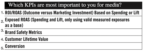
The ANA (Association of National Advertisers) did a survey recently of media executives. Before we get to the results, here’s an explanation for civilians: A KPI is a “Key Performance Indicator.” In other words, it’s an indicator that marketers use to evaluate how well their media dollars are performing for them. In this survey the ANA identified 39 potential KPIs and asked media execs to rank them on certain criteria.
Two of the most critical criteria were,
– What KPIs are most important to you?
– What KPIs are you using?
You would think that in any sane universe the KPIs that are most important to them would be the ones they’re using, right? But in a sane universe these people would be driving for Uber. In fact, if you look at the top 5 KPIs, there is almost no correlation between the ones these geniuses think are the most important and the ones they actually use.
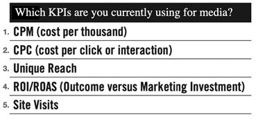
– The KPI they use most is “Cost Per Thousand.” They rate it as the 22nd most important
– The KPI they use second most is “Cost Per Click.” They rate it as the 27th most important
No, you can’t make this shit up.
You certainly can’t. No one would believe it because it’s batshit crazy, yet it’s also the considered behaviour of a lot of supposedly intelligent people.
I’ve spent the last decade or so writing and reading about what’s gone wrong with advertising. Sure, I’ve also joined the conversation when the industry has done great things, but the general vibe has suggested that things are getting worse.
What I don’t understand is this: if we can see what’s going wrong, and we can point it out to each other, why isn’t the wrong becoming right?
Every time I read a post from The Ad Contrarian I wonder why digital advertising hasn’t ground to a halt, or at least adapted to the point of being unrecognisable from its current form. I also wonder why the people running certain social media companies aren’t in jail, and why people are so chill about having every aspect of their lives spied on, dissected and sold to thousands of companies for the purpose of enriching them. This is the kind of surveillance that would make the KGB blush, yet we’re willingly participating in it for the opportunity to share Condescending Wonka memes and a daily rundown of what we had for dinner.
Then I read Dave Trott’s posts and I wonder why well-paid agencies and clients don’t prioritise the noticeability of their advertising. Why they don’t start by trying to make their ads markedly different to those of their competitors. Why they don’t try to make sure they do something that not only improves the chances of people attributing the communication to the brand that paid for it, but also to remember said communication and association. Isn’t that the point of advertising? As Dave asks, why isn’t the question of noticeability on every brief?
Then I read Richard Shotton’s tweets (and his book), and I wonder why, when plenty of information is available to help improve the efficacy of an ad, no one seems particularly inclined to utilise said information to make their ads work better and their money go further. It’s all out there for the very reasonable price of his book – a massive, easily accessible advantage to anyone who wants to make use of the information. But nah.
It’s almost as if we’re in some weird nether world where most of the people tasked with communicating on behalf of a brand have no inclination or interest in doing that effectively. And, even stranger, the people who pay them to do it give a similarly minuscule number of fucks about creating something that actually works, that might then get them a raise or promotion.
Instead we have a smorgasbord of blandness, underpinned by the apparent certainty that producing several really long decks should be our priority. Or that we should be trying to feed a voracious social media beast, the better to continue a non-existent online ‘conversation’ between desperate brand and utterly uninterested customer. Or that we should be producing advertising that we ourselves would loathe, and purchase an adblocker to avoid.
Why is this? Why are logical methods for improvement superseded by the kind of guff we’d all prefer not to be responsible for?
I think there are lots of reasons. Here are a few:
The Newark Reason
Are you aware of the Newark Choice mentioned occasionally by Rory Sutherland? Flying into New York through Newark Airport is a better choice than JFK. It’s quieter, faster and closer to Manhattan. But here’s the thing: if a PA booked their boss a ticket to Newark and something went wrong, they would be blamed for making that slightly odd choice. But if they booked good old JFK, and there was some kind of problem, the boss would blame the usual crap that comes with flying into such a busy and disorganised airport. So the wise choice, with a low ceiling but no floor, is to book JFK because if you are the PA nothing can go wrong for you personally. You might think the PA misses out on an opportunity to show some great initiative, but that is a small, risky upside against a potentially disastrous downside.
In advertising terms, that translates to a client (and possibly agency) that would rather plod along close to the average, reasonable, so-so status quo. Why buy something unusual that might freak out your boss? What if everyone loves it, but the boss’s friend sees the boss at the tennis club and asks why they made that weirdo ad with the orange kangaroo. The boss then asks the CMO, and when the response is too esoteric or abstract the CMO could well get fired. That doesn’t happen when you make an ad a bit like last year’s, and sales increase by an expected 0.46%. Not much of an upside, but crucially no downside.
And if the CMO behaves that way (kind of understandable when you have a mortgage, kids in private school and a divorce to pay for, and he or she will only be in the job for a year anyway, so why scare the horses?), the agency will follow suit. You know they won’t buy the orange kangaroo campaign, so why write it, let alone present it? Maybe you can show it as the wacky one in the group of three, so you can all chat about how great it might be to make it before, with a heavy heart, going for the slight repeat of last year.
For lots of reasons CMOs now spend on average of 40 months in the job, by far the shortest time of anyone in the C-Suite, and half the average tenure of the CEO. This might be a chicken and egg situation, where they don’t like to do the job because it’s unfulfilling, or it’s unfulfilling because it made up of unlikeable tasks, but whatever the reason, people are generally not trying to blow shit up in that role.
We can trot out the truism that it’s actually braver to do non-descript advertising because its far more likely to fail, but we all know the that’s not how the CMO thinks. Brave advertising is brave advertising; the kind of thing that is unusual, and stands out from the crowd, leaving the brand at the mercy of its new found fame. There are of course no guarantees, so a courageous new path could well go ‘Newark Airport’, while no one gets blamed for the dull old JFK.
Yes, some brands and their CMOs do want to make a splash, and they tend to find the agencies that offer splashy campaigns, but they are by definition the exception rather than the rule. There are far more tortoises than hares in the world, and far more people still fly through JFK, and if they all switched to Newark it would soon become as problematic as JFK.
The Proliferation Reason
There are too many things to wrap your head around: too many channels, too many ads, too many sizes, too many versions, too many people to oversee, too many markets, too many influencers, too many lines, too many shapes, too many decks, too many slides, too many CDs, too many clients, too many charts, too many meetings, too many deadlines, too many opinions, too many cooks, too many broths.
I’ve written before about the problems of increased complexity, but it fits in this post because of the way in which it harpoons many of what we might refer to as ‘best practices’. For example, we always espouse the benefits of simplicity; it is the way in which we get more people to understand what we’re trying to say. But if, for example, an idea has to go through many CDs, then it will be more likely to change on that journey. And if you have lots of channels, a single CD can’t always be across every execution, so the simplicity is further diluted.
And of course the money has to be spread more thinly. It still takes a surprising amount of time and effort to come up with ads for a social feed or programmatic campaign. Each execution still has to be art directed and (probably) written, approved internally, altered based on that feedback, presented at an external meeting, altered based on that feedback, probably altered again both internally and externally, resized and re-art directed for those new sizes, possibly rewritten for a new audience etc. etc. etc. And that’s just one strand of the larger whole. A TV ad might still have to be made, and a director chosen (you also now have to send a director’s deck to persuade them to be interested in your project, so you have to write and art direct that), along with the internal and external meetings it will take to approve that choice etc…
That’s really only the tip of what has now become an iceberg of ridiculously unwieldy proportions. For every new/extra thing you have to do, time is lost that could have been used to improve the idea/writing/art direction of something else, and the inevitable consequence of that is a reduction in the quality of what we make. The process has spent a good decade heading consistently in the direction of this greater complexity, with staff being spread thinner and budgets doing the same.
So when you see people talk about the logical benefits of extra craft, that train left the station long ago. I recall a time where my art director could spend a week or two with a designer to improve a press campaign. Now there just isn’t the time or money to do that, and the communications have suffered accordingly.
The Data Reason
We all know the benefits of data: it brings a veneer of certainty to an uncertain process. If you can’t guarantee that a particular line or image will produce a certain response, then at least can now be certain that it will get in front of the right person at the right moment. So what’s the downside? Well, I think we all know that the promise of data has yet to be fulfilled, and we know this because of our own experience. Advertising doesn’t yet read our innermost thoughts and desires, serving us an ad for a pizza at the exact moment we were thinking of buying one. It has a good go at that, but mainly annoys us to the extent that hundreds of millions of adblockers are now used all over the world.
This contravenes the received wisdom by promoting the notion that you can lean into this so-called certainty at the expense of messaging that stands out from the other ads on the site. They all promote a list of ‘best practices’ that include the number of words you should use, the correct layout, and the kind of messaging that goes across well. But the problem is, if everyone is following the ‘best practices’ all the ads will appear similar. For millions of ads, there is now a rulebook for copywriting and art direction, which is the exact thing copywriting and art direction should not have.
But the ability to point to facts and figures is delightfully addictive. It means you can now prove that your advertising has this reach, or that clickthrough rate, and that both these figures are so-and-so percent better than the previous quarter. Ad agencies and CMOs are big fans of that. It means you don’t have to justify nebulous bollocks such as likeability, or whether the message will resonate enough for someone to buy the product in three years’ time. The numbers do not lie (of course they do), so let’s have more of them.
The Ker-Ching Reason
As Mick Hucknall sagely observed, money’s too tight to mention. Margins are thinner, shareholders want the kind of short-term financial benefits that comes from cost-cutting, profit and loss figures are reported quarterly… Cash is king, and its decrees reach into every nook and cranny: longer hours, smaller salaries, lower budgets, worse snacks, project-based accounts, more pitches and shorter deadlines.
So we have to skip many of the things that made the kind of ads that happened when those fabled ‘the ads are better than the TV programmes’ charts were produced. Of course spending more money to attract more talented people and giving them the time they need to make their best work is more likely to produce something admirable, memorable and inspirational. Every financial step away from that makes that outcome less likely. But as in the Data Reason, you can measure money, but you can’t always measure quality, so guess which one wins.
The We’re Still Cool Reason
Going back to the jingles, like I said the industry has been anti-sonic mnemonic for ages. Funny little tunes and cheesy little songs aren’t cool, and that means they’re out, because we’re cool, aren’t we?
Well, maybe, but I think you could make a good case for ‘maybe not’. Despite producing the occasional Guinness Surfer, Honda Cog, Phillips Carousel; despite going on shoots to far-flung locations; despite doing a job where some of us get to meet Thierry Henry or Daft Punk; despite having a boozy festival in the South of France; despite our output being seen by millions of people… are we actually cool (whatever that means)?
On current evidence we are apparently too cool to use a jingle.
But that might mean we’re also too cool to produce a piece of work that someone will remember three decades from now.
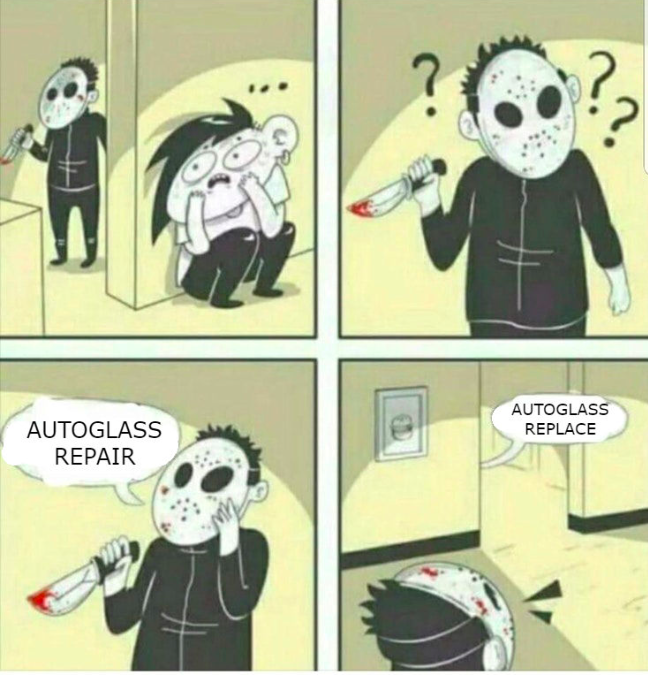
Now, I’m not saying that missing out on that opportunity is a definite indication of collective insanity, or that we should all be adding jingles to our ads, but at some point in the 2050s, someone somewhere is going to say the words ‘Autoglass repair’, and someone nearby is going to reply, ‘Autoglass replace’, and they’re going to laugh about it.
But they’re not going to laugh about that DOOH blag that got you a D&AD shortlisting in 2026.
How will that make you feel?
I’m 100% aware that writing the above will probably not make the slightest bit of difference to anything, that the time I have spent on this post is another indication of the ubiquity of the insanity. But fuck it. I actually enjoyed working through all that, watching clips of Inside Out and having another look at Carousel.
If it sparks something somewhere that improves something for someone, then great.
But even if it doesn’t I’m just going to hum the Chicken Tonight jingle, add a couple of slides to Tuesday’s deck and have a chat with Cillit Bang’s twitter feed.
Wibble wibble.
Every key of your computer is a different cool sound effect.
Explore the evolution of car design.
Compare yourself to the average everything.
Stefan Sagmeister: Beautiful Numbers:
I’ve been having a look through this year’s D&AD winners.
I’m not saying the juries got it wrong time and time again, but there are a few verdicts I don’t understand.
The first is the lack of an editing Pencil for this:
I’d also suggest that, despite its meh voiceover, it’s a pretty remarkable ad, with the kind of craft that blew the mind of ad people and the public alike. It appears only to have collected a Shortlisting for Direction (not even in The Book in old money), and a Wooden Pencil (an entry in old money) for the ad itself.
If I’d made this world-famous corker and scored only a single entry, I’d be rather miffed. Was it not entered into Editing? Were the Editing jury high? Drunk? Comprised only of Adidas employees?
Then there’s this campaign:
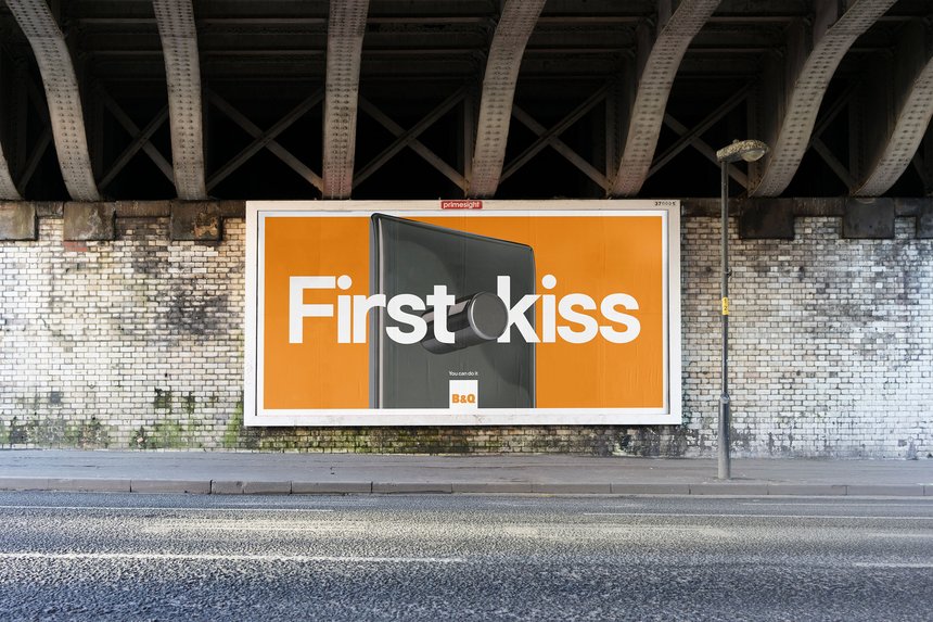
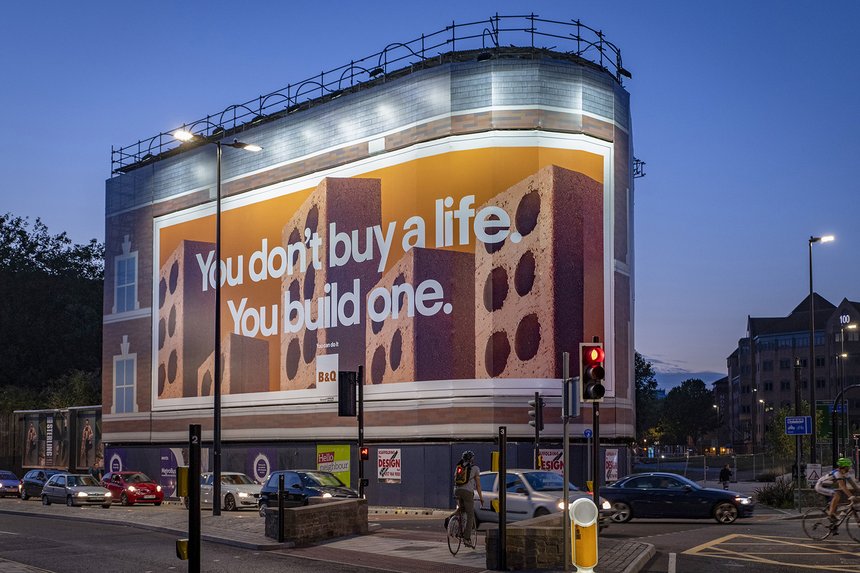
That was good, wasn’t it? Very good, I’d say. Almost great. Definitely worth an entry, if not a Nomination (Graphite in new money). I don’t know if Uncommon blasted the entries with punts in Graphic Design, Art Direction and Typography, but I would have.
Result: a single shortlisting in Press and Outdoor.
Huh?
On top of that, this was the only mention for at all for Uncommon, the agency that produced more famous work in the UK than any other last year. I get there might have been some snobbery about Brew Dog, but wasn’t there some cool ITV stuff last year? Or Habito? Like I said, I’m not sure what was entered, but Nils has usually been a committed enterer when it comes to D&AD, so I assume he would have given the above a go or two. Did they all fall by the wayside? If so, that’s bullshit.
Next is this campaign:
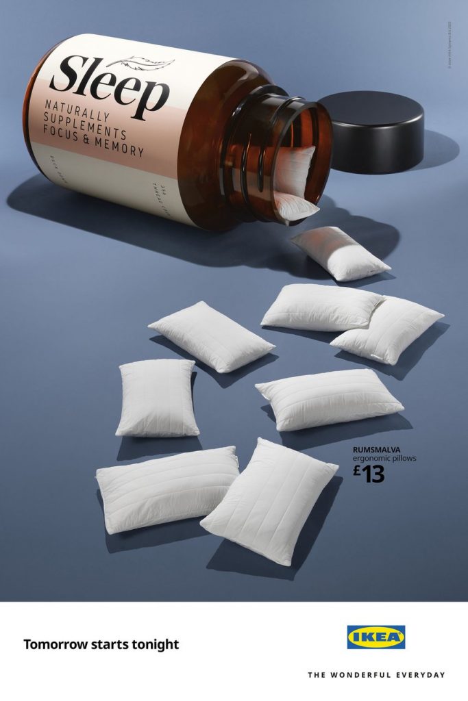

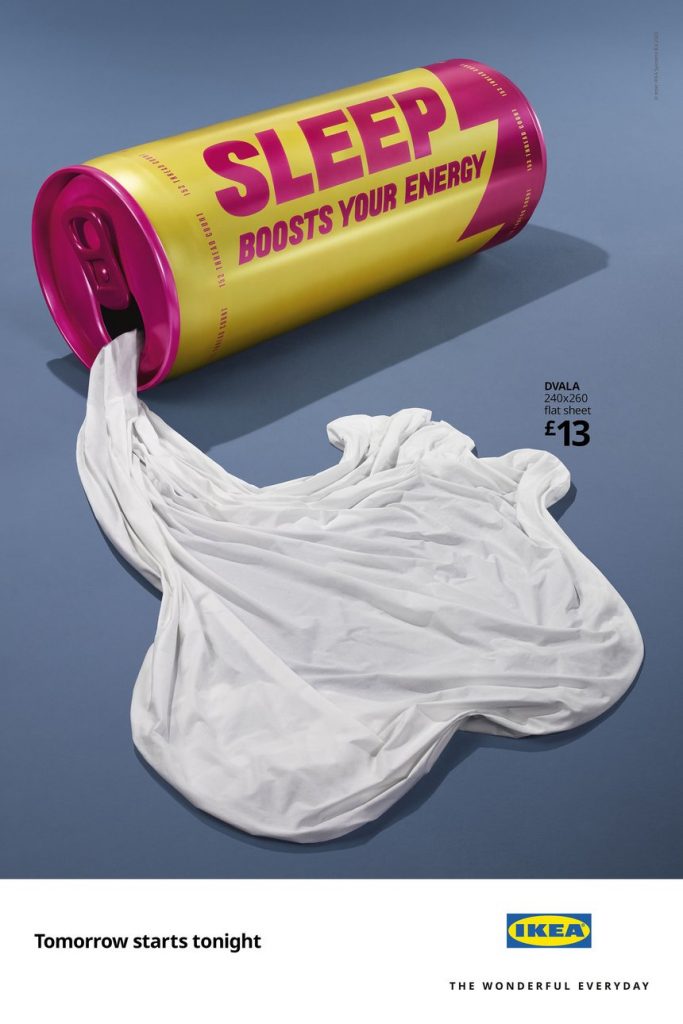
That’s good, isn’t it? Fresh strategy, excellent art direction and photography/image manipulation, even a good line.
Two Shortlistings in Press and Outdoor.
I’m assuming Mother entered them into craft categories etc., so they must have been ignored in Art Direction and Photography. I have no idea why.
Finally, this one is a bit more of a stretch, but I’m going to question it anyway:
Yes, it won three Yellows, Three Graphites and Two Woods (Woodens?).
But it should have won a Black.
It was better than at least two of the Black winners.
Anyway, commiserations to the people behind all that work.
I’d have voted for it, and at the end of the day, that endorsement is surely a greater honour that a piddly Pencil.
Good morning.
Apologies for the recent silence of this blog. WordPress lost all my data recently, so that had to be sorted out. We got most of it back, but if you’re wondering where a few of the more recent posts have gone, they have vanished into the digishpere, never to return. A shame, as they took a while to write, and I had a couple more cued up, but First World Problems and all that…
Moving swiftly forward, I have a new podcast episode for you. Paul Burke and I discussed the subject of ageism, during which we went off on various tangents, but eventually returned to the subject in hand.
It still requires further explanation, so I shall endeavour to find a ‘younger’ powerful ECD-type, to see what they think of the issue. Stay tuned for that.
In the meantime, here’s my chat with Paul on iTunes, Soundcloud and the play button just below these words.

The guy who wrote the good episodes of The Simpsons on how the hell that happened.
Scorsese on some specific scenes in his films: