Here’s a little song I wrote. You might want to sing it note for note. Don’t worry, be happy. In every life we have some trouble, but when you worry you make it the weekend.
Posted in Uncategorized
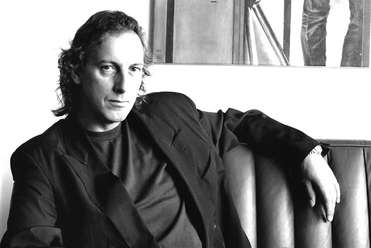
It would appear that one way of measuring the man (or woman) is by the calibre of people who want to mark his passing. In the case of Richard Foster, you can find Tony Brignull’s eulogy in Campaign, Paul Burke has added his to The Drum, and I now find myself in the position of hosting one from someone who worked under him, learned a lot, then took those lessons into the leadership of other agencies: Nick Bell.
Over to you, Nick:
A loving tribute to the man who helped make me.
Two things happened recently that moved me to write this.
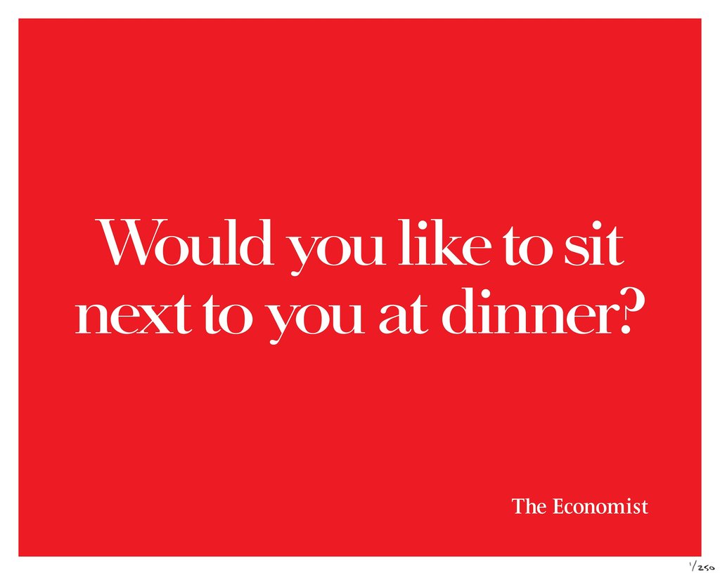
First, I read Ben’s excellent analysis of David Abbott’s ‘Would you like to sit next to you at dinner?’ for The Economist.
Then, just a couple of days later, I received the awful news that Richard Foster, my immediate boss in my days at Abbott Mead Vickers, had died.
There are many people ahead of me in the queue to write about Richard – friends, peers and colleagues who were closer to him and who knew him better.
But just as when David died in 2014, I have been feeling a significant sense of loss these last days – the loss of a man who profoundly influenced not just my career but also my life.
And so I want to pay my personal tribute to Richard.
Not just Richard the outstanding writer who, together with his long-time creative partner John Horton, created so much outstanding work, including not a few excellent Economist executions.
But Richard who gave me my break at one of the world’s greatest agencies and who, through his guidance, so informed what I was able to go on to do.
Richard hired Greg Martin, my art director partner, and me in 1987.
We had been working for Mick DeVito and Derek Day at the then Ted Bates and, with Mick and Derek resigning to set up their own agency, we were desperate to get out.
We would have been happy to take a pay cut from our lofty £13,000 a year salaries to work at Abbott Mead Vickers but when Richard called to offer us the job, he also offered us a rise to £18,000.
Heady times!
But as much as it felt an achievement to secure a job at the great AMV, Greg and I soon realised the hardest part was still to come.
As well as being, beside David of course, the most talented writer in the agency, Richard and his art director John Horton were one of three Group Head partnerships in the creative department (they call them creative directors these days).
Richard and John took this responsibility, like their work, extremely seriously.
And Greg and I were about to find out just how seriously.
We had been fortunate enough to be granted places in the AMV creative department and in Richard’s and John’s group, now we had to prove we were up to it.
And for me, a so-called writer in a ‘writer’s’ agency, this meant being under the exacting wing of one Richard Foster.
There are so many stories I could relate that would give a sense of what it was like at that time for an aspiring young writer to work into Richard.
I’ll share two.
Within weeks of joining AMV, Greg and I wrote a press ad that subsequently made its way into the D&AD annual.
It talked to the durability of a Volvo car and was a picture of a guy getting into his Volvo outside the Stock Exchange accompanied by the headline ‘The clever money is in galvanised steel.’
Richard and John liked the ad, David liked the ad and so did the Volvo client.
It was going to run – whoopee!
But first, I had to write the copy.
This I did or rather thought I had until our next review with Richard.
Proudly offering him a sheet of typed A4, I breezily declared ‘Hi Richard, I’ve written the copy for the Volvo ad.’
Affording my effort his consideration, Richard soon lifted his eyes from the paper to me and replied simply ‘No, you haven’t’.
It was in this moment that I began to learn the standards I was going to have to live up to if I wanted to survive, let alone thrive at AMV.
And it was in this moment that I was first introduced to Richard’s red felt tip pen.
This pen was to become very familiar to me over the ensuing months and, in those early days, worked hard on my behalf.
On this first outing, by the time Richard had deployed it to eliminate anything he didn’t like there wasn’t actually any type left visible.
And as John and Greg slunk away, Richard spent fully ten minutes explaining to me that the drivel I had served up was woefully short of the standard of writing expected at AMV.
Richard explained how to construct a reasoned argument with a beginning, a middle and an end.
He pointed out the virtue of fact over supposition and waffle.
He taught me how to make one paragraph flow inexorably into the next.
And he suggested I spend some time with the Volvo and Sainsbury’s guard books.
Suitably chastened but highly motivated, I spent the next three nights holed up with said guard books and at my typewriter.
(No Macs yet, of course.)
I pored over David’s and Richard’s famous ads.
I read and re-read their copy.
Their writing was so simple.
It seemed so effortless.
But as I came to understand, the appearance of effortlessness requires an enormous amount of effort.
I think it was fully seven or eight revises later that my copy was finally approved by Richard.
I was exhausted but elated.
Over the ensuing months, many more of my offerings were subjected to trial by red felt tip pen.
And then one day something miraculous happened.
Greg and I having had a double page spread for Sainsbury’s approved,
I wrote the copy and, now with improved confidence, was ready to submit it for Richard’s appraisal.
As ever, Richard gave what I had written his serious attention.
And then, looking up at me from his seat, he handed my sheet of A4 back to me and simply said ‘ Yeah’.
Those who knew Richard will know that his ‘Yeah’ was actually more of a deep ‘Yuuurhhh!’ and communicated, as succinctly as was possible, his approval.
It is difficult to convey how much of an achievement that moment felt.
In a few months I had been on an important journey.
I had listened, applied myself, learned and improved immeasurably.
A lot of young creatives today might well consider all of this quaint.
I’ve heard it – ‘What does it matter? It’s only body copy for a press ad.’
But this misses the point.
In my early days at AMV and with Richard’s guidance, it wasn’t just how to write a piece of copy that I learned.
I learned the virtue of simplicity, of discipline, of being succinct, of clear thinking, of standards, of excellence, of taking pride in everything you do and, yes, of the appearance of effortlessness.
I said I’d share two stories.
If you’re still on board, here’s the second.
Approaching Christmas one year, Greg and I were briefed to announce in a full page national press ad that Sainsbury’s, for the third year in succession, had been voted ‘Wine supermarket of the year’.
Our job, essentially, was to make a simple statement of fact interesting, eye-catching, witty perhaps in order to stand out and be memorable.
I cannot imagine how many ideas we showed Richard and John but concept after concept was rejected.
What we thought perfectly good ideas were deemed not to be so by our demanding group heads.
And then, to ramp the pressure up just a little, Richard announced to us that if we didn’t crack the brief by the time of the creative department Christmas lunch, we wouldn’t be going.
Greg and I were not sure whether Richard was serious about this but it certainly focused our minds.
For young creatives in the department, the Christmas lunch was not to be missed.
It was a chance to rub shoulders with the seniors, to have a few drinks (a few?) and a lot of laughs.
Nevertheless and despite our best efforts, as the day drew near we still hadn’t come up with anything that met with Richard’s approval.
The day itself arrived.
Surely Richard wouldn’t follow through on his threat.
Well, he certainly kept a poker face and as people began to get their coats on Greg and I were feeling mortified.
Suddenly, the department was empty save for one young creative team staring at blank layout pads.
And then – wham! – it came.
Remove the letter ‘e’ from wine and what have you got?
Imagine a mythical mahogany door deep in the corridors of Sainsbury’s head office.
Individual brass letters screwed into the mahogany prestigiously spell WINE DEPARTMENT.
But somebody has cheekily removed the ‘E’, leaving just visible the outline of where it had been.
Under this visual runs the simple, factual headline ‘For the third year running, Sainsbury’s has been voted Wine Supermarket of the Year’.
Breaking the world record for scamping up a layout, Greg committed it to a cardboard tube and we legged it down to the Halepi restaurant in Bayswater.
Bursting through the door, we sought out Richard who looked surprised to see us.
Unsheathing our layout, we spread it on the table over his Dolmades and Kleftico.
I cannot be sure but I think I remember Greg having the balls to announce ‘We’ve cracked it, Richard’.
As so many times previously, our submission was afforded due consideration before Richard looked up at us, smiled and said ‘Siddown’.
I think it fair to say Greg and I got very, very drunk that afternoon!
So what’s all this about?
Why am I sharing these stories?
Again, some might feel all of this unnecessary – a little too hard, perhaps.
Well, I can tell them for an absolute fact that they would be wrong.
Because there is not a doubt in my mind that if it hadn’t been for Richard’s tough schooling and the standards he set me in those early days, I simply would not have been equipped to enjoy the career and achieve some of the things I have.
And don’t get me wrong – it wasn’t all hard yards and deadly serious.
Greg and I had some great times and laughs with Richard and John.
And they would give us huge credit when we’d earned it.
I remember Richard appearing in the doorway of our office one day.
He’d come back from D&AD judging and he was both proud and thrilled to tell us that work we had created had got ‘in the book’.
When I finally left AMV in late ’95 to take the opportunity of joining Leo Burnett as a creative director (group head in old money), in no time I began to truly value everything I had soaked up at AMV.
Honestly, the difference between the two agencies at that time was like falling off a cliff.
But I had a fierce resolve that all the hard yards and learning were not going to be wasted.
I was determined not to compromise on the standards that had become a part of me in my time at AMV.
A number of people inspired me in my time at this wonderful agency.
David, of course, with the tone he created for the entire agency and with the example he set every single day.
My partner, Greg, who frankly was better than me when we teamed up and when we won our jobs at AMV and who I was lucky to be teamed with in the first place.
Tom Carty and Walter Campbell who hit the agency like a tornado and inspired me not just through the work they created but with their work ethic, their friendship and their humanity.
And, of course, Richard.
So much of my learning came directly from Richard – from the standards he set me and the guidance he gave me.
In subsequent years I would bump into Richard at industry functions.
On these occasions he was unfailingly generous and complimentary.
‘We love your McDonald’s work’.
‘How the fuck did you get that Heinz Salad Cream campaign through?’.
‘Nick, your Smirnoff commercial is brilliant’, followed of course by a forensic breakdown of exactly why he thought so.
I last saw Richard a couple of years ago at a drinks reception in an art gallery off Piccadilly.
Inevitably, once he and I got together we talked too much shop.
Not for the first time, Richard told me how proud he was of the work I went on to produce both as writer and Executive Creative Director.
And not for the first time, I told him what a critical part he had played in this.
And then, just a couple of weeks ago, I received an email from Richard addressed to many of his friends from AMV.
I was shocked and deeply upset to learn that Richard was terminally ill.
I wrote to him.
I told him that if he still had his famous red felt tip pen, I’d be grateful if he would run it through every line of the copy he’d sent us.
Because, I explained, it was the only thing he’d ever written that I didn’t like.
Rest in peace, Richard.
And thank you for everything you gave me.
This makes me laugh every time I read it.
There are times when I’ve had to sing Happy Birthday to myself to remember my own name.
Old what’s-her-name in the corner with the acrylic jumper and mohair face.
Even if your typing speed is measured in minutes per word rather than the other way round…
It’s that wonderful rarity: a very long copy ad in the D&AD annual that’s actually worth reading (come on, have you ever really ploughed through 1000 words about a boot?), all the way down to the bottom of the coupon, where you’ll find something daft about stamp collecting.
The writer took a dull brief and made it into something far more enjoyable than anything printed in whatever newspaper it appeared in.
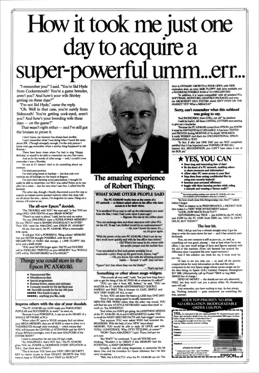
Although I would like to explain why it works so well by using forensic analysis of specific words and phrases, that process doesn’t really hold up here. It’s just a spoof of those ‘Get a great memory in days!’ ads that appeared with tedious regularity back in the 1980s, but with an enormous amount of product spec woven in amongst the excellent gags.
That’s it.
Funny writing is great writing because it’s so hard to do well, but so memorable (appropriately enough) and engaging on the rare occasions anyone manages to pull it off. When did you last read something properly funny from anywhere in the advertising industrial complex? Not a TV or radio ad, where the performance and visuals can boost some so-so writing; I mean a print ad where there’s nowhere to hide?
In researching this ad I emailed its writer, Kevin Baldwin (erstwhile generator of mean things for Anne Robinson to say on The Weakest Link), who had the following insights to share:
When I joined Cogent Elliott in Solihull during the 80s – my first proper agency job – the place was already producing really nice work on the Epson account, mainly created by a talented writer called Jim Mulligan. (Jim made the move to London before I did, but seemed to disappear fairly soon after that – the young art director he moved with, Paul Brazier, hung around on the London advertising scene rather longer.) It wasn’t a long-copy campaign – rather, a series of clever one-offs – but as a junior writer I felt rather daunted by the quality, and I remember being nervous when a brief for the next execution somehow ended up on the desk I shared with my then art director Martyn Dean. How it came to us, I’m not sure – maybe Jim was on holiday that week.
Anyway, the brief was for a computer printer to be used in offices, and its main selling point was the high quality of its output. The ad that resulted was ‘Fifteen ways to sharpen up your business letters’ – with fourteen examples of witty letter-writing, and of epistolary howlers to avoid, with the Epson printer as number fifteen. That ad was a bugger to write for a number of reasons: 1) I’d never written a long-copy ad before; 2) finding the examples of clever letters was hugely difficult in those pre-internet days, and I had to do a lot of hunting around in various Birmingham libraries (kids today don’t know they’re born, etc etc…); and 3) there wasn’t a lot of time to put it together. Two things helped, though – a David Abbott ad headlined ‘How to write for The Economist’, which was a selection of style tips which could have been very dry to read but obviously wasn’t in his hands, and the old Parker Pen ads written by Tony Brignull. For that first execution, I basically tried to mimic their tone of voice in those ads.
The ad was well received, but at that point it wasn’t clear that it was going to be the starting-point of an ongoing long-copy campaign. We thought it was probably just going to be another one-off.
Then we got a brief for another printer. The proposition this time was its speed – painfully slow by today’s standards, but back then an ink-jet printer which could produce two full pages of type in a minute was considered an ink-jet sprinter. (You see the path the ad could have taken there…) We came up with a DPS which was just solid type, to demonstrate the printer’s output in sixty seconds – and without planning to, realised we’d come up with another long-copy execution. The tone of the writing was different in that second ad – it was much more silly and playful than the first, as the joke was that we were just trying to fill up the two pages with any old nonsense. Looking back, it set the tone for the playfulness of the ‘Super-powerful memory’ ad later on.
That ad got more attention from the first, and one of the DJs on Radio One (unfortunately I can’t remember which one) actually read out some bits of the copy on air. We suspected we might be on to something with a long-copy approach – and then someone from the planning department pointed out the bleeding obvious, which despite its obviousness hadn’t occurred to Martyn or me, that a campaign which effectively celebrated the printed word was perfect for a range of printers.
After that, it was clear that a long-copy campaign was the way to go on the Epson account. (Sorry, Jim.) After one more DPS execution in the Sunday supps, the media plan switched to full pages in the broadsheets, which felt like the natural home for the campaign. The ads ran more regularly and picked up something of a following; we even got fan mail from readers of the ads, which is something I’ve never experienced since. I mention that not to show off (well OK, maybe a bit), but in anticipation of a point I’ll come to shortly.
Each execution was devised around a particular feature of the printer we were promoting – a quiet model led to an ad about the taciturn US President Calvin Coolidge, for example – so when we got a brief for a PC with a (then) powerful memory, we took the same approach. Even though the ad was to be for a PC rather than a printer, we thought it would be silly not to stick with the long-copy approach as it was going down so well.
So – how could we talk interestingly about memory in a long-copy format? What hook could we hang the ad on?
The answer was there on the front of all the broadsheet newspapers which our ads were running in (usually the bottom-right corner of the front page). There was a direct response ad which had been running for years, offering a way to improve your memory. Every reader knew it, everyone had read it – and better still, the copy had a set-up and a style which was a dream to parody. It featured an exchange between two characters, one of whom astonished the other by his ability to remember names, places etc. The ad always featured a picture of a grey-haired man looking composed and pensive – so that was ripe for mickey-taking too.
Thus, the ‘Super-powerful memory’ ad was created. We picked apart every aspect and angle of the copy and wove as many daft jokes as we could around it – even down to the coupon at the end. It wasn’t intended to be a direct-response ad, and we didn’t expect people to return the coupons for more information (though many did) – it was just that because the ad we were lampooning had a coupon, we need to incorporate one as well to see it through to its conclusion.
We knew exactly who we were writing for. We were getting enough feedback to know that we’d built up something of a following among the broadsheet readers – and even if they weren’t all actively looking for the next ad in the series (as some said they were), they knew and enjoyed the style and approach of the work by then. And as mentioned, the ad we were parodying ran so often then that they would definitely have got the joke. We were just trying to entertain the audience we knew we built up by then, and in doing so to make them feel better-disposed towards Epson as a brand.
That was our ultimate aim, of course. Computer printers were (and I guess still are) cold, uninteresting-looking pieces of functional equipment with little to differentiate them. We wanted to make people feel warmer towards Epson by entertaining them. And it translated into sales.
There were even times when the campaign had to be paused for a few weeks because Epson couldn’t ship over product quickly enough to keep up with demand.
The only other point I should mention is that the Epson campaign was probably the only time in what might laughingly be called my career that the client gave the creative team free rein to do what we liked. They saw quickly that the work was working, and just stood back to let us get on with it. At that fledgling stage, I assumed that pretty much all clients would be as hands-off as that, and respect the agency enough to go with their recommendations in full.
Little did I know that it would never happen again. And little did I know I would never write a campaign as successful as that again.
Thanks, Kevin, for both the ad and the background.
I only came across this ad a couple of weeks ago. My former boss, Duncan Milner, had commented on a LinkedIn post that it was the one that made him realise he wanted to work in advertising.
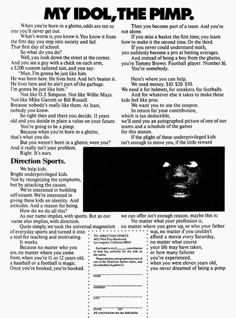
I took one look and immediately understood why. What a headline. Could you ignore it, especially with that incredible image underneath? No. You’d have to read on and discover who had decided to idolise a pimp and why.
I had a dig around online and tracked it down to this exhaustive Chiat/Day blog, which said it was from 1969, which might explain the line, ‘You see a guy with a chick on each arm, a $200 custom suit, and you say: “Man, I’m going to be just like him…”
But I’m willing to bet that very few of my UK readers are aware of it. In those days most advertising awards were not as international (and homogenised) as they are now, so you got work that was full of local flavour, like this one, written for an LA charity about an LA situation by an LA agency.
And it’s not just the headline. The copy is full of the perfect amount of righteous indignation, understanding the kids and blaming the circumstances, including the people behind the ad. That’s unusual, and unusual things that make sense are more likely to stick in the mind.
There’s a deft turn where, without you noticing, ‘you’ stops referring to the kid and starts referring to the person reading the ad. That takes good writing. As does the ending, where it says, ‘if the little reward we can offer you isn’t enough reason, maybe this is:’, then slides in 42 more conditional words before giving you the ice-cold conclusion: ‘when you were eleven years old you never dreamed of being a pimp’.
It also uses great specificity beyond the geographical location. The amount of money, what that money will be used for, the fact that it’s tax deductible… This isn’t just ‘please donate and your cash will fund a giant corporate charity’; you can now visualise the good things your contribution will bring about: sports gear… to help kids… find some constructive purpose… instead of becoming people who beat up prostitutes for money.
It’s a well-worked, well-rounded, engaging argument that leads you from the dismal situation suggested by the headline to the rational reasons why Direction Sports can do something about it.
I don’t know how many 50-year-old ads still hit this hard, but I think if this ran full-page in a newspaper tomorrow it would generate a lot of conversations and donations.
Maybe just take out the reference to emulating OJ Simpson.
Brian Blessed explains his beefs:
Director’s cuts that improve on the original (thanks, A).
Map Men: dropping funny knowledge (thanks, D):
Books.
I’ve read quite a few: long, short, exciting, dull, fiction, non-fiction, for pleasure, for obligation, for my English A-Level, War and Peace, Zen and the Art of Motorcycle Maintenance, Katie Price: My Story…
But through all those letters, words, paragraphs and pages, I don’t think I’d ever really considered why reading books was such a worthwhile pursuit.
Fortunately, in the late 1990s and early 2000s, a copywriter called Nigel Roberts explained it to me again and again through the unexpected medium of advertising:.
This one is my favourite:
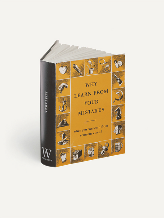
‘Why learn from your mistakes when you can learn from someone else’s?’
In a single sentence, the most compelling reason to read books (and watch TED talks) that I’ve ever come across.
On the technical side it does something I’m very fond of: it takes a cliché and turns it on its head. ‘Learn from your mistakes’ in one form or another has been attributed to many people, from Henry Ford to Winston Churchill, but it’s a bit of an arse. It means you have to make those mistakes then suffer the consequences.
What if you could learn without suffering? That would surely be far better. Well, buy a book and the discomfort of others becomes a five quid paperback that gives you a painless head start in any subject.
Who can argue with that? It’s actually a better piece of advice than than the inexplicably tenacious ‘learn from your mistakes’, and if you can write a line that makes Churchill look like a bit of a thickie, you’ve done your job very well indeed.
The truth and the construction are faultless, but I also like the ‘surely this must have occurred to you before?’ tone of voice of a friendly mate down the pub. Such a big thought needs a smaller delivery, and that’s what Nigel has given us. Not off-puttingly pompous or condescending. Just a little nod in the direction of a better life.
The entire campaign deserves a pat on the back (as does the quite brilliant art direction from Paul Belford). Find it here, along with lots of other great writing by Mr. Roberts (and my podcast interview with him can be found here).
But as I’m on the subject, a few quickies:
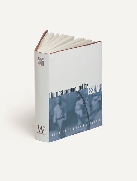
Escape from prison with a book? I might apply the same benefit to a boring train journey or trip to the in-laws (not my in-laws, obviously. They’re all very entertaining). I also like the use of the unwieldy, almost onomatopoeic word ‘shovel’. It makes the digging process seem more of a drudge than the ‘spade’ a lesser writer might have employed.
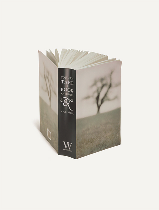
The physical and literal versatility of books, all summed up in a sentence. I think Nigel made good use of ‘and vice versa’ as a line construction in other campaigns, but this was the first. If you can do a perfect vice versa you have written a good line. If you can do it several times, you’re a very good writer. I’ve seen plenty try their hand at it and simply add confusion.
Let’s end on a high.
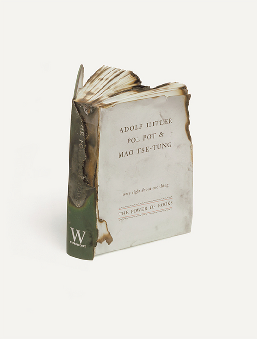
Imagine starting an advertising headline with ‘Adolf Hitler, Pol Pot and Mao Tse-Tung were right about one thing’. That is a flying trapeze quintuple somersault over a pool of crocodiles that you’d better land perfectly. And Nigel did. With just four words he turned something that’s probably tattooed on Nigel Farage’s bum into another great reason to buy a book in Waterstones.
Why learn from your mistakes when you can learn from Nigel Roberts’ copy?
I wasn’t expecting this to happen so soon, but thanks to a excellent contribution from multifaceted writer extraordinaire Mr. Paul Burke, I already have my first guest post in this series.
And it’s kind of ‘guest posts‘ because Paul has offered up two examples of the finest in advertising copywriting:
I have two submissions, both from CDP around 1980. Rawlings is one of the best posters ever. The only trouble now is that, if you’re under 40, it’s impossible to appreciate just what a popular and enduring catchphrase Schweppes had in “Sssh. You know who”. Everybody in the country knew it.
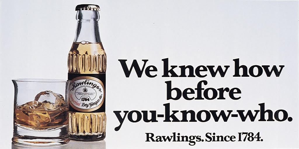
In one short, perfectly balanced line, it explains why Rawlings is a better tonic than the brand leader whilst not actually mentioning Schweppes by name but still using their own famous catchphrase to denigrate them. There is nothing I can fault in this ad. And the copywriter was also an art director: Ron Collins.
Then some body copy which – examine every word – is faultless. A long forgotten ad for a long gone travel company.
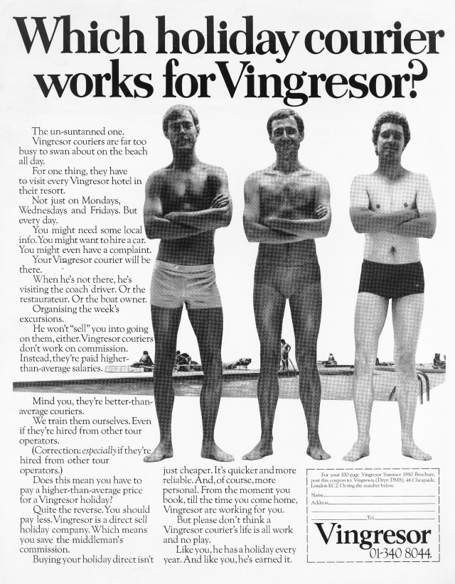
First, it’s a good visual idea that works perfectly with the headline which, in turn, makes you want to read the copy. So much product information crammed in but you don’t mind because it’s written so perfectly in such a friendly but intelligent tone of voice. I love the use of “Mind you” and “Correction:” and all rounded off with a wonderful endline.
My only criticism (and it isn’t the creative team’s fault) – this should have been a nice big colour DPS. But then you could point to the fact that this team put so much thought, care and intelligence into a small B&W single page. Just wonderful. And the team: John Horton and (of course) Richard Foster.
Thanks Paul. A pair of crackers.
That first one is annoyingly clever. It’s one of those ones where the copywriter’s skill has made it seem as if the elements fell serendipitously into place, but anyone who has slogged over a line knows how rarely that happens.
Sorry to get a bit wanky here, but the start and finish match as neatly as the lines of a haiku, and the turning-its-own-weapon-against-it use of the competition’s endline? Chef’s kiss perfection, as the kids (probably don’t) say.
The second was given an added degree of poignancy as the writer passed away on the day Paul sent it over. So let’s take a moment to appreciate Richard Foster, one of the best copywriters of all time.
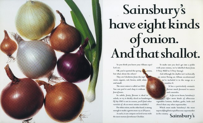
Richard and I worked in the same creative department for several years. I can’t say I knew him particularly well (if you want to get a proper insight into the person and his work, this post and podcast from Dave Dye should be your first port of call), but of course I knew how brilliant he was. Just read his page in The Copy Book; it’s everyone’s favourite: a succint explanation of how he went about writing the copy for a Sainsbury’s ad. No philosophical musings or ancient anecdotes. Just the job and how it is actually done by the best in the business.
I’ll leave you with my favourite of his ads, one that took pride of place on the back of my bathroom door for a few years. Sometimes great headlines just make you like the company behind them, while imparting some fairly prosaic information. The brief was dull, but the result was as memorable as you could hope for. Thanks, Richard, for this one and for so many others.
Explore the radio garden all over the world.
Fun with Reggie Watts:
Locations from the movie Colors, then and now (thanks, A):

Anthony is many things: comedian, journalist, DJ, presenter, author, pilot, maker of excellent roast potatoes, and, of course my next-door neighbour (find out all about him/hire him here).
But he is also a top-level voiceover artist, who has lent his vocal cords to such clients as Nike, Lego, Samsung, Kellog’s and Disney. Here’s his Nike one (he’s the newsreader):
So I thought it might be a good idea to ask him what it’s like on the other side of the recording booth glass. What’s he thinking when you’re going through those fifty menus, trying to decide between the Yaki Soba and the American Hot? What advice most effectively improves his read? Should you ask him to do an impression of Michael Caine?
We also find out which branch of Pret all the VO artists used as a hangout, how many voices routinely audition for a gig these days, and the difference between actors and professional VOs.
Unsurprisingly it is the best recorded episode I have ever done, and has the most mellifluous voice that isn’t mine.
Here’s the iTunes link, the Soundcloud link and the direct play button.:

Paul Belford is currently writing an excellent blog. It explains in detail why certain print/poster ads were so good, but with a focus on the art direction.
I think the ideal complement would be a similar blog about copy, written by an equivalent master of the art form.
But in the absence of Nigel Roberts, Mary Wear or Richard Foster, you’re left with me. Sorry.
I know I’m not a ‘great’ in the sense that I’m not in the Copy Book, not have I won a Copy Pencil, but until I start asking people far better than me to write guest posts, this is it. Feel free to stop reading now, or carry on and see if you agree with my assessment.
Now that I’ve got the admission of under-qualification out of the way, let’s start with the ad on this page.
Of course, choosing one of David Abbott’s Economist ads is like shooting a Great White in a barrel, but let’s not ignore the perfect just because everyone knows that it’s perfect. The point of this post is to explain the reasons behind the perfection.
Longtime visitors to this parish will be aware that I trod the boards of this account in my youth. That qualifies me to explain that it’s an arse to work on. Too many excellent predecessors. Too much competition from one of the best creative departments in the business. Too many areas already explored, and therefore obsolete. Smart Cars, Smarties, pictures of brains, Brains from Thunderbirds, Latin, lightbulbs, Venn Diagrams, Blue Plaques, paint colours, Einstein, shredders, keyholes, jigsaw pieces, long headlines, pros and cons, pregnant pauses etc. etc. etc.
And yet the stone would always accommodate one more squeeze.
I’m not the only one who would actually trawl through a thesaurus looking for different angles on ‘read this and be successful’. Then again, Jeremy Carr was apparently at lunch with the Economist account team when the waiter asked, ‘Still or sparkling?’ and unwittingly wrote a headline for the next batch.
But back to, ‘Would you like to sit next to you at dinner?’ Why did I chose that one over all the other superlative Economist lines?
First, because it expresses a truth. All the best art does this, but to convey so much of life, and inspire so much introspection in ten simple words is remarkable. Yes, we’ve all considered this situation for our own selfish wants, hoping our next-door neighbour won’t bore us to death over the seafood risotto, but how many times have you considered it from the other side? Think about it right now: have you ever been the dreaded, unwanted dinner party partner?
Now you’re considering it: how interesting am I? How funny and insightful are my anecdotes? How witty is my repartee? How many subjects do I feel comfortable discussing? Am I up to date on the current affairs, or am I going to look hopelessly out of touch?
A marvelously subtle dagger’s jab of fear, and expressed without the distracting self-congratulatory ‘cleverness’ of a pun.
Now I love an Economist pun as much as the next man, so long as the next man is Dave Dye, who hates them so much he was willing to piss off both his boss and his boss’s boss just to avoid running one. I think they’re only good if they also express a truth (‘Great minds like a think’), otherwise they tend to go an inch deep, but no further. Punless truths get to the point faster by removing extraneous obstacles of expression.
The edge of a conversation. The loneliest place in the world.
Lose the ability to slip out of meetings unnoticed.
What exactly is the benefit of the doubt?
So the insight is compelling. What about the way it’s expressed?
Well, no one ever says ‘Would you like to sit next to you at dinner?’, but they might say, ‘Would you like to sit next to Trevor/Susan/Joe at dinner’. So Mr. Abbott has taken a familiar sentence construction and turned it on its head. ‘Would you like to sit next to you’ sounds just odd enough while remaining easy to understand. This makes it penetrate a little further: your brain races away with the presumed ending, but then it has to put its brakes on and recognise the difference. So it thinks harder, stays with the ad longer, and goes through a process that lives longer in the memory. The line wasn’t just noticed, it was implanted.
Tonally, it’s perfect. The meaning of the line is, ‘Are you boring?’, but it’s said in a way that leaves it all up to you. It’s not nastily implying that you are a dullard; it’s merely asking the question. It welcomes you by presupposing that you are the kind of person who has friends that might invite you to dinner. It also suggests that this has happened to you often enough that you understand the situation, and its potential to go wrong. It invites you in with warmth, then turns the whole thing on its head by asking if you’re worthy of that invitation, all in ten words.
It also works so well with the construction of the entire ad: ‘Would you like to sit next to you at dinner? The Economist’. Question and answer, problem and solution. Twelve words that sell you a magazine with deft simplicity.
How else could it have been written? Perhaps something addy that tries too hard, such as, ‘What do you bring to the party?’. Or a ham-fisted attempt at the effortless elegance: ‘Would someone be happy to sit next to you at dinner?’. How about, ‘Be first on a list of dinner party guests’?
All dreadful, but they demonstrate how having the thought isn’t enough. The idea of being an interesting dinner party guest is the first part of the process. The real skill is in landing the plane so well that you get a round of applause from the passengers.
That’s what David did: concept and execution in perfect harmony.
He also made it look effortless. Then again, if you’ve read anything about how he worked, it probably was.