Great Copy, Part 6.
Yes, I’m shooting fish in a barrel again. But this is a series about great copywriting, so that’s what you get. I’ll find some more obscure stuff later, but in the meantime, let’s see what happens when a fly lands on your food.
Before Charles Saatchi was the county’s preeminent art collector (while I’m mentioning his good deeds, for balance I’ll remind you that he is also a famous wife choker), he was a damn good copywriter. Have a look at a few D&AD annuals from the late 60s and early 70s and you’ll find many examples of his brilliance.
But the finest is this one, and it’s an object lesson in how to write persuasive, impactful, memorable copy.
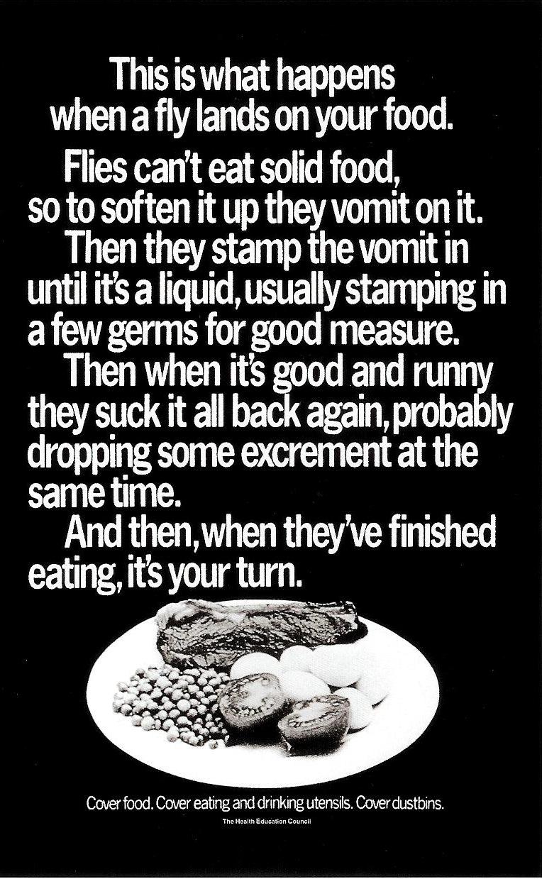
First off, it’s factual: ‘This is what happens when a fly lands on your food‘. He could have said,’This will turn your stomach‘, or something equally attention-grabbing, but it would have reduced the strength of the information. The facts are bad enough, so just get out of their way and present them, clearly and starkly, to the reader. Every additional attempt to be sensational would dilute those facts, so lesson one is, if you already have a rocket launcher there’s no need to stick a pea-shooter to the side of it.
Lesson two: use simple words. Aside from the very basic ‘probably’ and ‘usually’, the only one with three syllables is ‘excrement’, and it’s the right one because (see above), he’s being factual. Technically, ‘faeces’ is also correct, and shorter, but fewer people would understand it. This is an ad for everybody, so don’t shut anyone out with self-indulgent ten-dollar words that make you seem clever but make the ad seem more remote.
Of the 72 words, 57 are monosyllabic. That makes them easy to understand, but also helps the punchy, direct rhythm. Rat-tat-tat… it, stamp, suck… jab, jab, jab. There’s nowhere to hide from the relentlessness…
…Or the evocative descriptions: Good and runny, like a soft boiled egg, only, y’know, revolting; Stamp the vomit, a phrase you hoped you’d never have to read because now you can never forget it; Suck it all back again… Yes, like a vomit-and-fish-finger milkshake.
And let’s give a big hand to the repetition of vomit. Usually the aim is to avoid repeating outstanding words because doing that looks unimaginative and the repetition reduces the impact, but in this case, writing ‘vomit’ twice in eight words drives it home. (In addition, he couldn’t have just used ‘it’ because in the previous sentence ‘it’ refers to the food, so the extra ‘vomit’ is necessary to avoid confusion.)
Like all good stories it has a beginning, a middle and an end, and the end is the best part: And then, when they’ve finished eating, it’s your turn. Such a sardonic, caustic conclusion. You are in line behind the vomiting fly. It is in charge here, doing all sorts of disgusting things to your food until it decides that it’s finished, and hands the plate back to you. Are you really going to let it do that? In modern parlance, are you going to be a fly’s bitch? Or are you going to cover your food up, keep it hygienic and beat the fly?
Then there’s the non-endline endline. As we now live in a world populated by guff such as, ‘Tomorrow’s future, today’, or ‘Making progress together’, let’s appreciate a simple set of instructions that aren’t trying to be clever: Cover food. Cover eating and drinking utensils. Cover dustbins. So now you know what to do to prevent to prevent the vomit-stamp-suck described above. Clear? 100%.
While we’re on the subject of the non-endline, what about the non-headline? It’s 72 words long. Is it the headline or the copy? Yes. Can you stop reading? No. Is ‘This is what happens when a fly lands on your food’ the headline? Maybe, but it’s also the first sentence of the body copy, so you’re in, reading about fly vomit. Sorry about that, but as compensation, you’re also armed with a way of preventing this horrible situation from happening to you. Quid pro quo, Clarice.
And here we are, fifty years later, with every word still utterly relevant, presented in a layout you still can’t ignore, and written a style that would work perfectly on any one of the 18000 days that have happened since it first ran.
This is what happens when a genius writes your ad.