ITIAPTC Episode 65 – Kenny Gravillis

I used to collect movie posters. I still have a few favourites, but in the end I ran out of wall space and it seemed a shame to keep so much great stuff rolled up in a cupboard, especially if someone, somewhere might really want that foiled Kill Bill One-Sheet I tracked down, or the UK Quad of Goodfellas.

Anyway, now that I live in LA, I can’t drive anywhere without seeing hundreds of them (fewer recently for obvious reasons), so I still keep an eye out for the good ones.

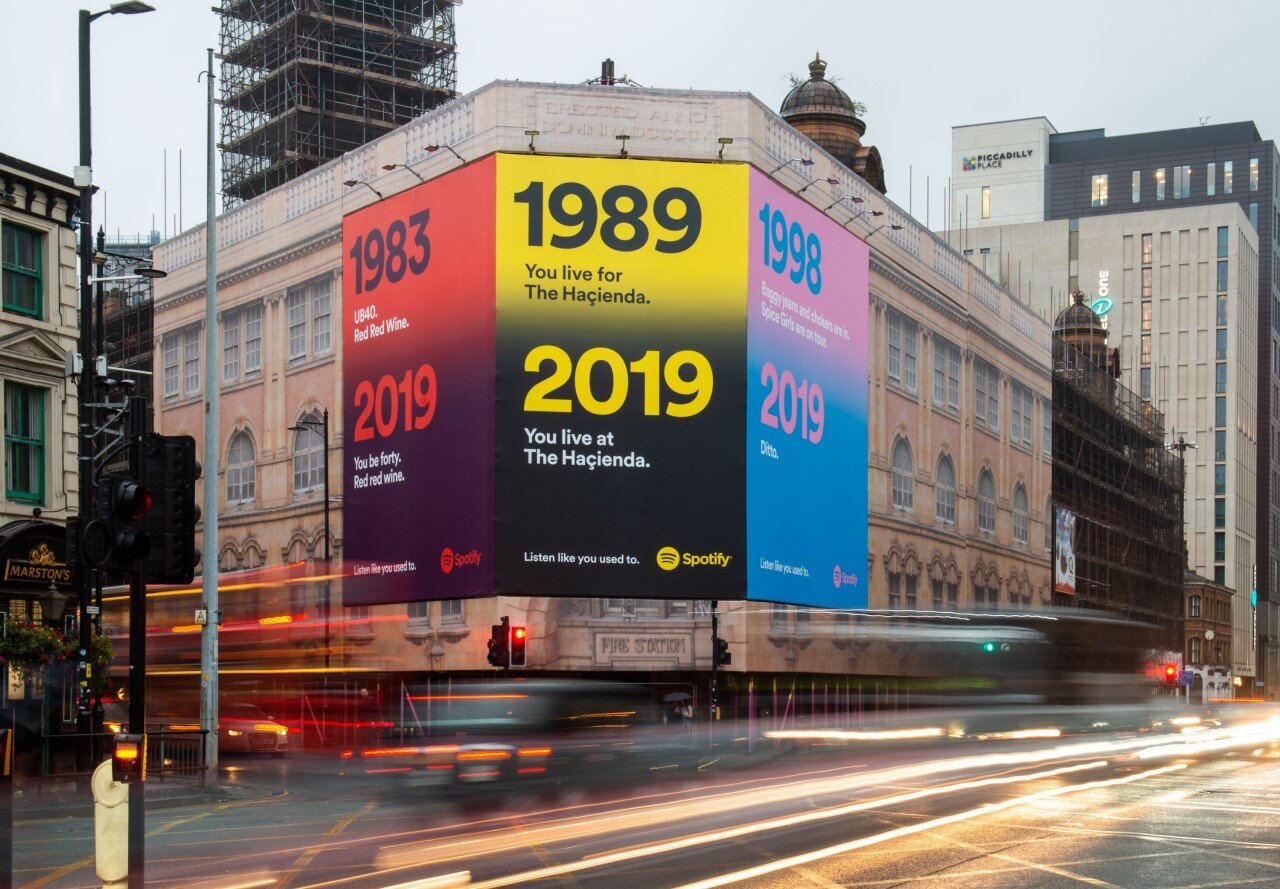
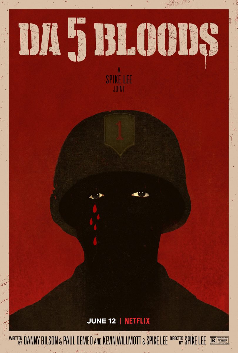
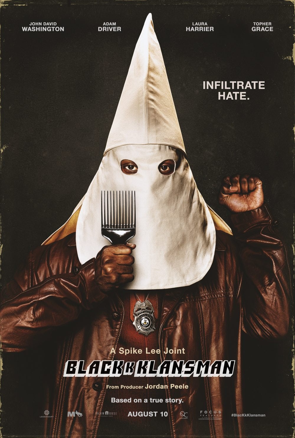
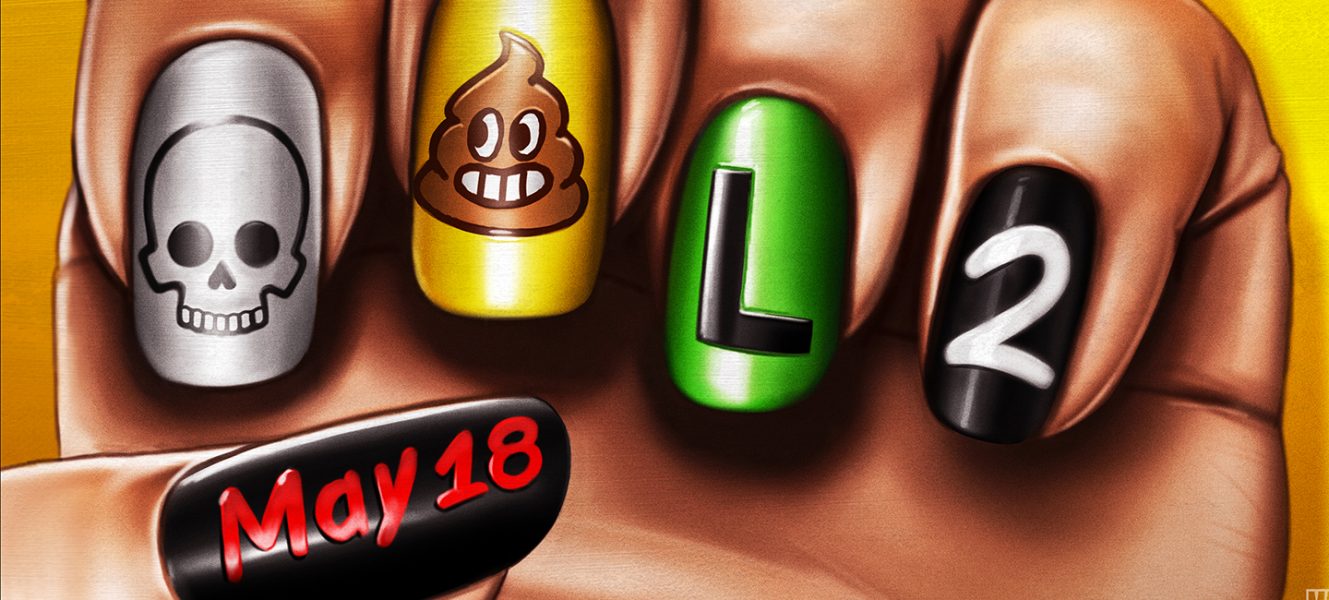
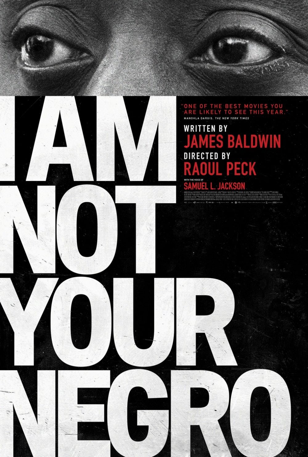
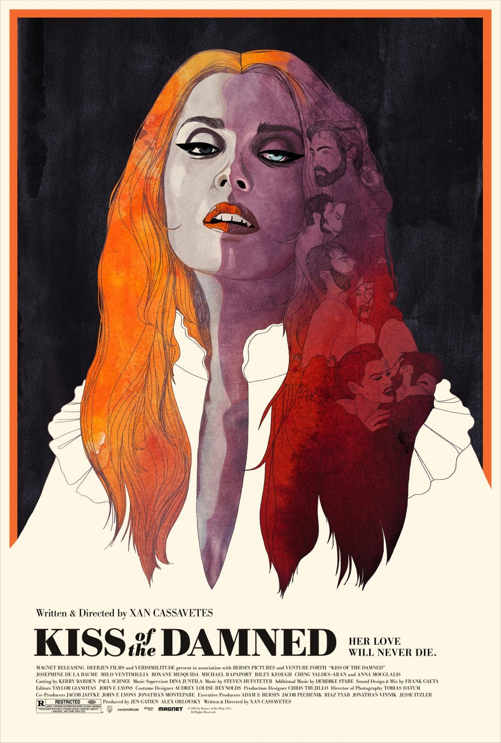
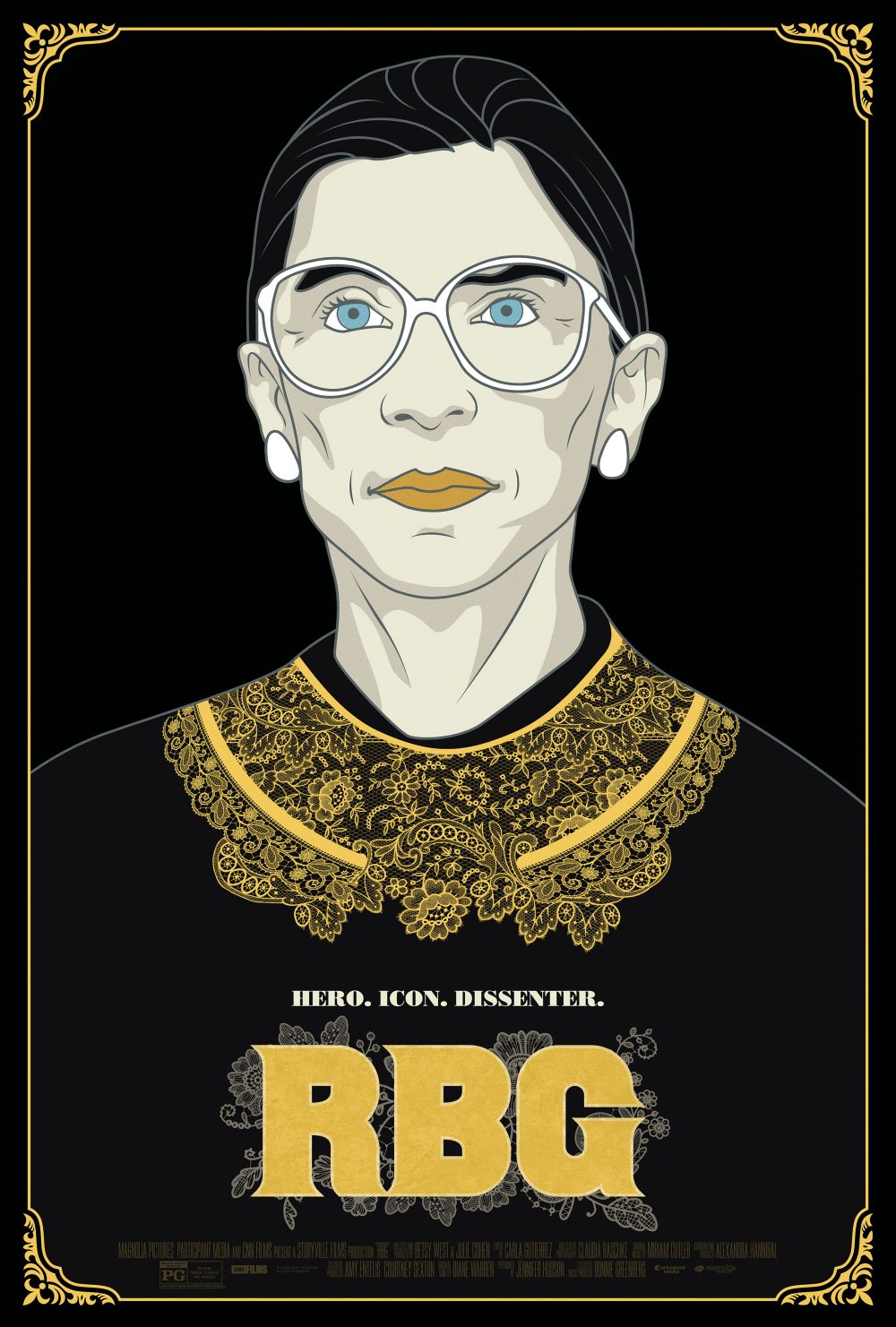
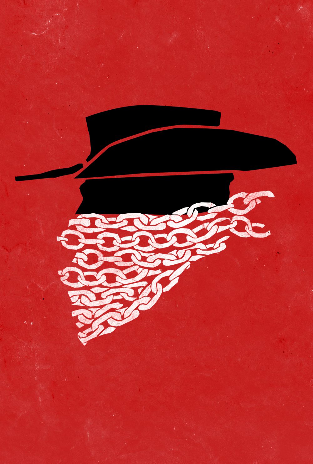
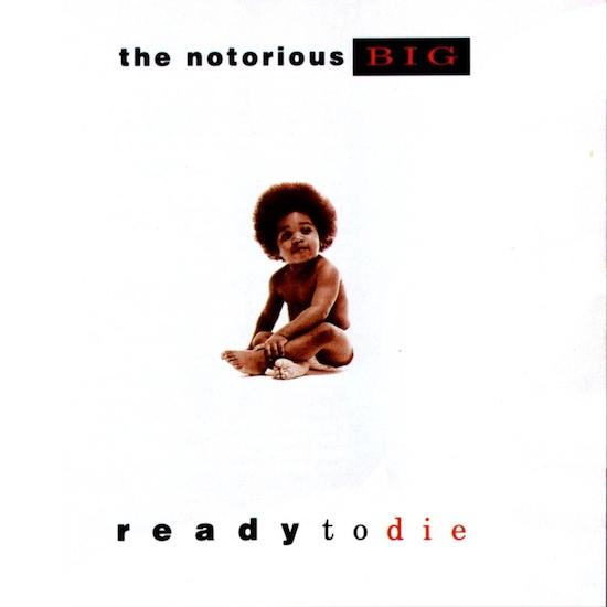
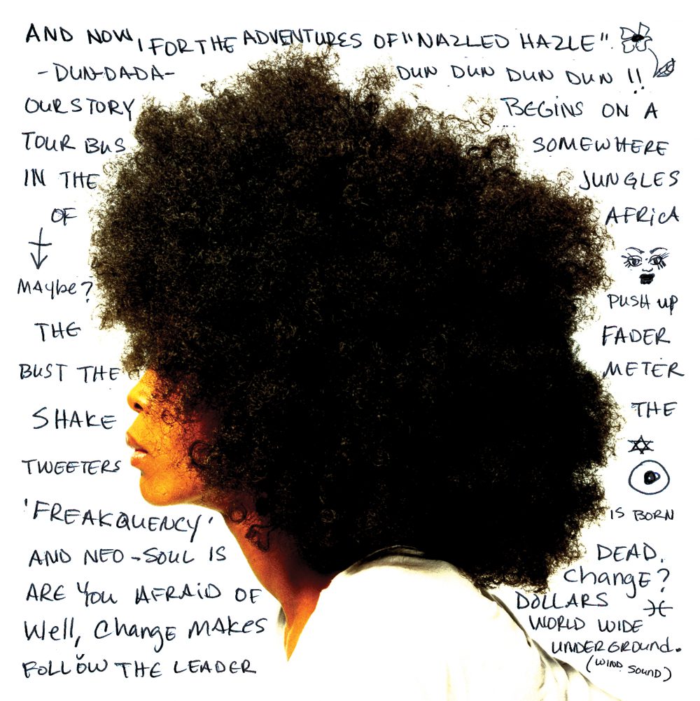
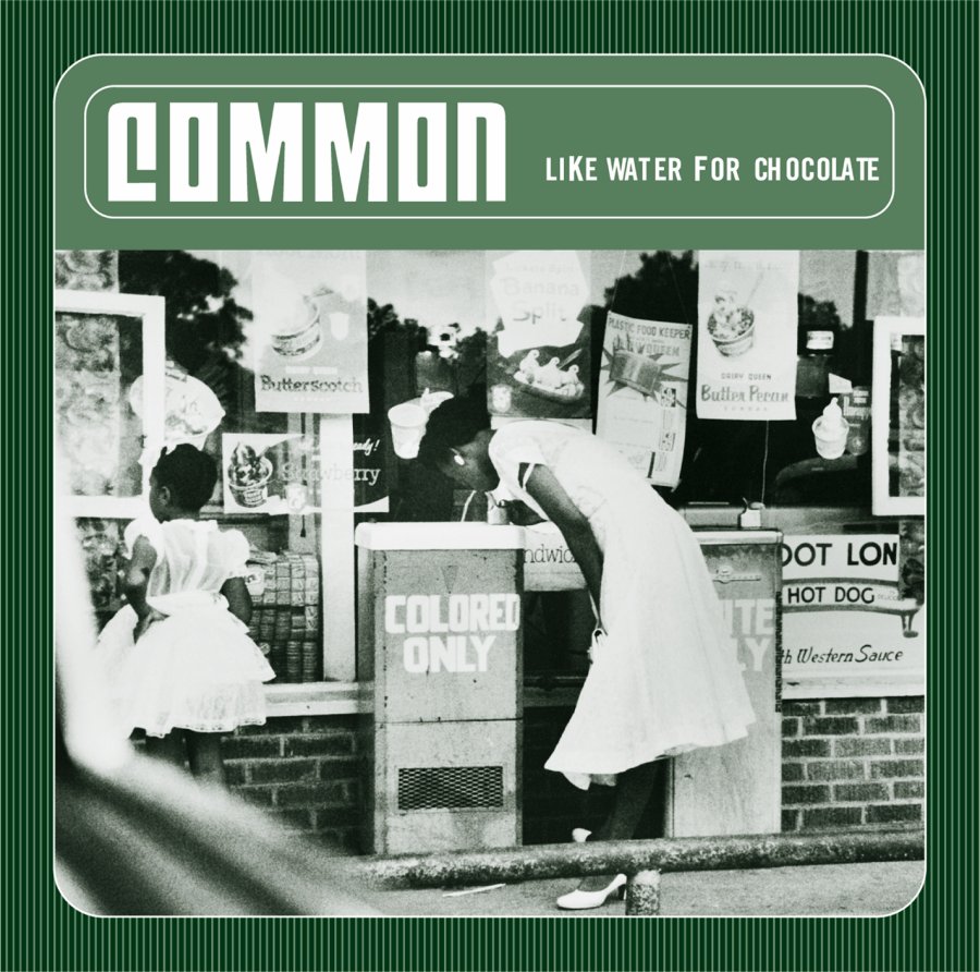
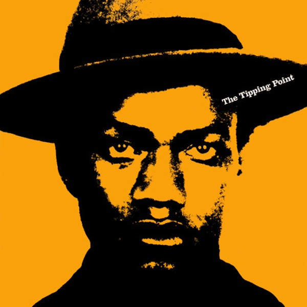
The very best tend to be done by my friend Kenny Gravillis at Gravillis Inc.:

See? He’s damn good.

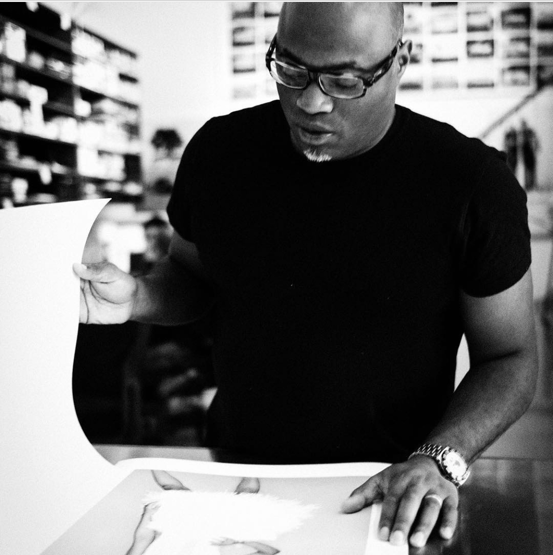
So we ended up meeting because his daughter babysat for me a few years ago. We then realised that we had a lot in common – a love of music, movies and frustrating football teams (he supports West Ham) – and now we’re just two ex-Brit mates in LA.

But I always love his work, so I’m always keen to discuss it, hence this podcast.

The other reason to chat is his career story, which goes from the Isle of Dogs to late-80s New York, to designing record sleeves for some of Def Jam’s biggest artists…

…to expanding that role into other labels…

…to pivoting from music to movies, and the surprising hurdles of making that change.

There’s a lot to learn here, all told in Kenny’s East London, NY, LA accent. And if you want to know more, here’s a Creative Review profile (£/$), and a short documentary on how he collaborated with Black Panther designer Emory Douglas on the artwork for Da 5 Bloods:

iTunes link, Soundcloud link, direct link:

If This Is A Blog Then What's Christmas?
ITIAPTC Episode 65 – Kenny Gravillis
Loading
/


If you change your mind, I’m the first in line. Honey I’m still free, take a chance on the weekend.

The Walkman turns 40.

Stop doomscrolling.

Take a look through someone else’s window.

Books with literal titles (including ‘Learning to Play with a Lion’s Testicles’).

Have fun with your keyboard.

Check how drunk you are.


I’m sinking mad deep, no shorts and no sleep. I’m bugged like a tapped phone, hard like the weekend.

Skill is what you make of luck.

Why veterinarians have the highest suicide rate.

Andy Warhol on surviving isolation.

Motherfucking website.

Are you tone deaf?

A dictionary of analogies to explain complicated stuff.

Possibly interesting random information and stats.

The tricked-out vespas of Indonesia (thanks, J):


ITIAPTWC Episode 64 – Blackcurrant Tango Client, David Atter.

This is the third and final ‘people who were heavily involved in the Blackcurrant Tango ad’ series: my chat with the client, David Atter. (Episode 1 with director Colin Gregg can be found here. Episode 2 with copywriter Chas Bayfield can be found here.)

Just in case you’re popping by at some random point in the future, here’s the beloved ad:

And a couple of the other Tango ads we discuss:

David discusses many fascinating elements of the job of ‘client’ but also gives us some great insights to the BCT/Tango process.

He currently has his own business model development and marketing strategy consultancy, providing advice, workshops & direction to help organisations use marketing as a force for good – for people, the planet, and profit

Here’s the iTunes link, the Soundcloud link and the direct play button:

If This Is A Blog Then What's Christmas?
ITIAPTWC Episode 64 – Blackcurrant Tango Client, David Atter.
Loading
/


I’m the arsenal, I got artillery, lyrics are ammo, rounds of rhythm, then I’ma give ’em piano. Bring a bullet-proof vest, nothin’ to ricochet, ready, aim at the brain, now what the trigger say. Tempos trifle, felt like the weekend.

The gratification migration.

How a big ship is built.

Music x Advertising blog.

How one of Netflix’s biggest mistakes helped build its weird culture.

The making of My Beautiful Dark Twisted Fantasy:


ITIAPTW Episode 63 – Blackcurrant Tango copywriter, Chas Bayfield.

This is the second in my series of three posts/podcasts about Blackcurrant Tango, apparently one of the most beloved ads of the last thirty years:

You could read the Colin Gregg post, or read this repeat of what I said there: I put this up on LinkedIn and it caused a massive, affectionate response. So I thought I might do 20 mins each with Chas, Colin and the client, David Atter. But the calls went on too long for that to be a viable option, so here are three individual episodes, one with each of them.

As a former mid-90s creative, I was delighted to be able to ask Chas about what it was like being a young creative at HHCL. The stories of what happened before, during and after the phenomenon of BCT are as fascinating as you might hope.

Here are the first ads he ever made (they got in The Book):

Then these (they won a Silver Pencil):

Here’s his site. Enjoy our chat…

Here’s the iTunes link, the Soundcloud link, and the play button.

If This Is A Blog Then What's Christmas?
ITIAPTW Episode 63 - Blackcurrant Tango copywriter, Chas Bayfield.
Loading
/


ITIAPTWC Episode 62 – Blackcurrant Tango Director, Colin Gregg

I’ve been putting up great ads from the 90s on LinkedIn.

It started as a snarky attempt at pointing out how ads used to be better, and that even ads from 20+ years ago would be better than the ‘best’ of today.

One of these ads was the wonderful Blackcurrant Tango epic of 1996:

It seems to hold a unique affection for advertising people of a certain generation. I remember speaking to people at the time who said it was the ad that made them want to get into the industry. But even now, people seem to love it as much as they admire it.

So the LinkedIn post got a huge and positive reaction, which made me think it might be good to get the story behind it. My initial idea was to have a 15-20 minute chat with the creatives, the client and the director, giving me an hour of material for a single BCT podcast.

Fortunately, when I started speaking to the director, Colin Gregg, that plan went out of the window. that chat alone was a good 45 minutes, so I realised I’d need three separate episodes.

This is the first; a conversation from the director’s POV about everything from the technical difficulties to the relationship with the agency and creatives.

Colin’s a lovely bloke, so I hope you enjoy this as much as I did. And if you want to hire him for anything, here’s a link to his current production company home.

And the ‘Making Of’ film that he mentioned:

And – incredibly – the script:

Here’s the iTunes link, the Soundcloud link and the play button.


The Genius of Black Lives Matter

I live in Laurel Canyon, a (very) mainly white neighbourhood of Los Angeles. Recently the front gardens have made a few additions:

So that’s the spread of BLM endorsement in a white neighbourhood. Many other parts of LA have been decorated with similar messages, as have many other parts of the world.

When Eric Garner died in 2014, BLM was generating around 40,000 tweets a day; in the last month that has risen to 8 million. Of course that growth has come as a result of an incredibly strong grassroots movement, inspired and fueled by many further instances of racial injustice.

But the other reason for the increase has been a masterstroke of branding. ‘Black Lives Matter’ is the name of the organisation, but it’s also the name of the rallying cry. So anyone can take it on without permission, giving it the energy it needs to spread far and wide without the need to go through committees or branding teams.

And that means it can live in the examples above, but also in brilliant work such as this piece of film:

Director: Meena Ayittey, Editor: David Warren, Sound Design: Liam Conwell

The director, Meena Ayittey explains,

There are no words that can describe that feeling in the pit of my stomach when I watched George Floyd being murdered on camera. I was driven by disbelief and anger when I conceived the idea for this project.

The footage that we see of regular shootings of unarmed black men in the USA was more powerful than anything that I could film myself so I wanted to make that the main focus of the film. We have seen these police shootings so many times that it can be almost easy to become immune to the grotesque brutality embedded in these images.

I wanted to catalogue the murders of these innocent people in a way that doesn’t shirk away from the real violence that people in our society are experiencing. The fury and of the speech by senator Flowers held the exact level of intensity I wanted. Her words expressing her anguish for her son’s life had a profound impact on me.

For any Black or Brown person watching these images it’s like watching a family member, a father, an uncle, a son, being killed again and again. I feel that both the media and police in the USA in particular, often dehumanise these victims. I wanted to reverse this. I wanted people to remember that George Floyd, Philando Castle, Rodney King, Eric Garner, Michael Brown Jr and all the victims of police brutality had mothers. And to feel that insurmountable and devastating loss that anyone would feel after the murder of a family member.

“I totally agree that people can take the BLM movement on more easily. I also think that the enforcement of the lockdown has forced people to take stock of George Floyd’s murder and to assess their own feelings regarding the killings of Black people because there are none of the usual distractions such as commuting to work, getting kids to school etc. These killings have been going on for decades but this one feels different. The celebrities and brands that are pledging their alliance to BLM might be slightly hypocritical in some instances but I think that’s also giving the cause a lot of momentum.

Excellent points.

If any of you are wondering how you might make a difference to that movement, the brief is always out there.

Take it on like Meena and my neighbours, and spread the word.


They pulled in just behind the bridge. He lays her down, he frowns. “Gee, my life’s a funny thing Am I still the weekend?”

Are you concerned that you’re about to spontaneously lose your penis?

How apples go bad.

So you think you know the banjo?

Great artists at art school.

Classic movies as old books (thanks, J).


This ad is brilliant. That’s why I hate it.

I was having a skim though the D&AD winners this afternoon. One of the big successes in the TV section is this fantastic piece of work from Mother and Tom Kuntz:

It’s funny, original, charming… and utterly depressing.

I get it: the point of advertising is to sell stuff, but IKEA, a company that proudly displays its sustainability credentials and initiatives on its website, is shaming people into feeling so bad about anything that’s a bit tatty, messy or ‘outdated’ that they replace it, at a further cost to the environment.

First, lots of people have imperfect furniture, scratches in their wallpaper (does IKEA even sell wallpaper?) and messy homes, and that’s OK. Do we really have to make an expensive piece of mass communication that says these things are supposed to make you feel bad/guilty/like a failure? That’s a pretty shitty thing to do, especially when people are busy trying to make ends meet and bring up their kids and keep their relationships going. So they’re also supposed to feel shit about their ageing, but perfectly serviceable table? Or the mess that exists around their children? Or their mirror that’s 90% fine?

How about we ease back on the expensive, beautifully-made guilt trip? It’s just corporate bullying, the equivalent of the nasty guy at school who takes the piss out of your ‘not-quite-cool-enough’ T-shirt: “Come on, you sad bastard, get a new one! I know the other one works fine, and maybe you even like it, but really, your T-shirt, and by extension you, are just not good enough”.

And ‘This place is small; it’s barely a house‘? Really? Really? Shaming people for living in a small house? Imagine a human being doing that. You’d think they were a right arsehole, and you’d be right. Hey, IKEA and Mother, some people have to live in small house (or – shudder – a flat) because that’s what they can afford. Fuck off for calling them out for it, no matter how cool your grime track might be.

Second, the environmental side of this is really depressing. Sure, patch up the wallpaper and tidy up the mess, but encouraging people to spend their money swapping out perfectly functional stuff for new, resource-sapping replacements? That’s the message for the bling-bling era, or back in the old days of Chuck Out Your Chintz. But it’s now 2020, and we really don’t need explicit messages of pointless consumption, especially from a company that supposedly stands against the further exploitation of the environment.

I haven’t been paying much attention to this year’s advertising awards, but the idea that a responsible, intelligent jury would hold this up as what we should aspire to is truly sad. It’s a great ad for a bad thing, and that actually means it’s a terrible ad.

Could we all grow up a bit, take a bit of notice of the chaos that’s going on around us, and be more responsible about what we put out into the world? And if we can’t manage to clear that fairly low bar, how about not giving the bad stuff shiny prizes?

(And I only wrote about this very subject last week, FFS.)